 |
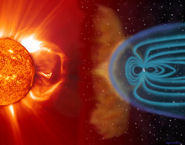
When a flare and its associated CME erupt from the sun, a burst of radiation, followed by a hail of relativistic particles and a cloud plasma propagate out into the solar system. Besides producing pretty aurora when the plasma hits the earth's ionosphere, these geomagnetic storms can destroy satellite circuitry, cause large scale blackouts, disrupt radio communication over large portions of the earth's surface and pose health risks to astronauts. As we become more and more dependent on our satellite fleet and expand human exploration of space, understanding the forces that cause flares and CMEs and learning to accurately predict them is taking on critical importance.
These eruptions originate from areas of intense magnetic fields in the corona above active regions (the area around sunspots). While the process is still not completely understood, it is thought that reconnections of these magnetic fields release the enormous energy for solar eruptions. At several hundred Gauss, these magnetic fields are on the order of a thousand times stronger than the earth's magnetic field. They are so strong that the completely dominate all other forces in the corona. The solar atmosphere is in the plasma state, in which the hydrogen and helium nuclei have been stripped of their electrons. This soup of particles is electrically neutral, but individual nuclei and electrons have electric charge that prevent them from moving perpendicularly to the field lines. So when the field lines move, they pull the plasma along with them. At the site of a magnetic reconnection, there is a rapid shift as contorted field lines snap back like rubber bands, accelerating a giant bubble of plasma and magnetic loops into space at speeds up to 2000 km/s.
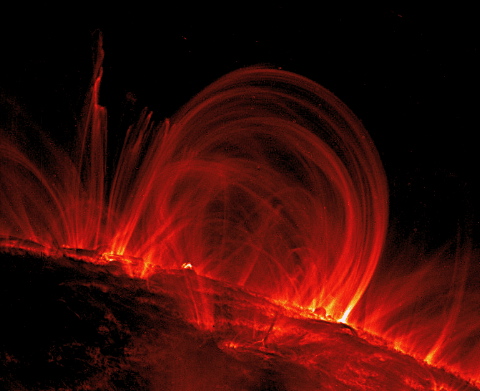
Cooling plasma constrained by magnetic field lines. |
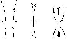
A simple example of magnetic reconnection. Two field lines of opposing polarity are slowly forced together. When they meet they reconnect and snap back into a lower energy configuration. The upper loop is ejected into space, dragging plasma with it. |
There are two factors which theorists believe increase the likely hood of active regions to erupt, the twist of the fields and the complexity of their spatial configuration. The former seems to be considered the most important by the most solar physicists at this point. My project, however, focuses on the later. Anyone who spends time watching active regions for solar eruptions will soon note that active regions that seem qualitatively more complex are much more likely to erupt and when they do, the intensity of the eruption seems linked to this complexity. That is, active regions that appear as a clearly separated pair of sunspots will remain relatively quiet, and those that appear as a tangled overlapping mess will likely do something cool.
Quantitatively describing this geometrical complexity has been difficult because there are so many variables to account for. The goal of my project is to describe this complexity by calculating the height (from the photosphere) at which the magnetic field simplifies to approximate a dipolar field. This height, which I call the "dipolar threshold", would provide a rough description that naturally incorporates many aspects of an active region's distribution in a more succinct manner than would be possible with a more direct geometrical analysis.
To find the dipolar threshold, we need to know something about the magnetic field above active regions. Since we can't exactly fly a Hall probe through the corona, we have to measure it through secondary effects. Field lines can often be deduced by watching plasma flow, but not precisely or reliably. Currently, the best way we have of measuring the solar magnetic field is by taking advantage of a quantum mechanical process known as the "Zeeman effect". Electrons have a magnetic moment determined by their orbital and spin angular momentum. When this moment interacts with an external magnetic field, the energy of an electron orbit is shifted by: (messy constant)(L+2S) dot B. Where L is the orbital angular momentum, S the spin angular momentum and B the external magnetic field. This energy shift changes the energy differences between electron orbits, thus the wavelengths that can be emitted or absorbed by the electron are changed as well. Since this shift depends on the quantum states of the electron, the wavelengths are not uniformly shifted, but split into three components. This spectral splitting can be measured with an interferometer to determine the magnitude of the magnetic field in the line-of-site direction of the instrument.
The direction of the line-of-site field is determined by the circular polarization of the shifted lines. Electrons with angular momentum aligned with the magnetic field will emit and absorb light that is circularly polarized in the same direction. Those with momentum aligned against the magnetic field will emit light that is polarized in the opposite direction. So if the spectral line with the higher frequency (increased energy) is circularly polarized in the positive or counter-clockwise sense (towards the observer), then the magnetic field is pointing towards the observer as well. If it is polarized in the negative or clockwise sense, then it is pointing away from the observer.

Magnetograms
The Michelson Doppler Imager on board the SOHO spacecraft analyzes the Zeeman effect on the Ni I photospheric absorption line at 6767.8 Å. With this data it produces snapshots of the magnetic field called magnetograms. These magnetograms show only the line-of-site component, which is a reasonable approximation of the vertical field through the photosphere,as long as only areas near the center of the solar disk are considered. To the left is an example of a magnetogram next to an image in visible light from about the same time. The black indicates negative flux, white positive and grey neutral. Notice that the areas of strong magnetic flux are in the vicinity of the sunspots. Sunspots are dark because they are cooler than the surrounding areas. The strong magnetic fields constrain the plasma and keep it from convecting so heat cannot transfer as quickly from deeper layers. |
The magnetogram data only describes the vertical component of the field at the photosphere. To find the dipolar threshold, we need information about the fields in the corona high above the photosphere. This must be extrapolated from the magnetograms. This is not a trivial excersize. We know the magnetic fields in the corona follow the equation:


 |
where |  |


Now that we know how to extrapolate the potential field, we can investigate the evolution of that field at different heights above the photosphere and identify the point at which it becomes dipolar. So when is a magnetic field dipolar enough to be called dipolar? Take a look at the following series of images.
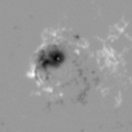 Original Magnetogram |
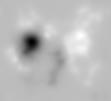 Extrapolated Field ~4500km
 |
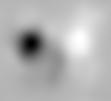 ~13500km |
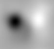 ~22500km |
So now we can calculate the dipolar threshold, but before we can make much use of it, we need some length scales to compare it to. Otherwise, comparisons between active regions of different sizes will be meaningless becuase a larger active region will naturally have a higher dipolar threshold. I took two measures of active region size for comparison. The first, the "l" scale, is the differnce between the centroids of positive and negative flux. A centrtiod is a weighted average of position, sort of a "center of mass" for the flux. The second, the "r" scale, is the radius of a circle that includes 90% of the total flux of the active region.
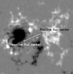 The "l" length scale |
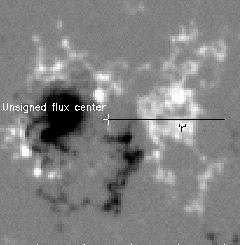 The "r" length scale |
So what happens when you apply this method? Below is a table of active regions I used my programs on. For each there is a snapshot of the region's MDI data, the h/l and h/r for this snapshot and a link to a plot showing how these values evolve over a 5 day period. There are two groups of active regions I studied. The first group consists of 7 active regions I picked out to give a range of complexity and eruptive activity. Looking at just these 7, the method seems to match fairly well with qualitative judgements of complexity. Notice, however that h/l and h/r seem too low for AR9682. The second group consists of 21 active regions. These were chosen by picking 5 time periods of 10 days and analyzing any active region which produced sunspots and transited the center of the solar disk (30E to 30W) during that peroid. So this group represents a somewhat random selection of active regions - although I did pick periods that included at least some CMEs to insure I had at least some data from CME producing regions. At the time I began analyzing this second group, I thought the method summarized complexity fairly well. I wanted a more random sample to investigate the connection between h/l and h/r and the likelyhood for CME production. However, with the larger sampling of active regions, it became clear that the method has some real problems. The most striking example of the inconsistancy with qualitative judgements is the comparison of AR9733 and AR9737. AR9733 is one of the most complex regions analyzed, yet has among the lower h/l and h/r, while AR9333 is one of the more simple regions anlayzed yet has the highest h/l and h/r of all.
| AR9077 - 7/13/00 h/l = 2.452 h/r = 0.798 Time Series Plot |
AR9358 - 2/21/01 h/l = 0.412 h/r = 0.304 Time Series Plot |
||
| AR9522 - 7/2/01 h/l = 0.272 h/r = 0.206 Time Series Plot |
AR9682 - 10/31/01 h/l = 0.267 h/r = 0.186 Time Series Plot |
||
| AR9798 - 1/27/01 h/l = 0.228 h/r = 0.206 Time Series Plot |
AR9916 - 4/26/02 h/l = 0.246 h/r = 0.193 Time Series Plot |
||
| AR8027 - 4/8/1997 h/l = 0.524 h/r = 0.218 Time Series Plot |
| AR8099 - 10/30/1997 h/l = 0.387 h/r = 0.284 Time Series Plot |
AR8100 - 11/2/98 h/l = 0.255 h/r = 0.191 Time Series Plot |
||
| AR8210 - 5/2/98 h/l = 0.892 h/r = 0.339 Time Series Plot |
AR8214 - 5/4/98 h/l = 0.274 h/r = 0.297 Time Series Plot |
||
| AR8216 - 5/5/98h/l = 1.342 h/r = 0.481 Time Series Plot |
AR8217 - 5/8/98 h/l = 0.519 h/r = 0.269 Time Series Plot |
||
| AR9231 - 11/18/00 h/l = 0.440 h/r = 0.240 Time Series Plot |
AR9232 - 11/19/00 h/l = 0.412 h/r = 0.297 Time Series Plot |
||
| AR9235 - 11/20/00 h/l = 0.493 h/r = 0.312 Time Series Plot |
AR9236 - 11/24/00 h/l = 0.148 h/r = 0.120 Time Series Plot |
||
| AR9415 - 4/9/01 h/l = 4.684 h/r = 1.319 Time Series Plot |
AR9417 - 4/7/01 h/l = 0.226 h/r = 0.158 Time Series Plot |
||
| AR9418 - 4/10/01 h/l = 0.382 h/r = 0.315 Time Series Plot |
AR9420 - 4/11/01 h/l = 0.673 h/r = 0.440 Time Series Plot |
||
| AR9422 - 4/13/01 h/l = 1.905 h/r = 0.498 Time Series Plot |
AR9426 - 4/15/01 h/l = 1.897 h/r = 0.570 Time Series Plot |
||
| AR9732 - 12/12/01 h/l = 0.229 h/r = 0.206 Time Series Plot |
AR9733 - 12/14/01 h/l = 0.257 h/r = 0.223 Time Series Plot |
||
| AR9737 - 12/15/01 h/l = 3.707 h/r = 1.227 Time Series Plot |
AR9738 - 12/17/01 h/l = 0.412 h/r = 0.344 Time Series Plot |
||
| AR9741 - 12/18/01 h/l = 0.503 h/r = 0.368 Time Series Plot |
Not surprisingly, these measures that don't effectively measure complexity, also don't have any relavance for CME production. Below are plots of the average h/l and h/r for each active region versus the number of CMEs they produced during the 5 days they were analyzed (it takes about 5 days for an active region to go from 30E to 30W). Theree are no discernable trends. Are regions with higher h/l and h/r more likely to erupt? No.
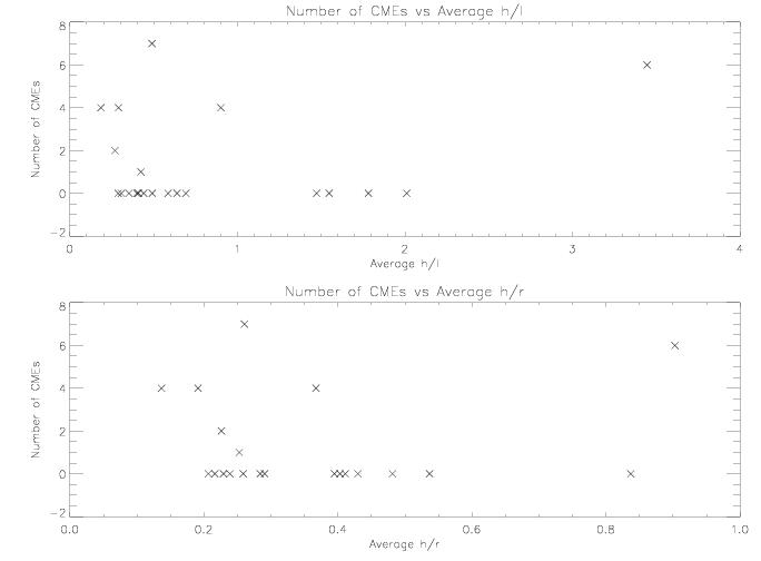
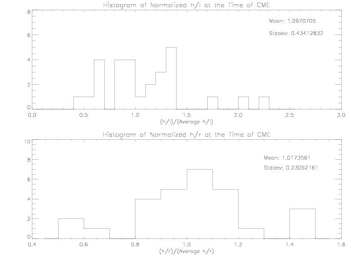
The relative values of h/l and h/r an not significant either. Below is a histogram of the values of h/l and h/r at the time of CMEs divided by the average
h/l and h/r for the active region during the 5 day period. Are regions more likely to erupt when h/l and h/r are higher relative to their average values for that region? No.
