Week 8
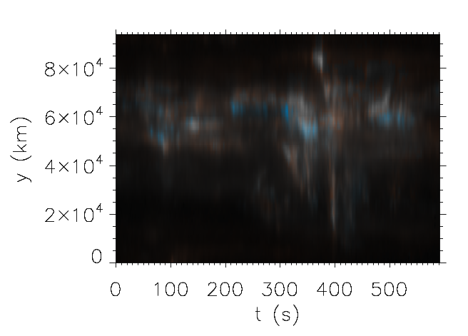
I spent a large portion of this week fixing the bugs in my color tables from last week and improving the code significantly. I made the color tables brighter and created codes that are more general so that they can be used in the future. These are pictures of the velocity legend and image made the new way:
 |
 |
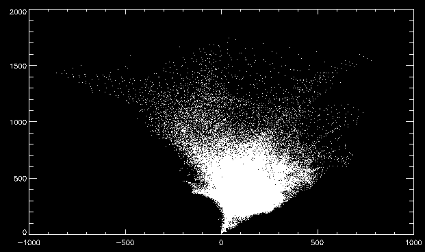
I also made a graph of the velocities vs. line widths for each pixel of the explosive event. This is the plot:
 |
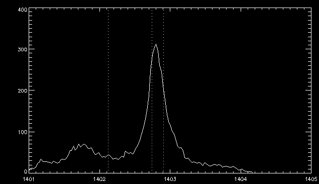
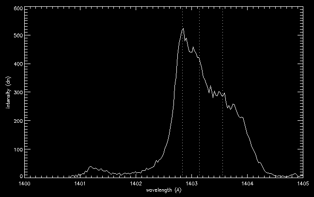
We were skeptical and curious about the points that appear to be very blueshifted and have a great line width, as these velocities were much greater than expected. I plotted some of the individual points so that we could see what was going on. Here are a couple examples of such profiles.
 |
And here is the profile of the point that appeared to have the greatest blueshift:
 |
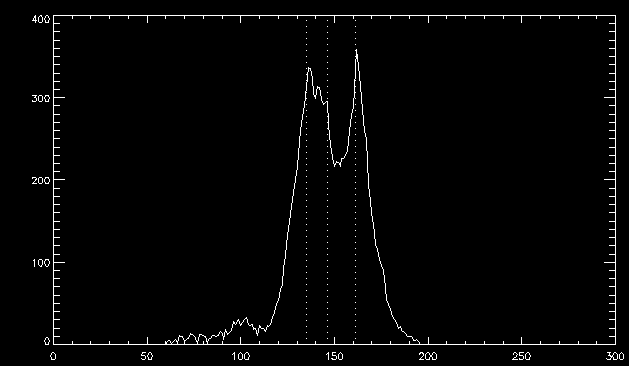
Additionally, here is an example of a point with extreme redshift and a large line width:
 |
It appears that all of these line profiles are legitimate, which is pretty cool! We are not sure what the bump to the left of the Si IV line in the blueshifted profiles is, however. At first we thought it might be another spectral line, but there is not one at that wavelength. It may instead be plasma that is moving extremely fast.


