Logbook
| July 27, 2010: I started making some scatter plots of LCT vs. MCT velocities for all poles at any given time. I just finished doing all three regions (that's a lot of plots, BTW.) I had some issues with the July region, which, as it turns out, was an array size issue. After some rumination, I fixed said issue and reran the make_lct_arr program as well as my lct_vel program and guess what? The velocity plots now make a lot more sense! Huzzah! So much for my attempting to explain that using the velocity map. In any case, here are the two regions from July which are now fixed: 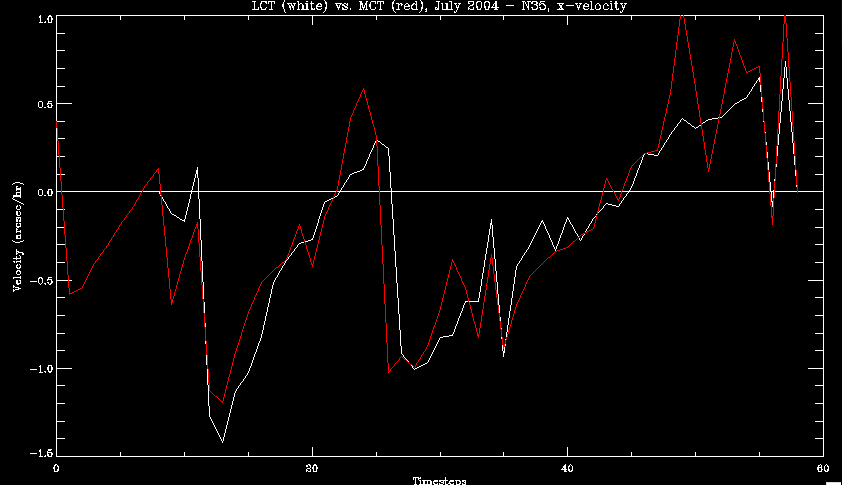 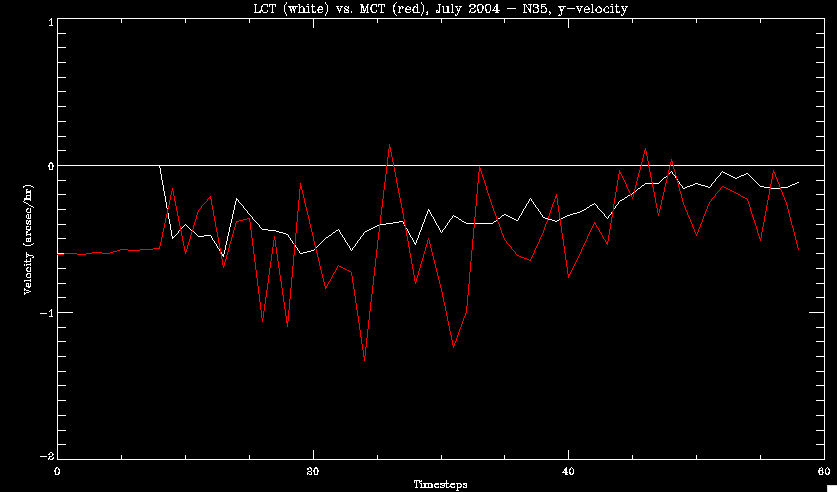 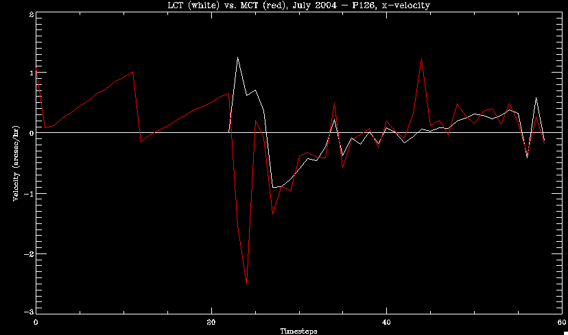 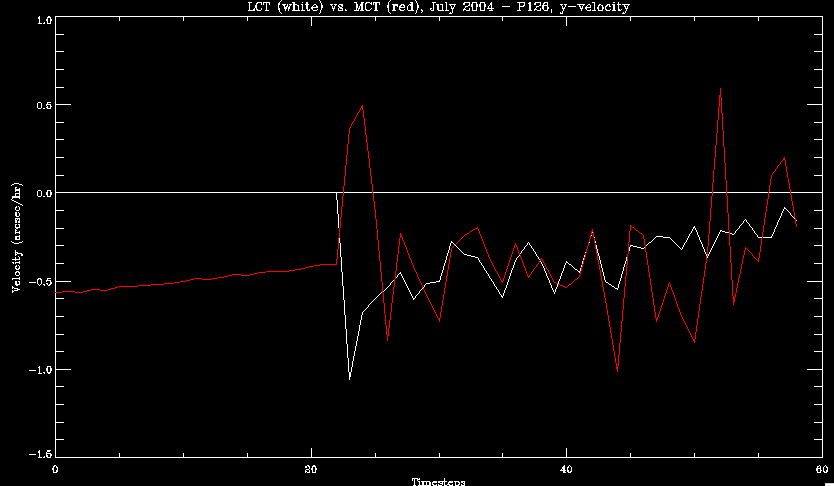 So that's cool. Here's some of the scatter plots, chosen at random from the Feb region: i = 45 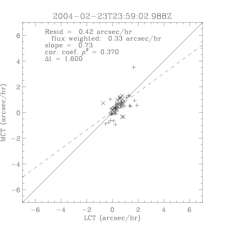 i=96 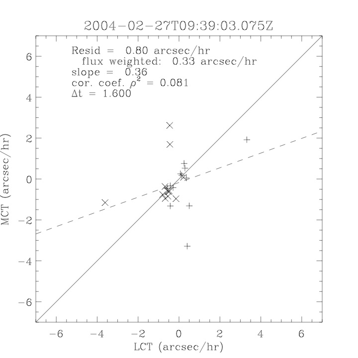 July 26, 2010: Worked on my presentation and cleaned up/organized my code. July 23, 2010: Spent a good deal of time in meetings and working on my presentation, but I've done a bit of work thinking about why the July region MCT and LCT velocities aren't matching. I don't have any definitive answers, but I will say that between time c. 44 and the end (58) MCT gives a velocity for region N35, and LCT gives almost none. Take a look at the velocity map for this region at timestep 49: 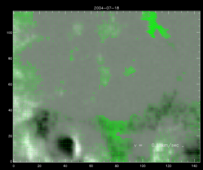 N35 is the diffuse negative region lower down and farthes to the left of the window. Note that the velocity vectors are extremely small. However, if you watch a movie of it, you can track movement of the centroid that definitely occurs there. July 22, 2010: Alright, so here's the deal: I've rewritten the pole velocity program (which, by the way, comes from an algorithm referred to as MCT, so I'm going to call it MCT velocity from now on) so that it calculates the velocities in the plane of the sky. Now it can be compared directly with the LCT velocities. Additionally, we had to account for the rotation of the sun after we translated it, so now it seems to be giving results that make a lot more sense with what we're seeing in the masks. I've spent a bit of time cleaning up my save files from IDL so that they contain all the important information from the three regions we've been dealing with. I think I've finally gotten everything working - took a while and was frustrating! But I'm getting some serious correlation between LCT and MCT! I'm going to go through each active regions and post the interesting plots. One thing to note is that because of the transformation in planes that we've made, the places in the MCT velocities where it's meant to be zero no longer are... I'm not sure if that's important, but should be noted. 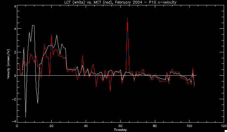 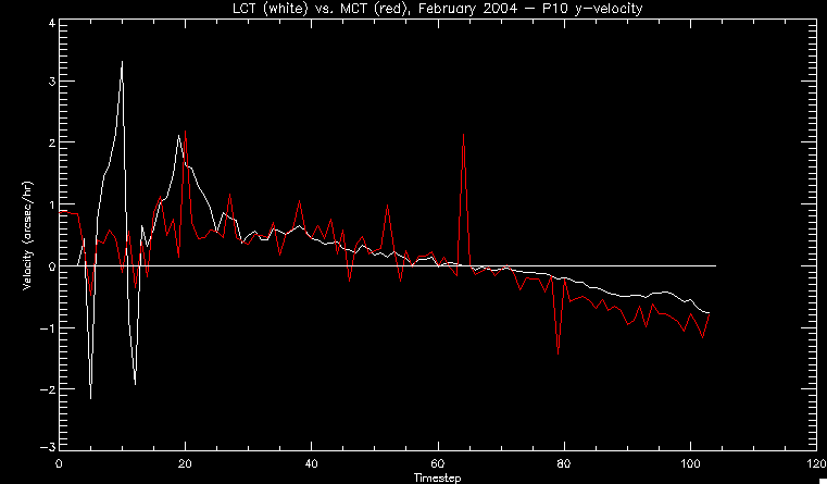 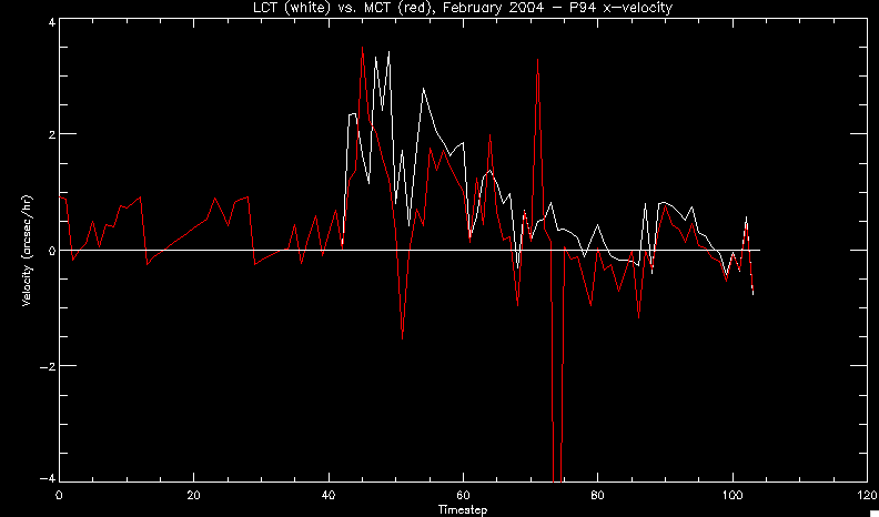 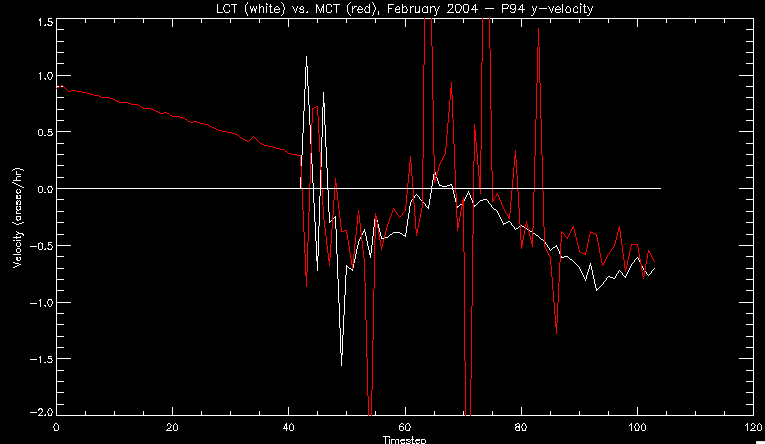 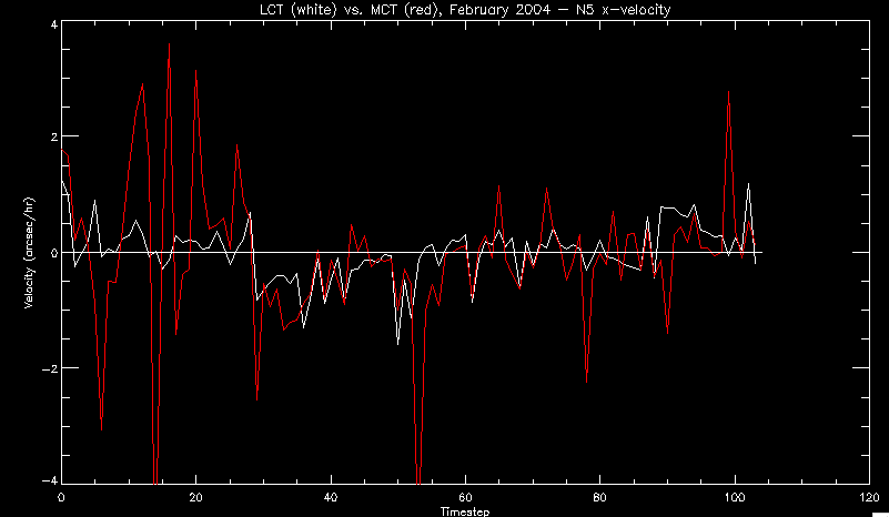 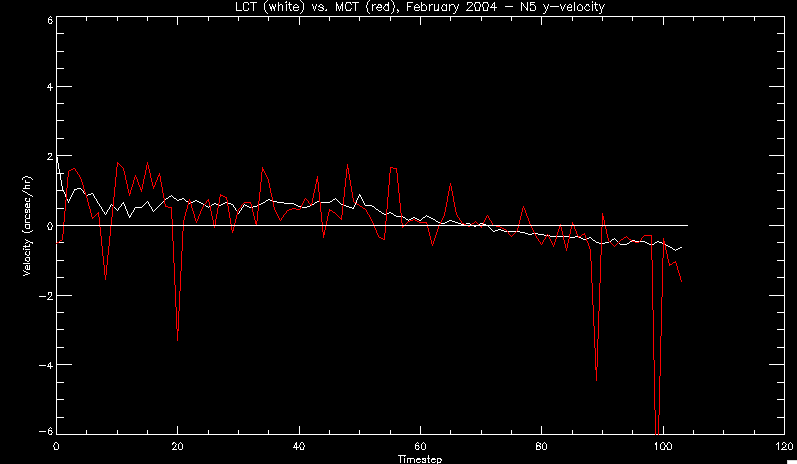 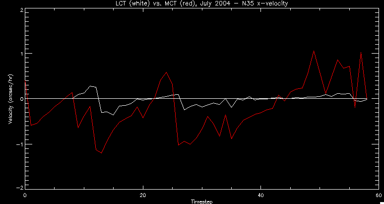 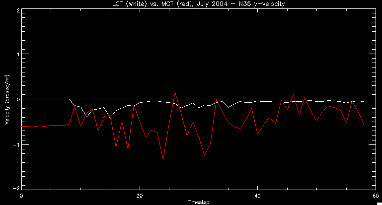 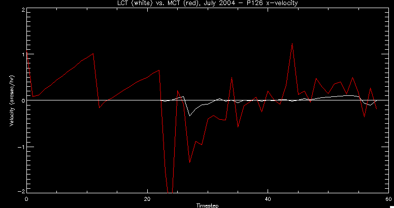 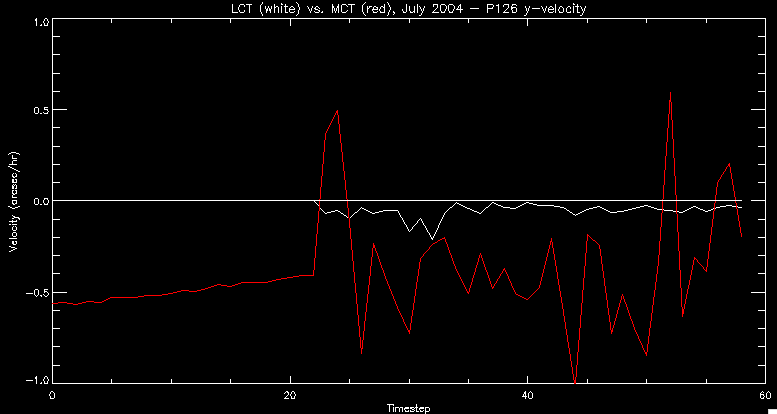 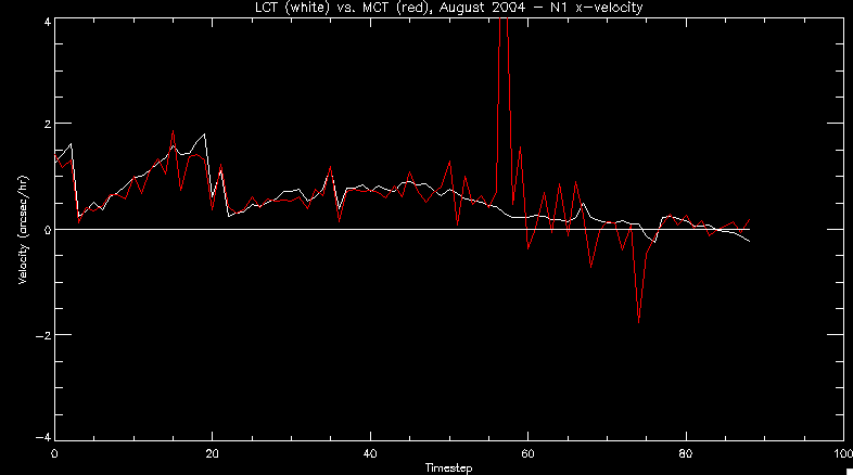 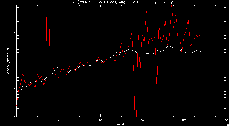 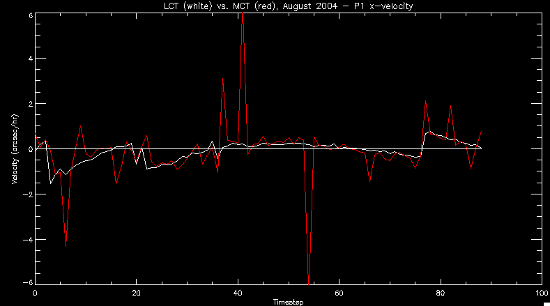 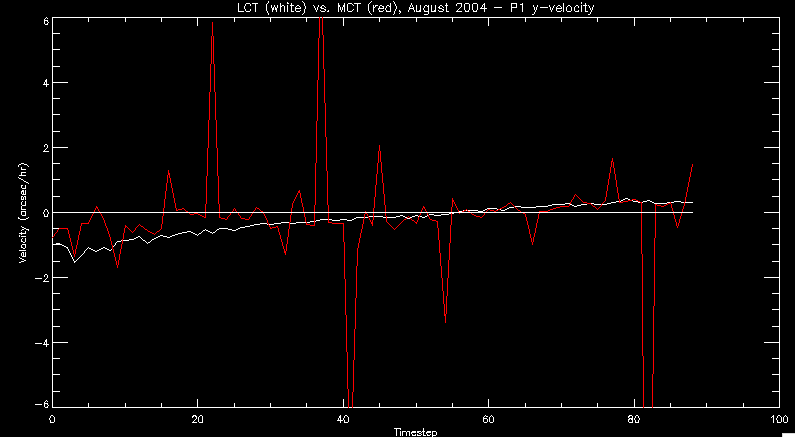 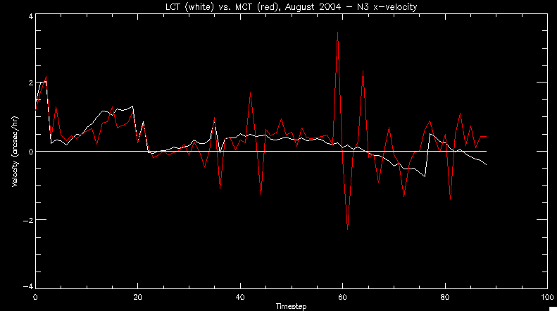 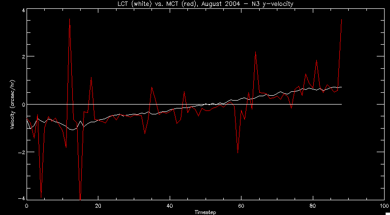 Additionally, I wrote a readme file that I put in my home directory that bascially details what everything in my folder is and does, for future use. July 21, 2010: Working on making some corrections to the velocity programs. July 20, 2010: My LCT program now processes the LCT velocities for all poles, which is convenient. Took a little convincing, but managed it, with a little help from my friends (read: Lucas.) Apparently there's some issue with the validity of comparing these velocities straight up - having to do with being inside the LCT window, but I'm not sure exactly where to deal with this, so I'm going to think about it and get back to it later. Additionally, LCT calculates its velocities in the plane of the sky, whereas our pole velocities are calculating using a tangential plane to the point of the pole, so I'm going to translate the latter to the plane of the sky. July 19, 2010: Making a bunch of plots so as to get a better idea of what we're dealing with when comparing LCT to pole velocities. These are all from the August 2004 region - see titles of plots for details. I feel like you can definitely see some correlation going on. 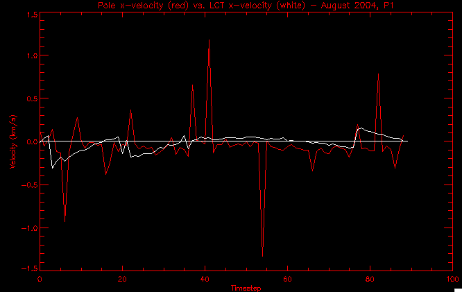 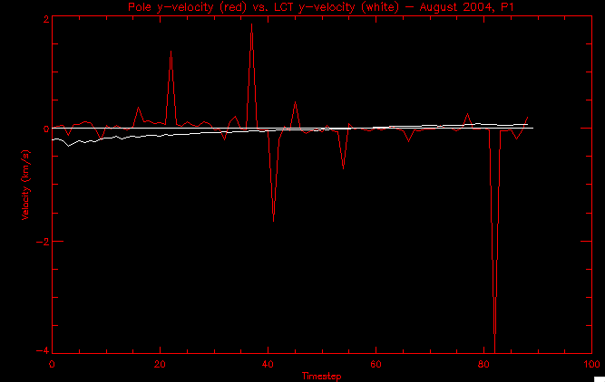 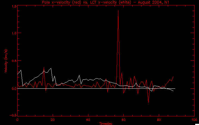 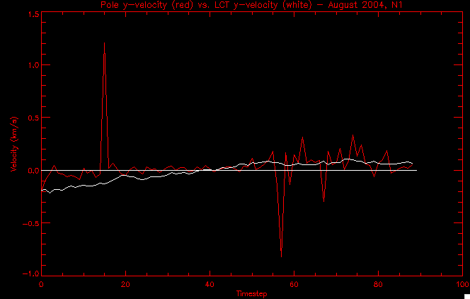 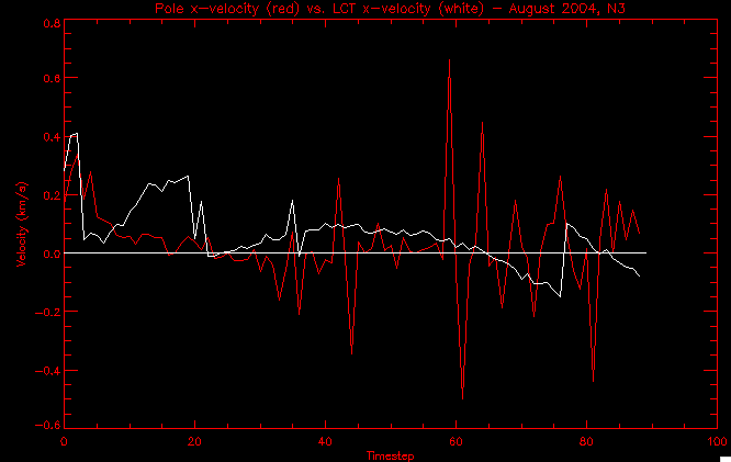 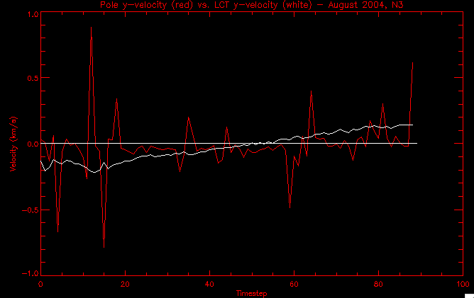 July 16, 2010: Alright, we did some more fixing of the LCT velocity program so as to get rid of weird outliers that we saw in the previous plots. So, here's an interesting program that shows you the velocity vectors from the LCT array at any given time. What's cool is that when you look at a comparison of LCT to pole velocity, you can see some distinct differences in places, so of course it would be great to have some way to determine which one seems more valid (as much as anything is valid in research - after all, who's to say what is "correct"?) So anyway, let me give you an idea of what I'm talking about. Here's a picture of the mask from time 60: 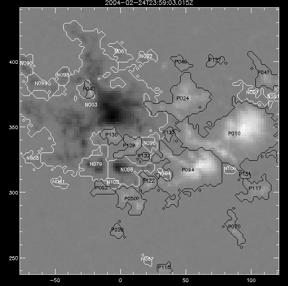 Here is a plot of y-velocities from P94, where the poles are in blue and the LCT method is white: 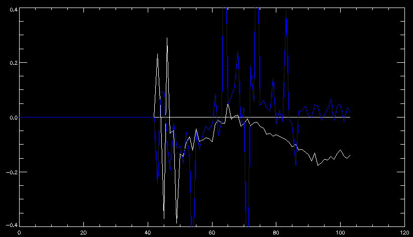 You can see that LCT shows a downward y-velocity around timestep 60 or so, where as the pole velocity doesn't really trend down until the very end. Now, here's a picture of the LCT velocity vectors from time 62: 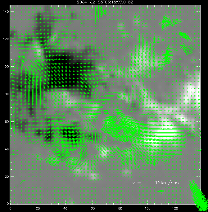 You can see that region P94 (the positive region in the lower right corner) has most of it's velocity at this time coming from the edges of the region - where the field is weaker. However, the video of the poles shows that the apparent downward motion of the same region indeed does not occur until later. So these are the results we would expect to see in the plot. Here is the July region, P126: 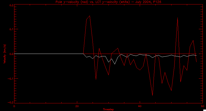 July, N35: 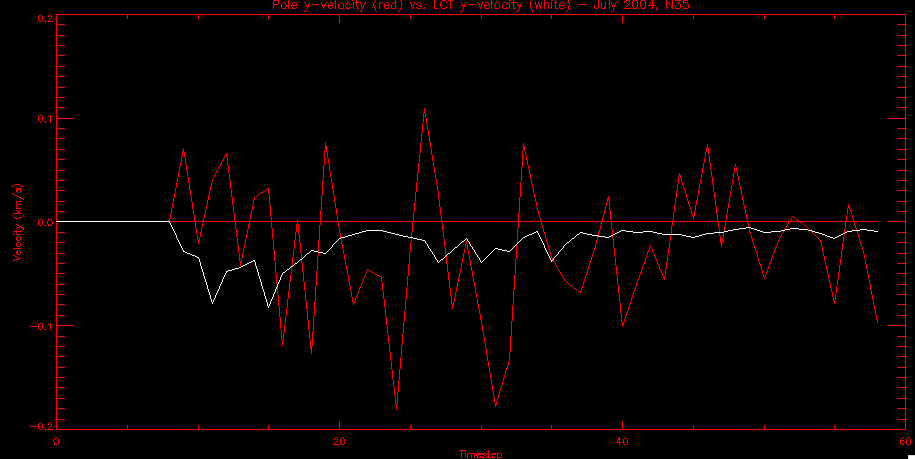 July 2004, P1, x-velocity: 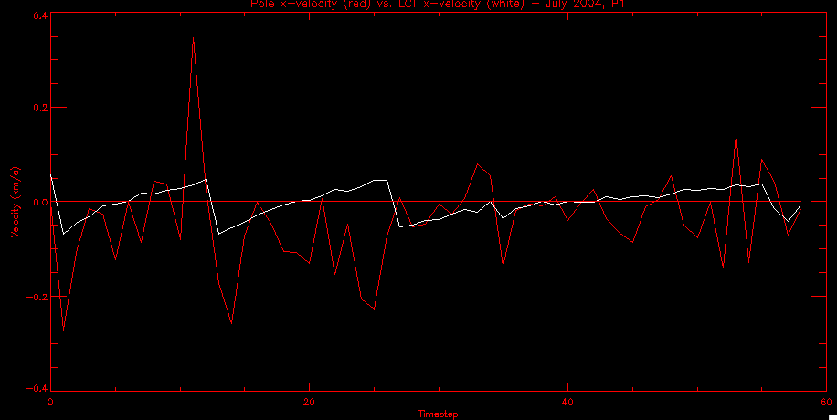 July 14, 2010: As it turns out, my LCT velocity code was pretty buggy. I think it's fixed now (thanks, Lucas!) In any case, let me put some plots up that make more sense. White line is LCT, colored line is mine. These are for Feb 2004, x-velocities only. P10: 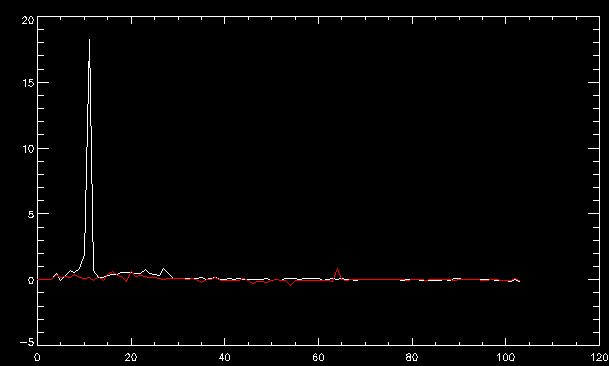 N3 (this one has a huge jump in LCT, like up to some thousands around time 22): 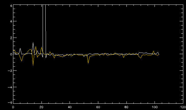 P94: 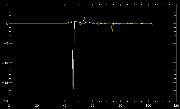 Thing to note: LCT often has big jumps. July 13, 2010: Still working on LCT. I'm writing a program that will do all the resizing and unit conversions from LCT and output a structure that we can actually work with. The end goal is to see how the two methods compare, providing insight hopefully into how both algorithms work. As a side note, subscripting errors follow me wherever I go and are the bane of my existence. Finally finished dealing with LCT. I've written a program that returns a structure of the x and y velocities in km/s. I also tweaked my velocity program for our method so that it also returns a structure of x and y velocities in km/s. I'm getting the LCT data for July 2004, and Lucas did the one from February 2004, so that's almost all done. Next step will be to actually do some comparison - fingers crossed! I have a funny feeling there will be almost no correlation, but that's life. To compare, I'm basically going to take the difference between our velocities and LCT velocities and see what comes out. Alright, first results! These are from the February 2004 region. This plot is our velocity minus LCT velocity for N1 in km/s: 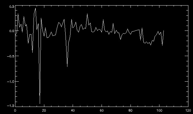 According to our algorithm, around timeste 20, N1 disappears, so the little differences are LCT on it's own. Here is the plot of just our velocity for N1: 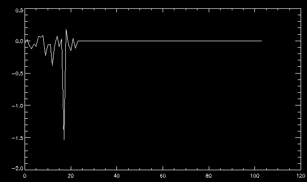 And just LCT velocity: 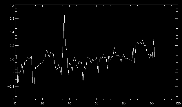 And finally, the x-velocities both together (where the white line is the LCT velocities): 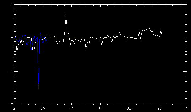 And the y-velocities: 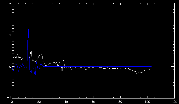 July 12, 2010: Working my way through the Local Correlation Tracking (LCT) algorithm, which is the current pixel-by-pixel method for finding velocities. It requires some TLC to get it to a place where I can compare the LCT results with my pole velocities. July 9, 2010: Finished the new August region. July 8, 2010: Finished the Feb 2004 region - looks good. As a side note, I tried to use rmv_shift sparingly in this instance and the internal region lines just went haywire. So, I didn't even use it for this region at all. Too bad. I am currently rerunning the same region with the saddle at 0.7 instead of the usual 0.6, to see what effect that has. Will be done soon. Found a new region - 2004-08-13, there is an X-class flare, so I'll do some work on it. The point is to get as many regions looking good as possible so we can actually get some stats about how things are working out. Alright, finished the run with the saddle at 0.7. I don't think it did anything that great, honestly. Although it fewer janky internal lines, plenty still remained, and it lost some lines that I think should have been there. I guess you could say that the loss of some bad divisions didn't outweigh the effect of too much smoothing. In my opinion. Began work on the new region - again, attempted rmv_shift, disliked the results and left it out. July 7, 2010: Finally got the velocity program working. Just some stupid mistakes with subscripting. Hurray! So now that we have the velocities of poles, I've gone back to the February 2004 region go clean it up so it looks in good shape with consistent labeling. Will work on changing some by hand. July 6, 2010: Glacier National Park was epic. So, I ran rmv_shift just to see if it magically started working again after the weekend, which seemed as likely as it randomly stopping working, but no luck. Uber annoying. Okay, so Lucas got it working - yay, Lucas! Spent a great deal of the afternoon hand-fixing some labels. I got the important ones looking pretty consistent, which awesome because now I can actually do something with it. Here's the flux: 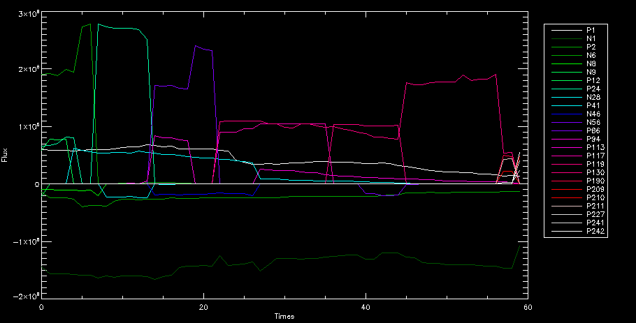 You can see the effect of fixing labels - the negative is looking very nice. The positive flux is still so choppy due to the large globby region to the left of the mask you can see if you look below - it divides it up a little randomly in places, but we don't really care about it because nothing interesting happens there. My velocity program still seems to have an issue. Not sure what it is. July 1, 2010: Having some issues with rmv_shift today - it's trying to do something it's 1.) Not meant to do, and 2.) Never done before. So that's awesome. Still looking at the velocity program. Not entirely sure I trust it yet. Here's a plot from February 2004: 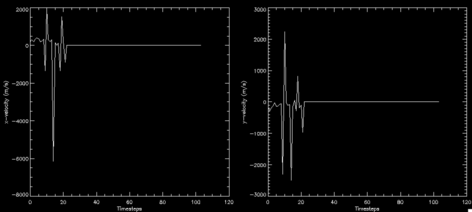 My one reservation is that 6000 m/s spot for instance. However, I've gone through and looked at the original data and that seems to be a legit result. Parr(16).x(0) - parr(15).x(0) should give the movement of the 0th pole from timestep 15 to 16. The result was c. 35 megameters, which is 35 x 10^6 meters, which when you divid by 96 mins or 5760 seconds, gives about 6000 m/s. So, the program appears to be fine. June 30, 2010: Spent some time trying to figure out what was wrong with my velocity program. I think I fixed it? Now gives more accurate seeming velocities for the surface of the sun. Also, there was a giant hail storm. June 29, 2010: Made some slight modifications to the flux programs I wrote - just making the plots come out better. Kept working on the pls_velocity program. It spits out the velocity in m/s... I think. That's assuming that the input was in megameters. I'm getting velocities on the order of tens of meters per second, which is approximately what you'd expect for matter on the sun. Here is the plot of the x velocity as a function of timestep from the 2004-07 active regions: 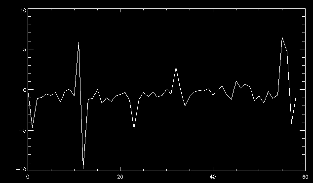 (Note that the flare occurs right where that big peak is - mean something?) I'm still trying to decide if this plot makes sense. The problem is that I don't know what 0 is. The poles array is a structure where I've used the parr.x and parr.y to determine velocities, but I don't know what those are in reference to, so it's difficult to know exactly what the plot means. Here's the y velocity: 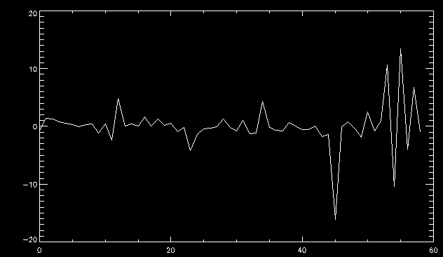 Just to give you something else to ponder, here is the x velocity of the 2004-02 region: 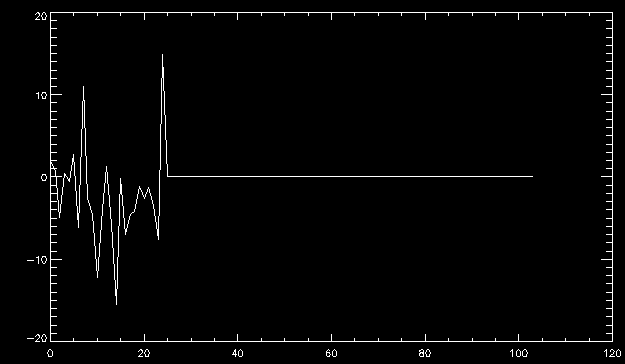 You can see where the region probably suddenly gets relabeled, because it disappears entirely. Either that or it doesn't move a single iota after the c. 27th timestep, which is unlikely. June 28, 2010: Finished the velocity program I was writing. Am convinced that rmv_shift needs to go back to the way it was - no matter what I do, the mask comes out stupidly. June 25, 2010: So spent some time thinking about how I feel about the last thing I mentioned yesterday about how regions exceed the three timesteps that rmv_flick and rmv_shift deal with, and how I said that maybe the problem was that some of regions lasted beyond that. However, I think that is incorrect. Rmv_shift is supposed to deal with the switching of labels, which is what we're dealing with. So, I ran the algorithms again including rmv_shift, but in very small amounts. Problem is that I'm still having the same issues - inner region lines that just are stupid. I'm going to go again, and leave rmv_shift until and only at the very end. Maybe I'll find that it's going back to rmv_flick and vanish after doing shift that makes it wonky. Well, I gained the results you might have expected - a very few weird internal lines, but was left with the fact that there were regions that still needed to be shifted. I think the take away point is that the rmv_shift algotrithm is necessary in some form, but that the form that it's in right now is not working. Left that behind to keep working on the velocity program that I started on a couple of weeks ago. Got it almost figured out, still needs to be finished, though. June 24, 2010: Okay, so after running the script that had no rmv_shift, I decided that it looked a lot (and I do mean a lot) better than with rmv_shift. Here's what the track_flux looks like: 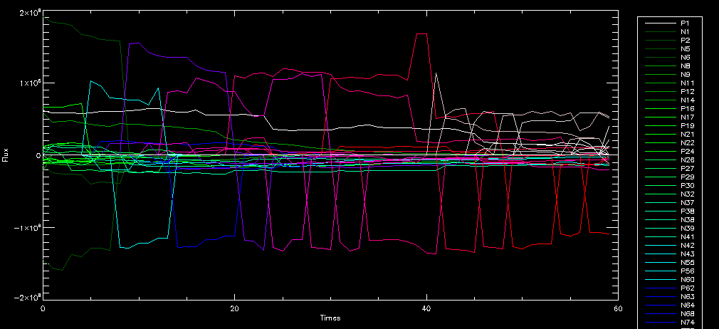 There are still obvious issues, but check out the difference in the regions between a run that does not include rmv_shift on the left, and one that does on the right: 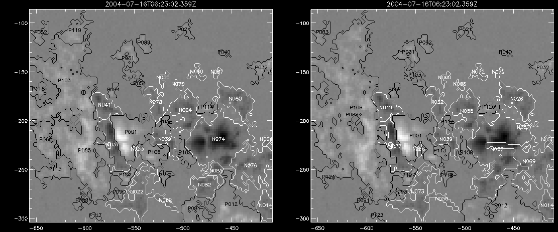 You see that in the left image, N74 stays together, as it should, and on the right, there's this weird protruding point. Not cool. Anyway, something to think about. You can, however, see the impetus for rmv_shift in the above track of the flux. What happens is that rmv_flick and rmv_vanish deal with regions in a range of three timesteps. The problem is that some of those gaps exceed that range, and neither of those algorithms are able to fix it. June 23, 2010: Started looking at a region from July of 2004. Specifically, I'm looking at MDI magnetograms runing from 2004-07-15 (before that the region is too far on the limb) and 2004-07-18 (when the last X class flare occurred. There's an interesting flare that happens at 1:43 on the 16th in that it appears to result from submergence of fields as opposed to the usual emergence. So, I've been running the scripts and taking a look at what happens. Here's some images so far: 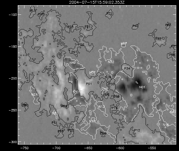 The above image is from about 10 or 11 hours before the FOI (flare of interest... yes, I'm creating my own terminology.) The FOI occurs at a point near N37 and P01. The image below tracks the flux before any smoothing was done: 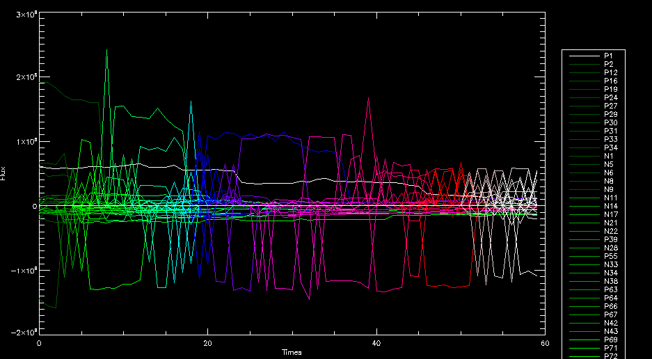 This is using gen_res4: 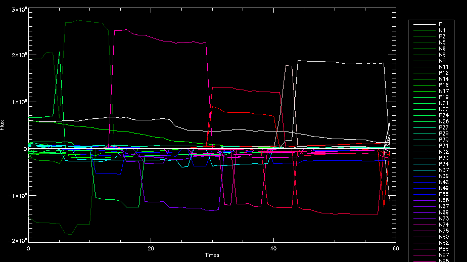 This is using gen_res5: 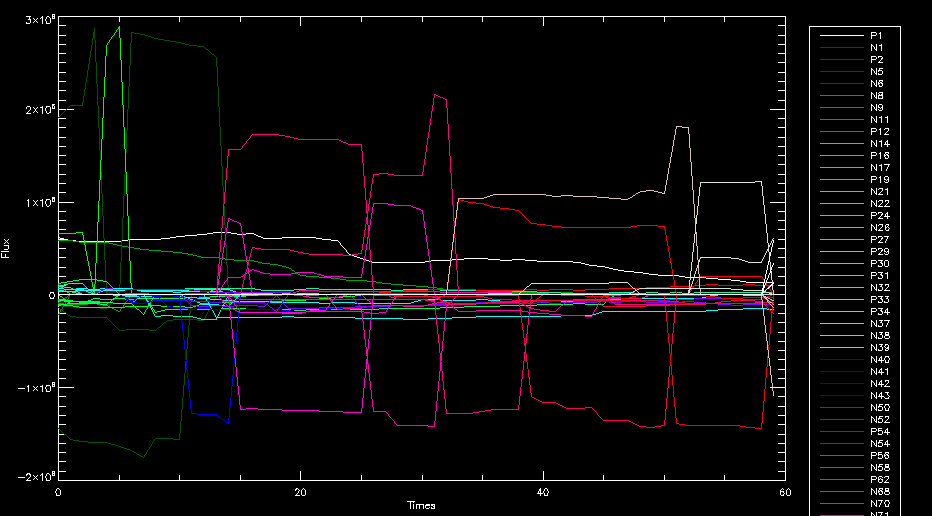 And gen_res6: 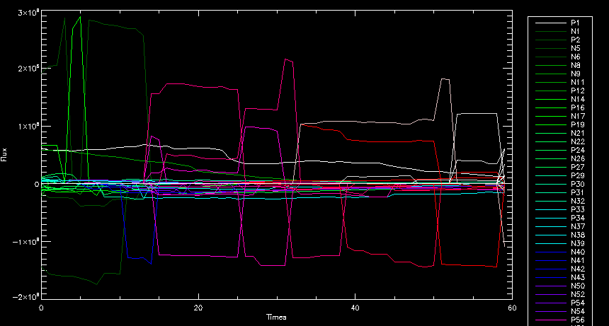 I've also run some of the algorithms that I wrote yesterday. Here are the difference plots of the shrinkage and growth for the 3 gen_res scripts. Using gen_res4: 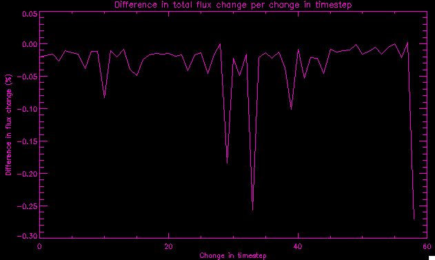 Using gen_res5: 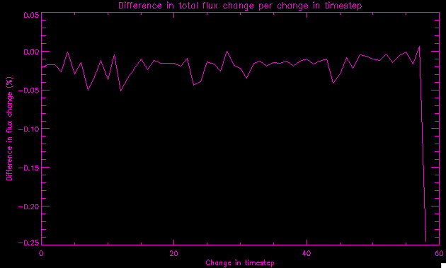 And gen_res6_3: 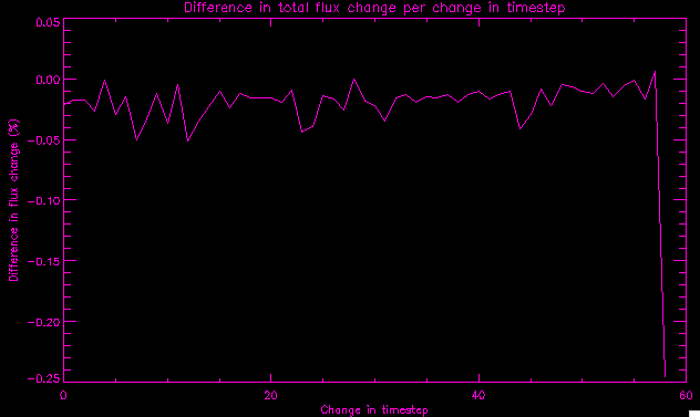 You can see that the tendency we saw in the plot yesterday to even out as the timesteps went on is not present here in these plots. I think the reason that we saw that in the previous plot is because of the quadrupole that occures right around that 20th timestep. The rmv functions certainly had some issues with that area, and it's not surprise that it was reflected in that plot. However, this active region contains a fairly steady quadrupole throughout the entire timespan chosen. Last thing I did today was write a new script that only ran the rmv_flick and rmv_vanish function, because honestly, the rmv_shift seems to create more trouble then it helps. When looking at the poles before any of the rmv functions were run, while there seemed to be a lot of renaming issues, there were not any of the weird divisions of regions that were obviously mean to stay together. After running all three algorithms, many of the labeling issues were fixed (from rmv_flick and vanish), but I was left with obviously wrong inner divisions. Will do more with that tomorrow. June 22, 2010: I've basically been collecting information today from the programs I've been writing in an attempt to get some useful data out of them. So far, I tweaked that last program I was talking about in the previous post so that it actually outputs the first value abov 50% and 95%, as opposed to a possible range. I'm going to do more with that later. What I've done now is write a program that takes the asymptotic values of the flux change per delta timestep and graphed them - one plot for shrinkage, one for growth, one overplotted, and lastly a plot of the difference. The last plot is the most revealing because say you have a region that doesn' change in magnitude that much from one timestep to the next, but it gets magically relabeled. That will correspond to a very large growth and a very large shrinkage simultaneously. The plot of the difference gets rid of those anomalies and actually shows where there's real change in regions going on. Here's the plots in the above order: 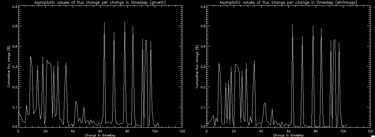 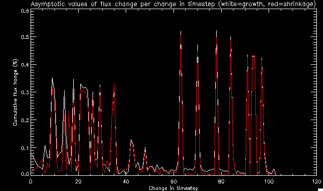 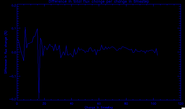 I know, really cool, right? June 18, 2010: So, turns out my program wasn't quite right. When I normalized the flux, I was dividing by the total flux for ALL time steps, which is actually wrong if you're wanting to only look at a single delta t, if you will. I changed it so it's now dividing by the total flux at that delta t, making it all make much more sense. The shape of the plot doesn't change much, but the values along the y-axis (percent change of flux) make a lot more sense. 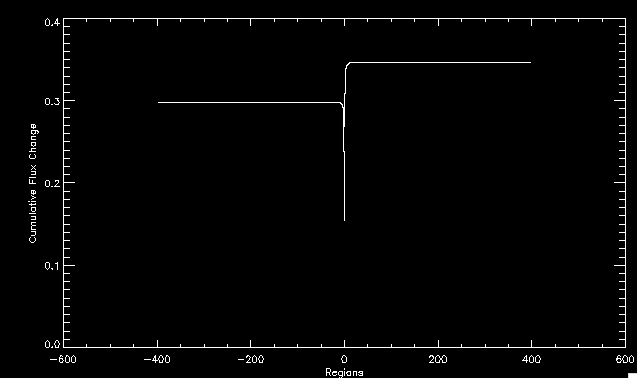 Also had it plot fewer regions, since they asymptote quickly. This is the 90th delta t: 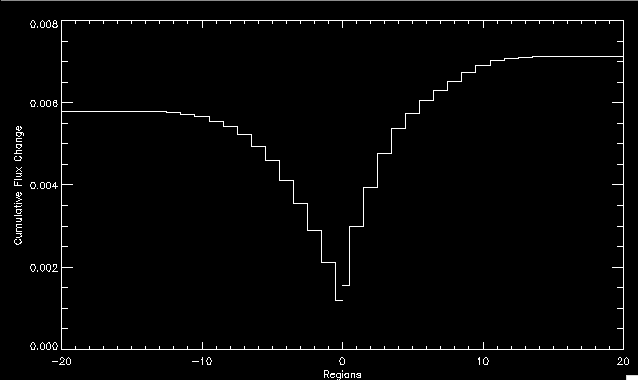 Compare this, which was one data stream, with the below plot, a stream that involved far fewer iterations: 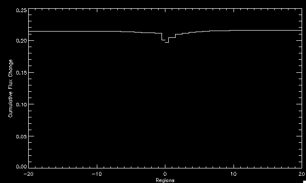 Note that this major growth coupled with a major shrinkage probably represents a label change rather than any great flux change. Last thing I did today was attempt to have the program output how many regions it took to reach 50% and 95%. Not as easy as it sounds. What I came up with outputs like this: IDL> flux_diff1, parr, 90 The values near 50% of growth: 0.420781 0.553441 These growth values occur between/at these regions: 1 2 The values near 50% of shrinkage: 0.497870 These shrinkage values occur between/at these regions: 2 The values near 95% of growth: 0.945491 These growth values occur between/at these regions: 9 The values near 95% of shrinkage: 0.957713 These shrinkage values occur between/at these regions: 9 The growth asymptotes to: 0.0071146588 The shrinkage asymptotes to: 0.0057970133 There should be a way to narrow it down to a single number, but I'll have to think about it some more. I'm actually wondering if there isn't some really simple way to do this and I just overcomplicated it, but hey, I came up with something that sort of works - surely that counts for something? June 17, 2010: Fixed the program so that the user can decide what time change's plot they want to see. Took me awhile to figure out how to subscript the arrays since they didn't really want to be square. I think the program does what I want it to do, although I need a second opinion. The program also tells you the value of the growth and shrinkage asymptotes. Here is the plot of growth and shrinkage between I believe the 68th and 67th time intervals - you can see it's not very pretty, but I think it's right: 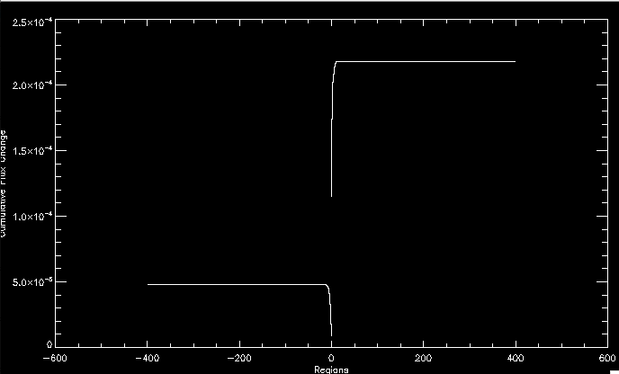 Here is the change in flux between 90 and 89 (it's prettier): 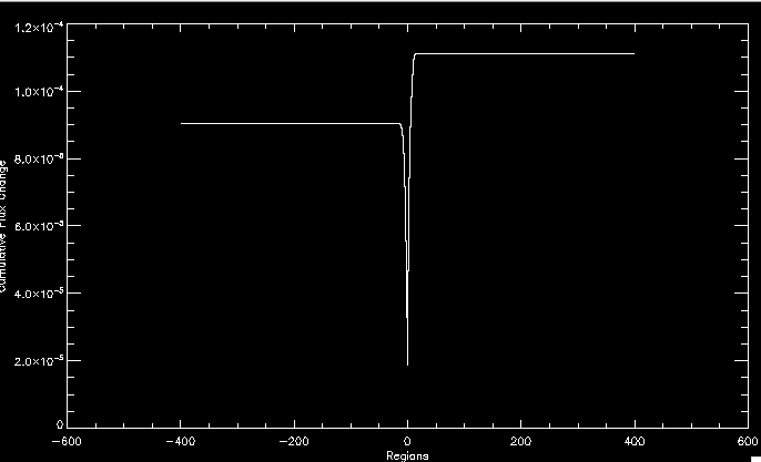 I'm also trying to figure out how to have the program tell me how many regions it takes to get to 50% and 95% of the total flux change - still ruminating on that one. For kicks and giggles, I also tweaked the program so that it would plot all the single timestep changes except all on one plot. I have no idea if this is useful - nevertheless, here is the result: 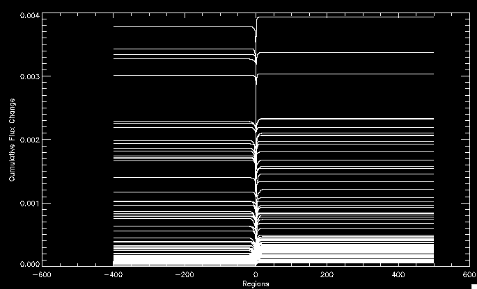 June 16, 2010: Got my little program working... still needs some tweaking. What it does currently is take all ~100 timesteps and mashes them together, then sorts the growing and shrinking regions separately. They are then normalized to the total absolute value of the flux of the region. The problem with this is that I lose a lot of information about what happens between single timesteps. The plots, however, still look cool: 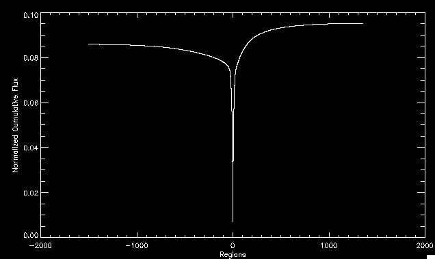 The above plot is using the poles array from my initial runs through the 2004-02 active region, which as I've mentioned before involves c. 1000 runs of the rmv functions. The plot below is using the poles array from the script that ran about 230 iterations, starting with rmv_shift: 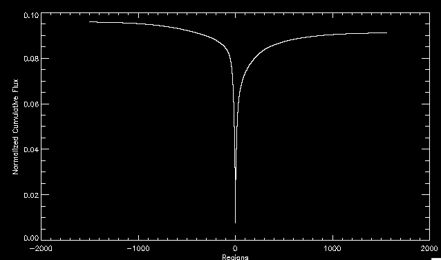 Interesting things to note include the fact that the order of algorithms run affects whether the growing or shrinking regions asymptote to higher or negative flux values, and the fact that the shrinking regions always see to have a sharper turning point. June 15, 2010: Today I started working on an algorithm to quantify the differences between orders of running the rmv functions. Basically, the array of poles that has been previously extrapolated from the mask array is input into this function, and the growth or shrinkage of each region is measured and then graphed as a cumulative histogram ordered from most change to least change. These values should at some point reach an asymptote, and that should be interesting to see. Of course, I say all this in past tense like the program is finished, when in reality I'm still debugging. June 14, 2010: More of the same. Lucas made some modifications to the rmv stuff, so reran the scripts I wrote. Tried to get a sense of the differences. Here's the kind of stuff we are currently trying to get rid of: 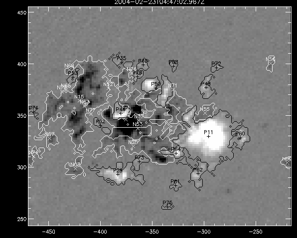 The line cutting through that patch of negative is just silly. I also made some movies of the evolution of the poles over this 7 day period. Will try to post one sometime. June 10, 2010: Continued with writing scripts to run various orders of the rmv functions. Each algorithm runs about 230 iterations, so they took awhile. Here are the results so far: 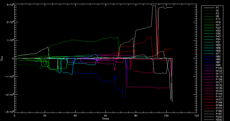 The above plot is from running rmv_shift first. 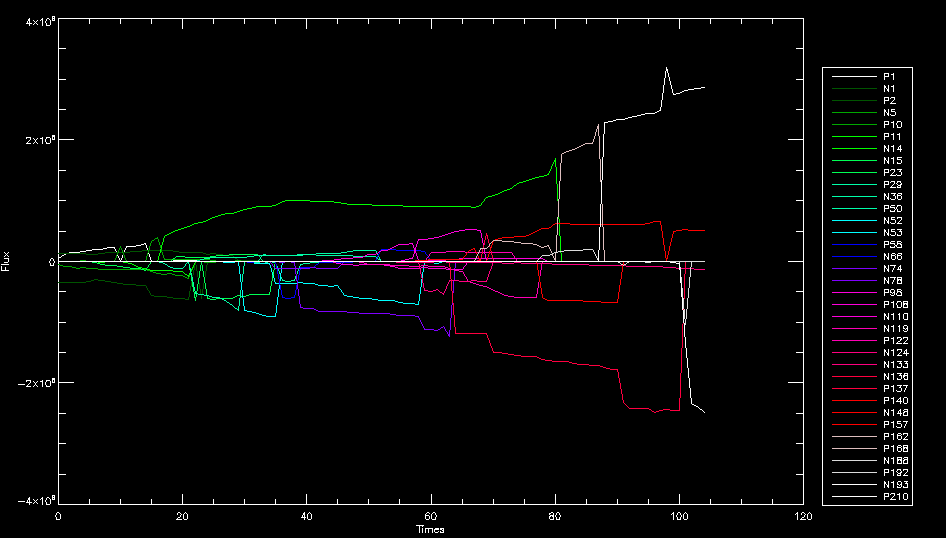 This one (above) was generated using rmv_flick, rmv_vanish, and then rmv_shift. 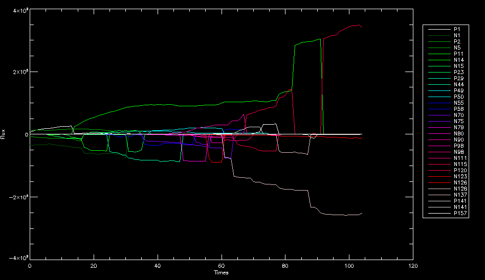 Finally, the above plot doing rmv_vanish first. Personally, I think this last one is the best of all of them. June 9, 2010: More of the same. Got the flux plot looking pretty good besides a few (annoying) aberrations. 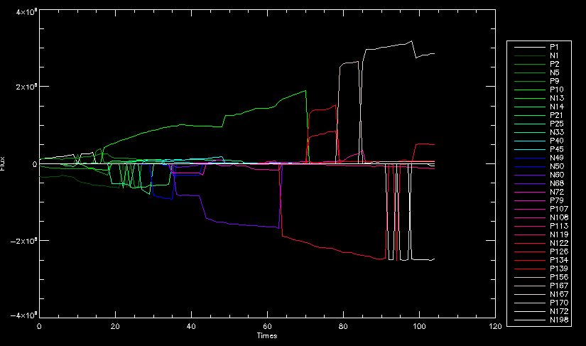 Started writing a program to find the x and y velocities of the poles, but got a little stuck on getting the time difference from step to step. Tried using julday, but having some issues. Need to debug. Also, wrote several scripts to compare how changing the order of the rmv_* algorithms affects the final outcome. More on that tomorrow. June 8, 2010: I've got the region I'm working on narrowed down to 6 days ranging from 2004-02-21 to 2004-02-27. It's basically a new region emerging inside an old one. Talked to Lucas about how running the programs works, as far as how it determines which poles get renamed and shifted about using the algorithms he wrote, and spent a long time running the scripts on this data, trying to get it smoothed out. So far, it's still pretty choppy. 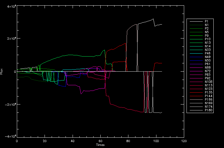 However, if you consider where we started, it's not bad: 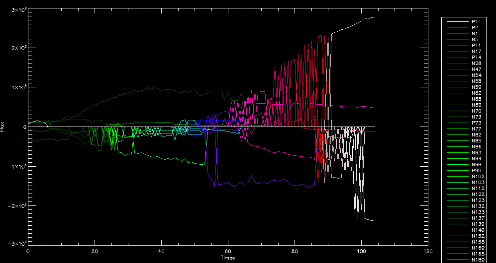 The times from 90 to about 98 seem to be in disarray, which can be seen in the images below. On the top is the image from 94, and on the bottom is 95. The issues with naming are obvious. 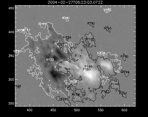 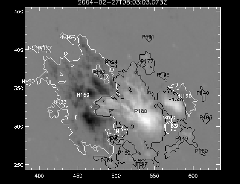 June 7, 2010: Didn't get much done today - everyone I needed to talk to seemed to be out of the office. Put some thought into how I could find the x and y velocities of individual poles from time to time, but not entirely sure I came up with something that works. Have to keep thinking about it. June 5, 2010: Today I've been messing around with pulling MDI images and running the rmv_flick, rmv_vanish, and rmv_shift algorithms to see what I can make of the emerging flare from February 2004. I first ran it for three days before the flare that occurred on the 26th, and then tried again for two days. The algorithms functioned as expected - basically smoothing out the data so that regions remained continuous from timestep to timestep. June 4, 2010: I finished up my introductory IDL projects today. The first simply took an image array from an MDI magnetogram and summed the flux, finding the total positive and negative fluxes, as well as the total flux. The idea is that each pixel in a magnetogram (and therefore the value in the array of the image) represents a value. That value is the line-of-sight magnetic field at that pixel. In active regions, we expect there to be as many negative as positive pixels, since they represent a B field that is both coming out of and then returning into the sun. Due to noise, the correlation of field coming out and field going in is never perfect, but that's the general idea. The second program I wrote had similar results, but it required input from the user. The first thing the user has to type is the desired date of the magnetogram. Then, the user is asked for a threshold, which tells the program to ignore data from the array below that value. The reason for this is that much of the pixel values below, say, 50 Gauss are simply noise and only get in the way. The proram then returns the same info as the first program. The last script I wrote takes the same user input and returns an image of where the local maxima are in the magnetogram. The higher the threshold input from the user, the maximum the returned maxima are. So, that was all very enlightening. Here's a magnetogram, for posterity's sake: 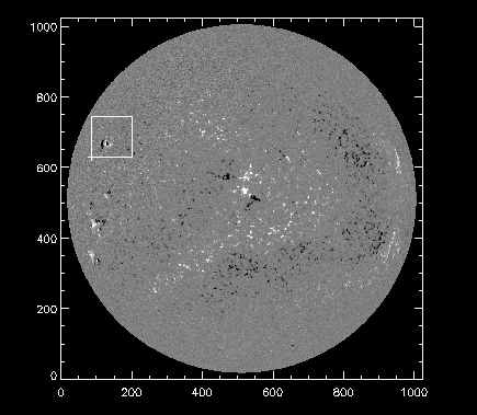 |