Zoe Sturrock: Research log for
Summer 2012
Solar Physics REU at Montana
State University, Bozeman, MT |
Home
|
Project Summary
Inferring
Magnetic Reconnection from UV Signatures in Flares
Solar flares are
spectacular energy release events in the Sun's atmosphere. It is
understood that the energy to fuel flares is provided by the Sun's
magnetic fields, most probably through a physical process called
magnetic reconnection. Magnetic reconnection changes the way magnetic
field lines connect to the Sun's surface, and the subsequent energy
release is often manifested as heating along a magnitude of newly
formed magnetic flux tubes.
In my project, I will study the evolution of flare radiation signatures
at the foot-points of magnetic loops formed during reconnection,
measure important parameters of magnetic reconnection, and search for
better understanding of the relationship between magnetic reconnection
and energization of plasmas or particles in flux tubes. I will analyse
and model imaging observations of solar flares and magnetic fields by
the satellites TRACE, SoHO, RHESSI and SDO.
Dates:06-07
June
For my first introductory IDL assignment I was given a set of UV images
obtained by AIA/SDO in two wavebands: UV 1600 and UV 1700, and was
given the task to analyse them.
I first decided to compare the 1600 images and 1700 images at a given
moment in time. We can then compare a given image at two different
wavelengths.
The UV 1600 image is given as follows:
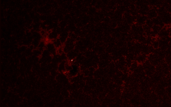
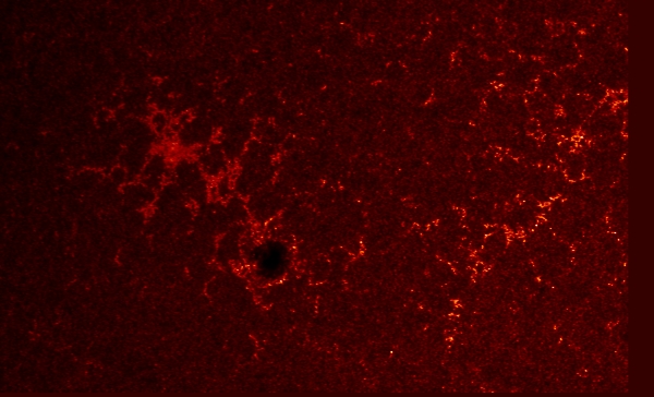
At the same moment in time the UV 1700 image is:
I was given a file that contained the 804
brightest pixels in the 1600 images. I displayed the location of these
pixels by superimposing symbols onto a 1600 image:
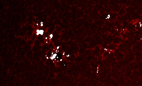
To do this I used the following commands:
tvscl,DAT1600(*,*,8)
for i=0,803 do xyouts,xx(i),yy(i),'*',/dev,align=0.5
I then looked at the time history (often referred to as a 'light
curve') of the brightest pixel of the 1600 image. This curve is the
result of plotting time against intensity.
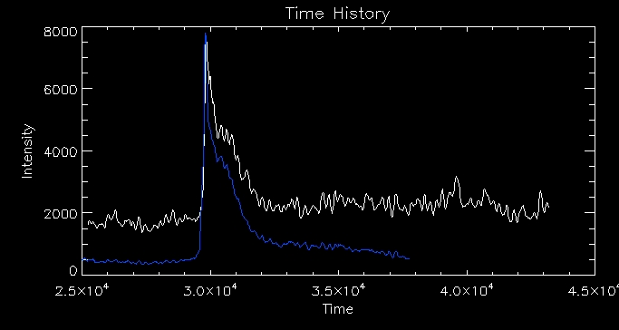
The white line represents the intensity of the
pixel in the 1700 image and the blue line represents the 1600 image.
Dates:08 June
Today
I looked through 'Highly Efficient Modelling of Dynamic Coronal Loops';
a paper by Klimchul et al. and Cargill et al. This paper looks at the
EBTEL model ("enthalpy-based thermal evolution of loops" which
accurately describes the evolution of the average temperature, pressure
and density along a coronal strand. This model is a highly efficient
"0D" model (named this as it only has one average value of temperature,
pressure and density at any given time in the simulation) which
improves significantly upon previous models of this type. Loops are
modelled as individual flux tubes or 'strands'. To understand
the EBTEL model, we must first understand the process which leads to
solar flares. Magnetic reconnection is a process which forms flare
loops
and whereby free magnetic energy is released which heats the
chromosphere forming flare ribbons. Magnetic reconnection is observable
so we can measure the magnetic reconnection rate. As I said previously
this leads to energy release. We can fit a heating function to this by
studying the observed UV light curve e.g. gaussian, triangle etc. This
causes the plasma to evolve and this is what we simulate using the
EBTEL model. Lastly, this leads to flare radiation which we can observe
and feed back into our model. The basic principle of EBTEL is to equate
enthalpy flux of evaporating or condensing plasma with any excess or
defecit in the heat flux relative to the transition region loss rate.
The EBTEL model consists of two equations governing the evolution of
electron number density and pressure:
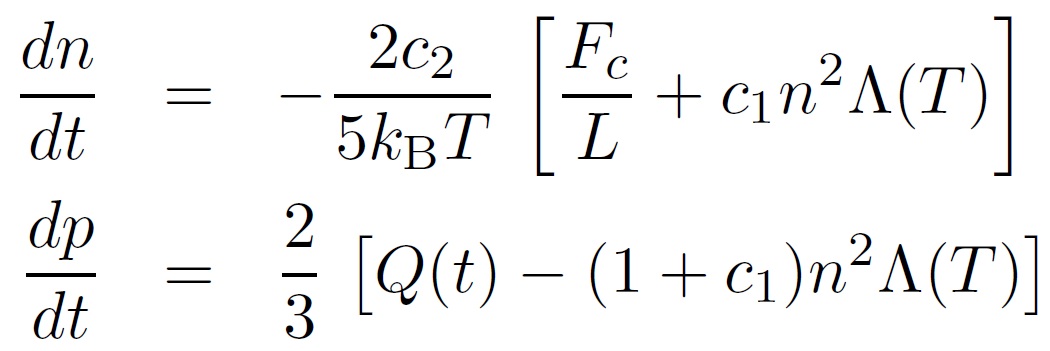
The first equation is a mass conservation
equation, and the second a thermal energy equation. Q(t) represents the
heat input and is governed by our heating function. Fc
is the
conduction flux, Λ(T) the radioactive loss function and L the half loop
length. the only free parameters are c1 which
is a constant characterising the
ratio of the total energy loss through the transition region to the
radiation loss through corona
and λ (where
Q(t)= λI). c1
has been assumed constant in the past, but the best matched constant
has been shown to be different for different loops, so evidence
suggests that it should be a variable. In my project I will
look
into the possible forms of this parameter. The main advantages of the
EBTEL model are that it provides the DEM(T) of the transition region
and can account for non-thermal electron beams and heat flux
saturation.
Dates: 12th-13th June
For the past few days
I've been looking at the IDL procedure which runs the EBTEL model.
Initially I used the default parameters in the code and
started to look at the output of temperature, density etc. of the
coronal strands. I first looked at the temperature profile of the
brightest pixel and observed that there is a sharp rise in temperature
at 140 minutes after 6UT then the temperature slowly decays.
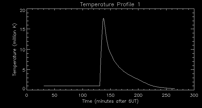
I then looked at the associated density profile:
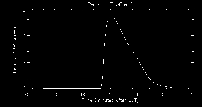
We can see that there is a time lag between the peak in temperature and
the peak in density. The rise in temperature in the coronal loop causes
thermal conducion which transfers energy to the transition region. This
heats up the transition region. The transition region must then lose
energy by radiation and other means (i.e. conducting energy further
down). When there is an imbalance between conduction from above and
loss of energy (radiation and conduction further down) there is an
upflow which carries mass into the corona. This causes the coronal loop
to become more dense as evidenced by the graph above. The peak in
density is at about 155 minutes after
6UT.
We can also look at the associated light curve for this particular
pixel.
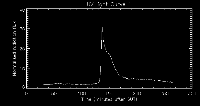
We can see a rapid rise in the radiation flux at about 140 minutes
after 6UT which only lasts a few minutes and a gradual decay lasting
tens of minutes. This agrees with the temperature and density
profiles produced. This indicates an impulsive
energy deposit in the lower atmosphere and subsequent coronal evolution.
Next I will look into how varying model input parameters affects the
output of temperature and density. I will adjust three parameters; c0
(defined as λ
previously)
which scales UV counts to energy, c1
which scales loss through the base of the coronal loop and c4
which is the ratio of beam-driven upward flux to heating flux.
Date: 14th - 15th June
Today I began to play with the parameter
values c0,
c1
and c4.
There is a built in procedure run_ebtel_new which performs a few
parameter runs taking three values of c0
and c1
([1,2,3]),
and three values of c4([0,0.4,0.7])
and loops round them. We therefore performed 21 different parameter
runs. I will select a few to display here, to show how varying the
parameters affects the dynamics of the system. The graphs
above are for the case c0
=1, c1
= 1 and c4
=
0. Let's look at how increasing c4
affects
the temperature and density by taking the case where c4
=
0.7:
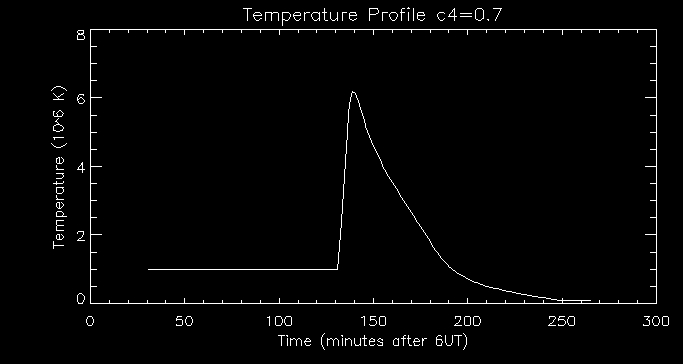
We can see that the temperature peaks at around 6M K, which is much
lower than previously. Increasing
c4
increases the ratio of beam-driven upward flux to total heating flux
which means the upflow arrives at a lower temperature as shown in the
graph.
Let's now look at the density:
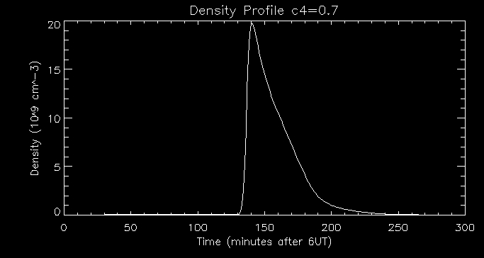
Comparing this with our previous density profile we can see that the
density peaks at a higher value here - 20 109
cm-3 . Increasing the amount of beam-driven
upward flux energises the corona by upward mass flow (evaporation of
plasma) which causes the
plasma density to reach a higher peak, as shown in the graph.
Let's now look at how varying the parameter c1
affects
the system. We can look at the temperature and density profiles side by
side for the case [1,3,0]:
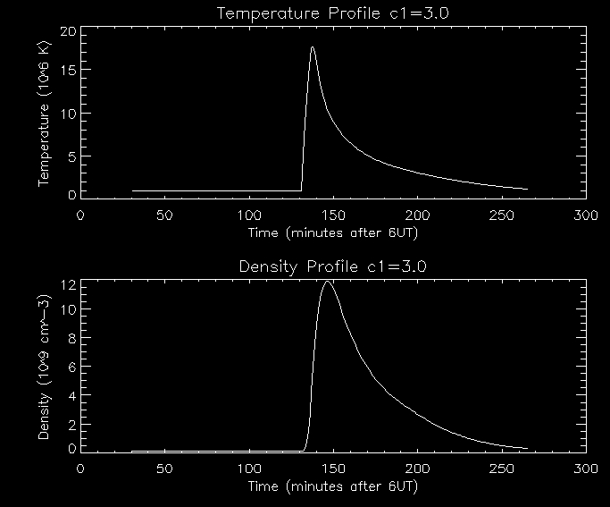
In
this example we have increased the value of c1
which increases the ratio of radiation loss through the transition
region to loss through the corona. This does not affect the flux tube
evolution so the peak
temperature remains the same. It does however affect the cooling decay
phase. There will be an increase in the downflow
(coronal
condensation)
which the flux tube to cool down more
slowly. I am not yet sure of why the flux tube cools down
more slowly. The
imbalance between conduction from above and radiation loss through the
transition region will be decreased so there will a
reduced upflow of
mass and hence a reduced peak density as illustrated by the graph above.
Lastly I will increase the value of c0,
while leaving the other two parameters as they were i.e. [3.0,1.0,0.0]:
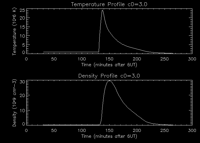
When we increase c0 we
increase the total heating flux so the temperature increases as shown
in the graph above. The density also increases with the total
heating flux increase, since when the coronal loop is at a higher
temperarure more heat will be transferred through thermal conduction,
causing a greater imbalance between conduction from above and energy
lost, producing a greater mass flow to the coronal loop. Therefore the
coronal loop will be much more dense.
I
will next look into how calculate the pressure. I modified the EBTEL
procedure so I could calculate P =2nkT, where k is the Boltzman
constant. Here is an example of a pressure profile of the brightest
pixel:
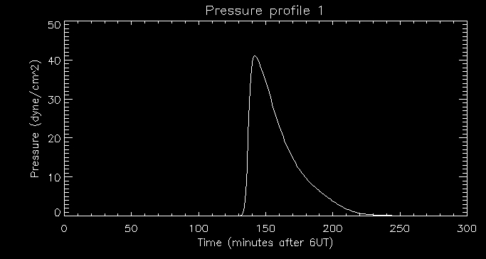
As we can see the pressure also peaks around 140 minutes after 6UT as
we would expect.
Dates: 18th June
Today I read through the most recent paper on
the model, namely 'Enthalpy Based Thermal Evolution of Loops. II.
Improvements to the Model'. This paper focuses on the c1
parameter - the ratio of the transition region (TR) to coronal
radiative losses. Two pieces of Physics are added in to develop new
models for this parameter: gravitational stratification and a
physically motivated approach to radiative cooling. By comparison with
a 1D Hydrad model and looking at each modification individually it
becomes clear that both modifications are essential. The inclusion of
gravity does not affect the TR radiation since it is driven by downward
heat flux however the coronal radiation falls due to stratification.
c1 increases as the scale height
decreases. Overall there were quantifiable improvements using the
modified EBTEL model, in particular there was a vast improvement in the
density when comparing the new and original versions.
Let's look closer at some of the mechanisms that govern the EBTEL model:
We divide the loop into coronal and TR parts with the boundary being
defined as where thermal conduction changes from a loss to a gain.
Whether the flux is into or out of the corona depends on whether the TR
is able to radiate the downward heat flux away. If it cannot
(essentially Fc > RTR
) material is evaporated into the corona through chromoshperic
evaporation (upward mass flow) hence causing the coronal density to
increase. If the downward heat flux is not enough to power the TR
radiation (Fc
< RTR)
then there is a downward enthalpy flux (coronal condensation).
Last week I was confused by the effect of increasing c1.
We can see from looking at the graphs that the corona cools down more
slowly. I asked Jiong and found out that this was because the density
of the corona had decreased which lowers the amount of coronal
radiation. The corona cannot cool down as quickly with less coronal
radiation.
Dates:19th-20th June
The
code I need to continue working with the EBTEL model has not arrived
yet so Jiong has given me a magnetogram (HMI image) so I can start to
experiment with calculating the energy release rate and magnetic
reconnection rate per unit reconnected flux. I will look at the
magnetic properties of the flaring pixels. The magnetogram only deals
with the vertical component of the magnetic field.
I first had
to coalign with the UV images (AIA data) I used in my introductory IDL
project. The images had different pixel scales so I had to use the
congrid function to rescale the HMI pixel size then I had to shift the
HMI image to align it witth the AIA image. I used the following code:
IDL>mmap=rebin(rotmag(500:1953,1900:2867),727,484)<300>(-300)
IDL>nmap=congrid(mmap,1454/2.42452,968/2.42452)
IDL>ref_uv=dat1600(*,*,50)
IDL>setpts,p,ref_uv,nmap
IDL>nnmap=shift_interp(nmap,xshift,yshift)
The
procedure setpts allows you to click on similar points in the two
images and outputs the coordinates of these points. I used these
coordinates to calculate xshift and yshift, and the function
shift_interp shifted the image to coalign it with the AIA image.
Here's the AIA (reference UV) image:
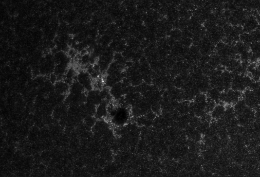
and the coaligned magnetogram:
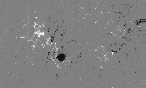
The dark shade of the magnetogram display the strong negative field and
the white illustrates a strong positive field.
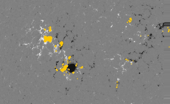
We can see the location of the flaring pixels on the magnetogram
illustrated below:
Now
I want to look into some of the magnetic properties of the flaring
pixels. I calculated the total reconnection flux of the flaring pixels;
one positive and one negative. In theory they should be identical but
because of assumptions and uncertainties I calculated a positive total
reconnection flux of 7.7288173e+20 Mx and a negative total reconnection
flux of -2.5749192e+20
Mx. Next I will calculate the energy per unit flux in all the
tubes.
Dates:21st June
Today
I began by calculating the reconnection in each flux tube (simply B*A),
and the total energy in each tube (the time integral of the heating
rate). Using these values I then managed to calculate the energy per
unit reconnection flux in each of the 600 tubes. I found values ranging
from 4.41300e8 to 8.01125e11. I then went on to try and calculate the
reconnection
rate in the entire flare region. For simplicity I made the assumption
that reconnection forming a flux tube takes place at the time when the
UV emission of each particular pixel peaks. I created an array of these
times and an array of reconnection flux measured before this time.
Using these I will go on to calculate the reconnection rate by taking
the time derivative of the reconnection flux array.
Dates:22nd June - 26th
June
Firstly
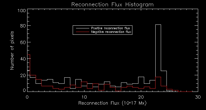
I plotted a histogram of reconnection flux (split into positive and
negative parts). As we can see from the histogram the positive and
negative reconnection fluxes follow a similar pattern.
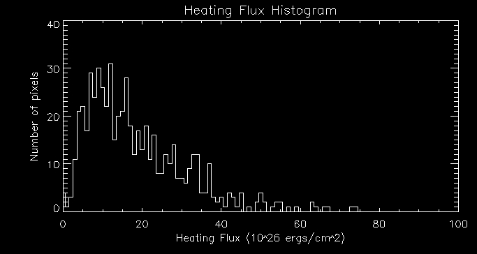
Then I plotted a histogram of heating flux:
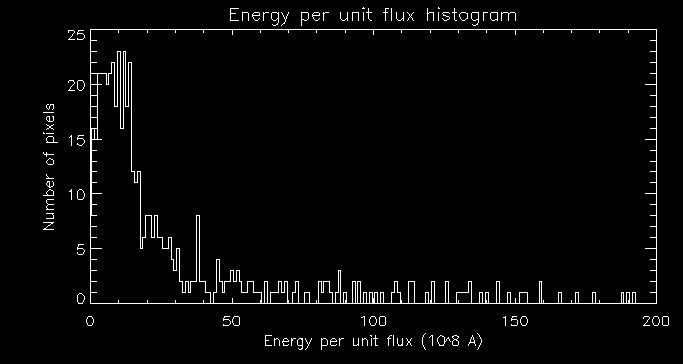
I then plotted a histogram of energy per unit flux:
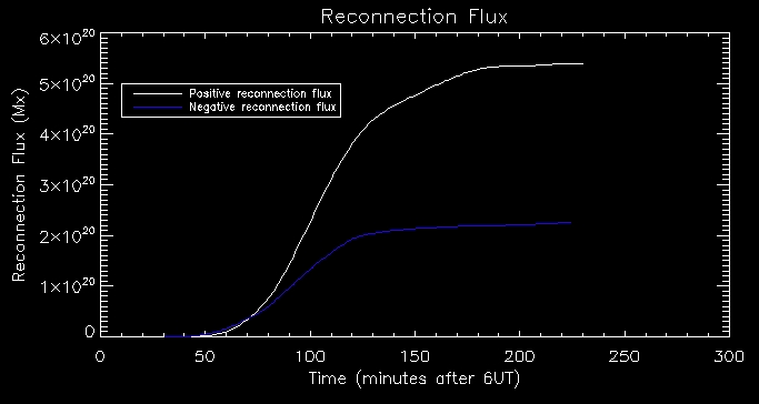
Next
I plotted reconnection flux vs time. To make this plot we make the
assumption that reconnection forming flux tube takes place at time UV
emission of that pixel peaks. The results produce a very nice plot
where positive reconnection flux and negative reconnecion flux
correlate fairly well.
Lastly,
I plotted reconnection rate vs time, where we see that the positive and
negative rates are again fairly correlated for the most part. The
reconnection rate continues for a long time backing up that new flux
tubes are still forming after the initial impulsive heating.
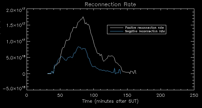
(reconnection rate measured in Mx/s - y-axis title cut off)
Date: 27th June
I will now return to looking at the ebtel model; as I said previously
the constant c1 value was unphysical. I will now
start to experiment with how best to change this value. c1
scales the loss through the transition region to coronal radiation,
which does not make sense physically. We will now try a new approach
where we say that the loss through the transition region is
proportional to the pressure, by some constant, say, c5
. To first get an estimate of this constant I produced a
scatter plot of the loss through the transition region computed using
the EBTEL model against the pressure:
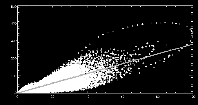
In the above scatter plot, pressure is along the
x-axis measured in dyne/cm^2 and loss through the transition region is
along the y-axis measured in 10^6 ergs/cm^2/s. From this rudimentary
approach we get an estimate for c5
of 2.79555e6.
Next,
I will try a more sophisticated approach where we take the case of
static equilibrium. We assume that conduction flux is all radiated away
by the transition region and the pressure is uniform
from the corona through to the transition region. We can deduce that
the differential emission measure, DEM, is proportional to P by some
pressure gauge scaler g(T). Using this and the definition of the DEM of
a single strand we can deduce that the loss through the transition
region is equal to P multiplied by some scalar c5
which we can approximate by the integral of the radiative loss function
multiplied by the pressure gauge scaler.
Dates: 28th-29th June
Using the more sophisticated
method we get a value fot c5 of 1.71491e7. We
can compute the loss through the transition region estimated through
each method and plot them on a scatter plot:
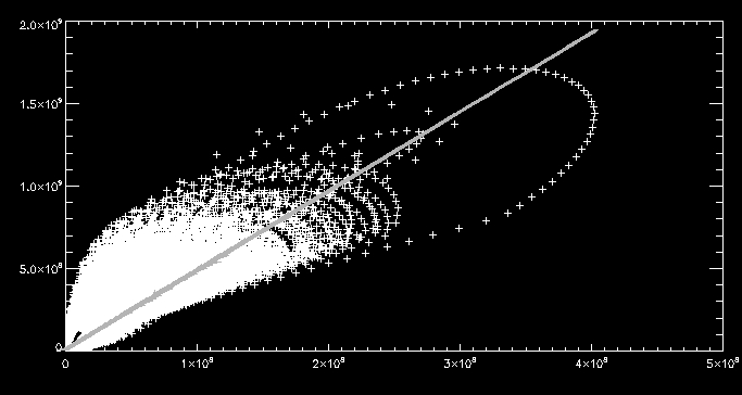
Where we have the loss through the transition region computed using the
first and second method along the x-axis and y-axis respectively. We
discover the losses are different by a factor of 4.79765. To remind
ourselves the first method is just the loss through the
transition region computed by multiplying c1
(1.4) by the coronal radiation and the second is the
integral of the radiative loss function
multiplied by the pressure gauge scaler. We can now start to
look
at how varying the loss through the transition region affects the
evolution of the plasma.
Dates: 2nd-3rd July
I
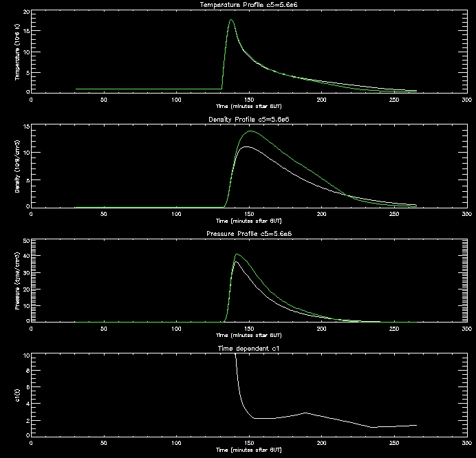
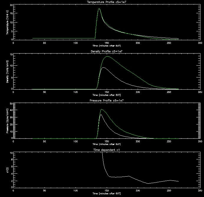
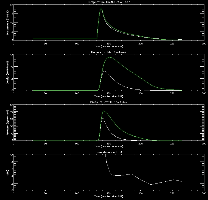
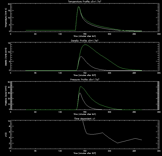
have produced some plots to display the evolution of the plasma. The
white line shows the evolution when the loss through the transition
region is scaled with pressure by different values of c5,
and the green
line depicts the evolution using c1=1.4 as
before (scaling with coronal
radiation).
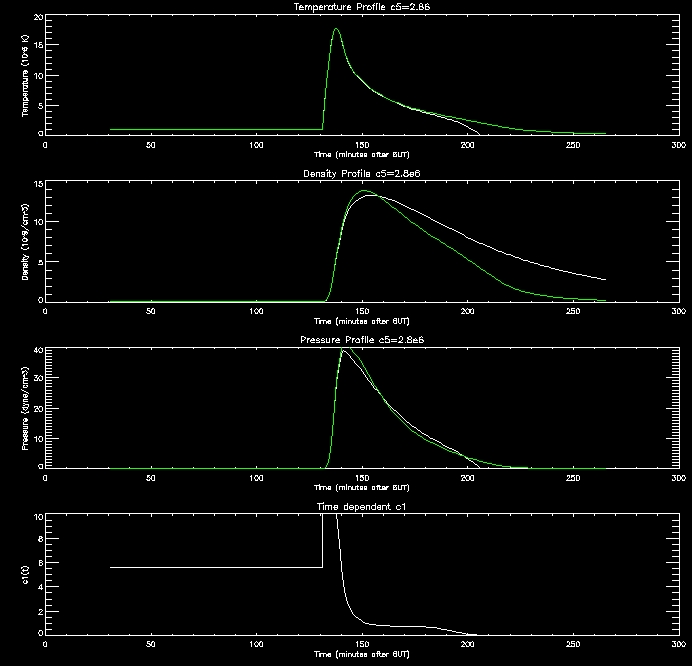
These
graphs are quite promising. as the c5 value
increases (increasing RTR)
the density in the corona drops since this creates an imbalance between
the conduction flux and loss through the TR which drives the conduction
flux lowering the density of the corona. When the corona is less
dense it cools down more slowly, as evidenced by the graphs.
Date: 5th-6th July
I
started to calculate the DEM(T) and realised that I hadn't used cgs
units for the Boltzmann constant so was getting the DEM in the wrong
order of magnitude. Having changed the pressure gauge scaler to
take this into account we get a different estimate for c5 of 2.04176e6.
I have produced some more graphs to explore this range (i.e. c5=[1e6,2e6,4e6,8e6,1e7]
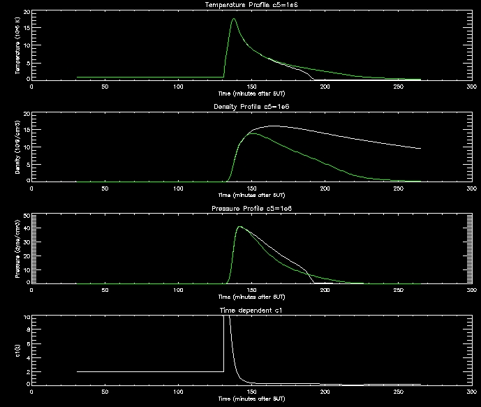
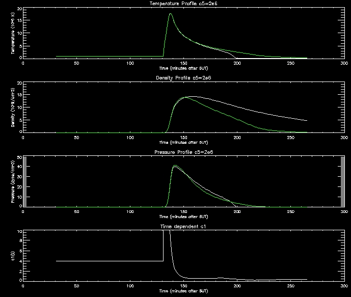
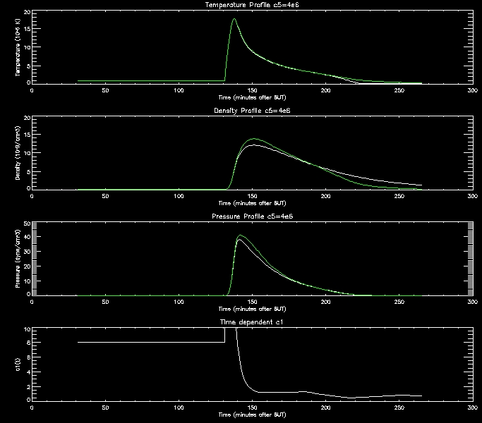
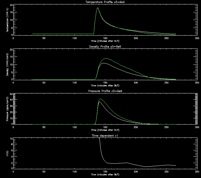
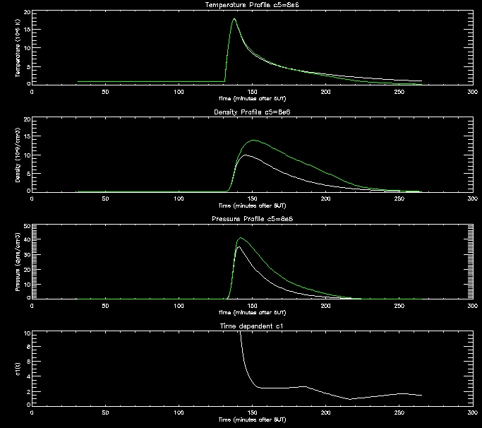

For further analysis I will continue to use thses range of values.
I also plotted the DEM against logT:
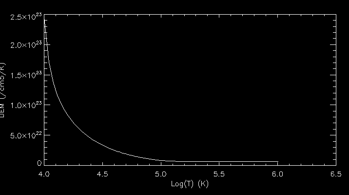
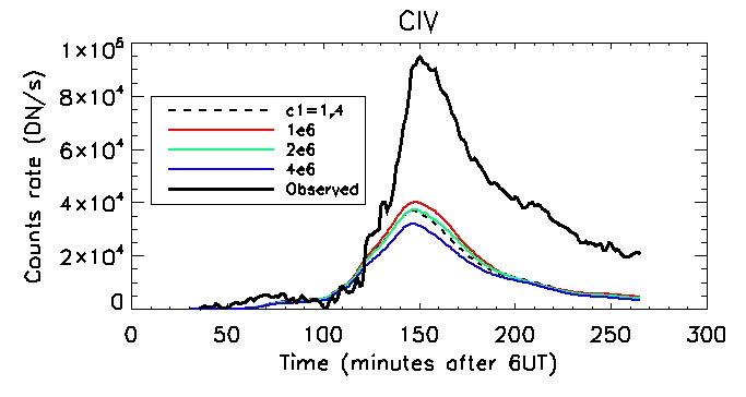
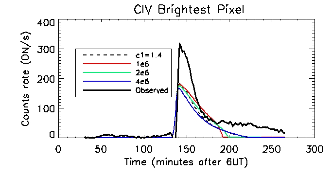
Next I computed the CIV emission for all the values of c5 and plotted them against the observed CIV emission.
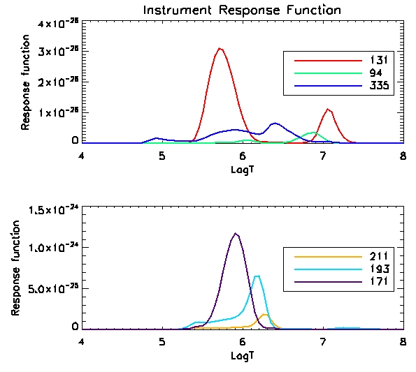
We can see the instrument response function against temperature below:
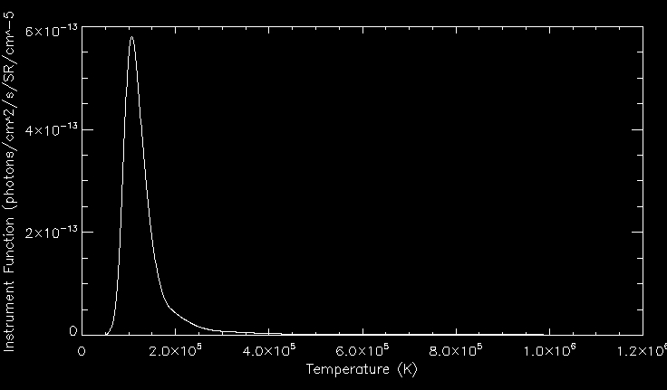
We
can see the optically thin CIV emission line forming at the transition
region temperature of 1e5 K. We calculate the computed carbon
IV line by doing the integral int C(T)DEM(T) (scaled with constants -
response functions etc).
Date: 9th July
We can see the observed civ emission is much higher than those computed using the range of c5 values.
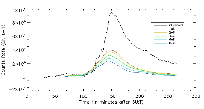
Date: 11th July
I created a few new plots for my midterm presentation:
This is the total inferred heating rate:
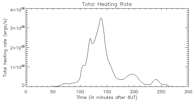
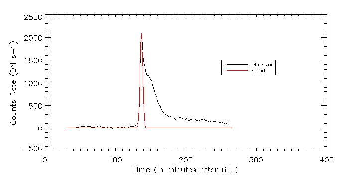
I also plotted the observed vs fitted heating function for the brightest pixel:
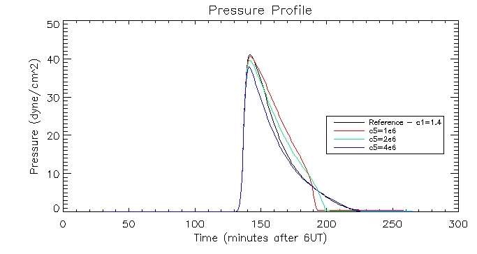
I then plotted the temperature, density and pressure profiles for varying c5 values:
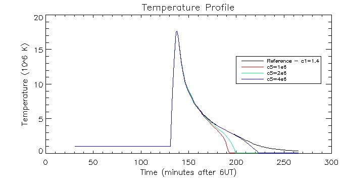
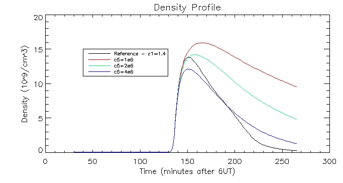
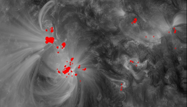
I also coaligned the AIA 171A image with our AIA 1600A image we have been using so far, plotting the flaring pixels on top:
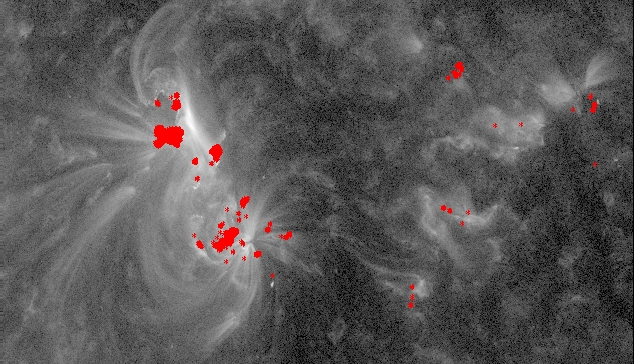
I then coaligned the AIA 131 image:
and then the AIA 211 image:
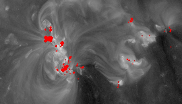
This image will allow us to compare with our model output later.
Date:16th July
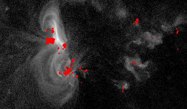
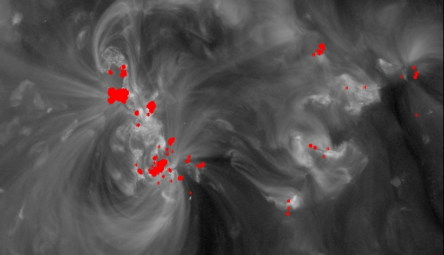
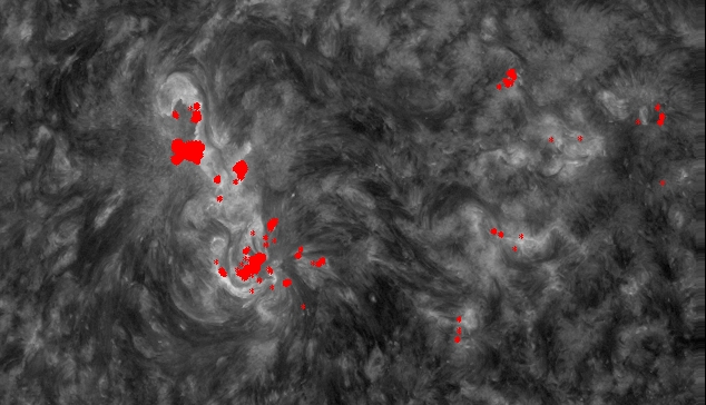
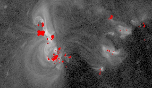
I aligned the rest of the AIA images. As before the red pixels are the flaring pixels.
The 94 image:
The 193 image:
The 304 image:
335 image:
Date: 17th July
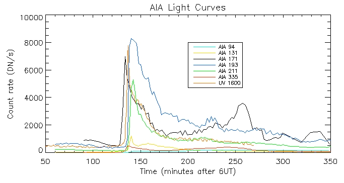
I have produced the AIA light curves for the above wavelengths. This is the light curve of the brightest pixel:
Date: 19th July
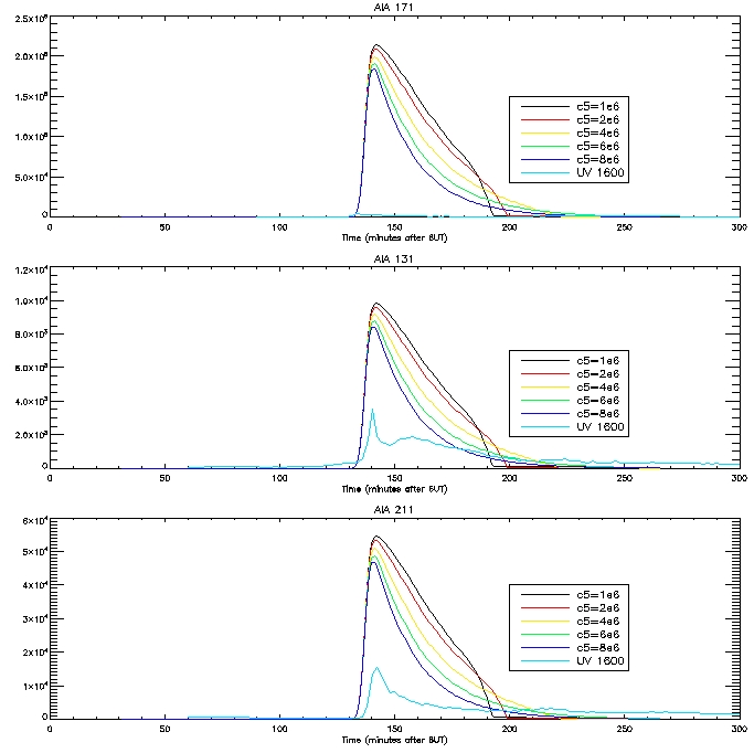
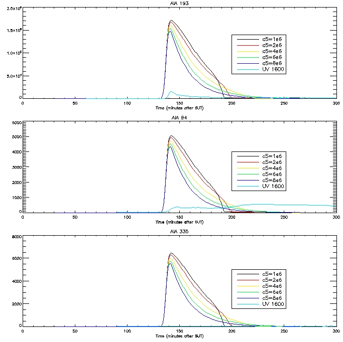
Here are the computed light curves calculated passing our DEM (g(T)*P) through our response function:
The
results are not very good, especially in the case of 171 and 335. Jiong
and I suspect that new loops are forming on the brightened footpoint
regions, leading to the second bump in the observed light curves in
some cases. The first peak is due to the loop forming which is
associated with the footpoint. We have decided that just looking at one
particular pixel is not the best approach, it is better rather to look
at a bunch of loops in a flare region.
Date: 25th July
We
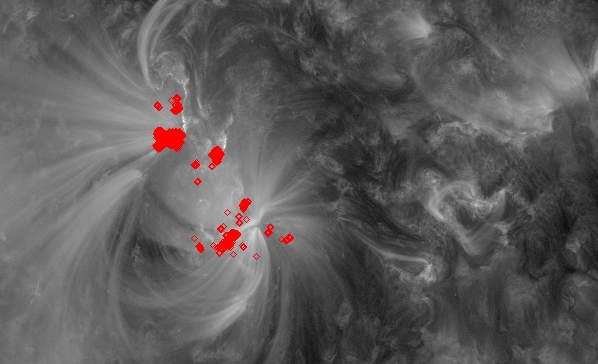
decided it was best to just look at the flaring regions in the main
part of the image and ignore all the trailing flaring regions off to
the right. So we are now only looking at 556 flux tubes. We can see an
example of this below:
Date: 26th -27th July
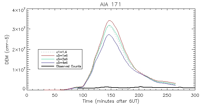
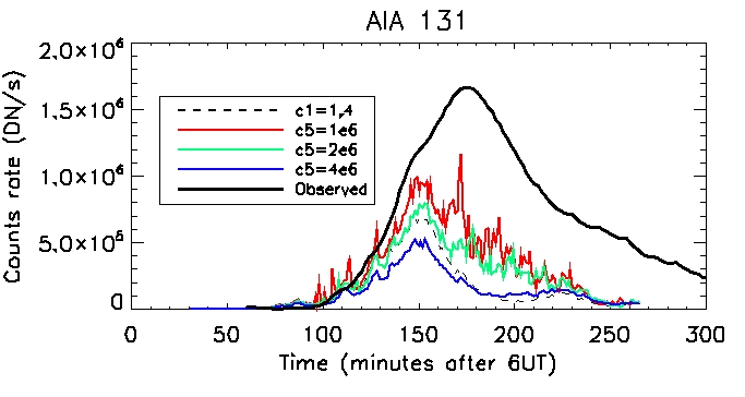
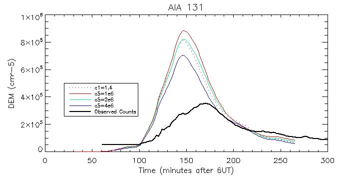
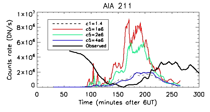
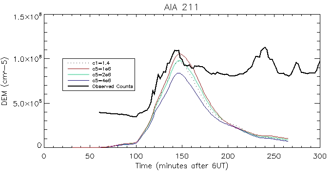
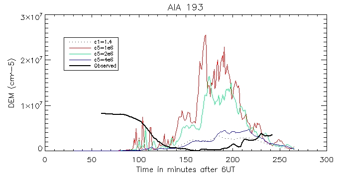
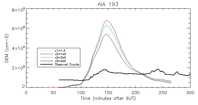
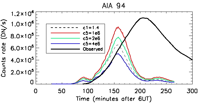
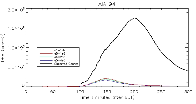
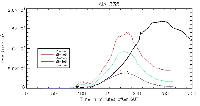
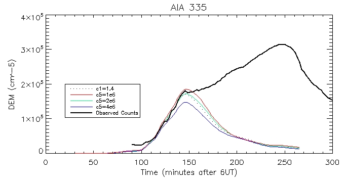
Here we have the computed DEM using the average temperatures and densities across the 556 coronal loops shown above.
I did this by summing up n^2(T)*l*R(T).
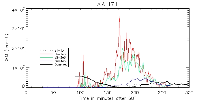
And the computed DEM using the footpoints and the pressure-gauge scaler arguement:
AIA 131: Coronal:
Footpoint:
AIA 211: Coronal:
Footpoint:
193 Coronal:
Footpoint:
94 Corona:
Footpoint:
335 Coronal:
Footpoint:
Date: 30th July
I
have started to put some graphs together for my final presentation. I
will look at the brightest pixel, and another less bright pixel.
The
temperature, density and pressure profiles I presented for my midterm
were of the brightest pixel. Here are the equivalents for the other
less bright pixel:
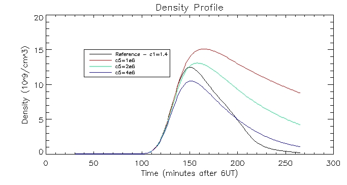
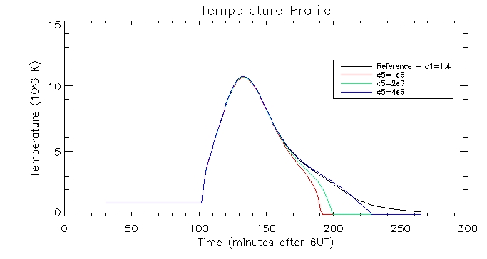
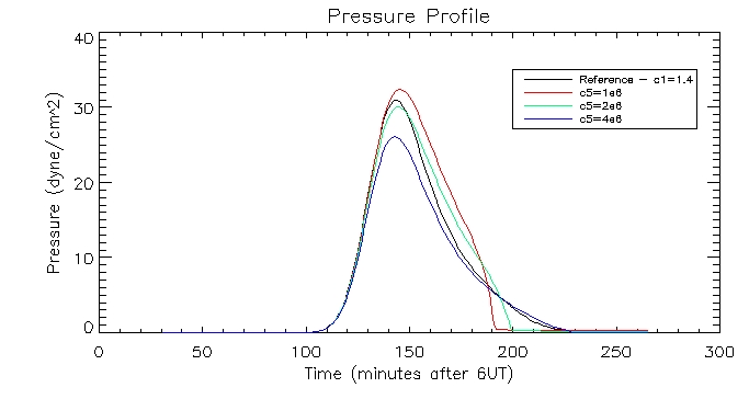
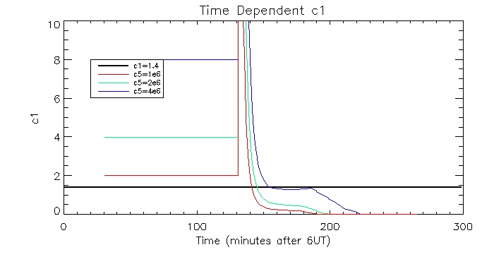
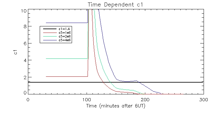
I
also plotted the time dependent c1s calculating using the pressure
gauge scaler method and plotted them against the constant c1 value.
Here is the plot of the brightest pixel:
And of another less bright pixel:
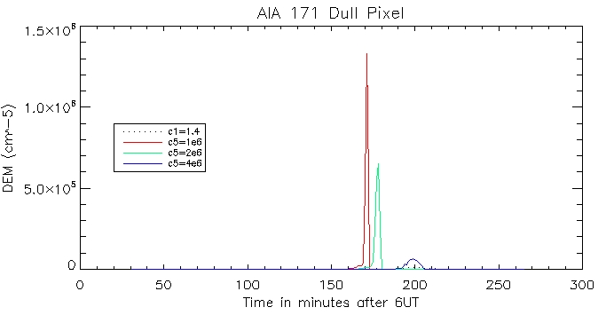
Then the calculated coronal radiation using the coronal DEM for all 6 wavelengths. Here is that of the brightest pixel:
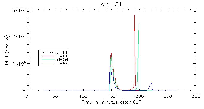
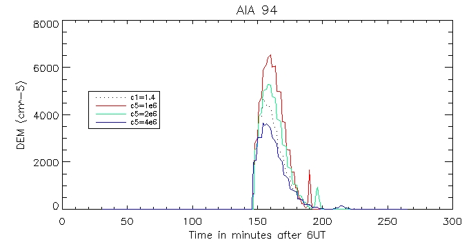
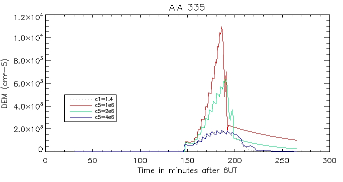
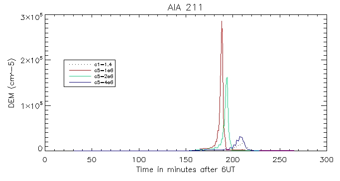
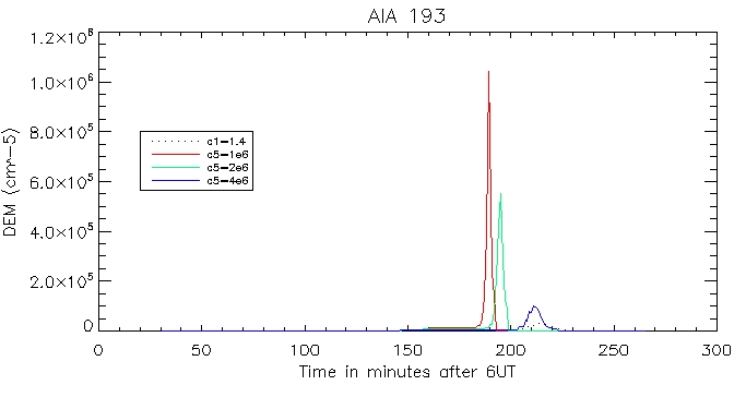
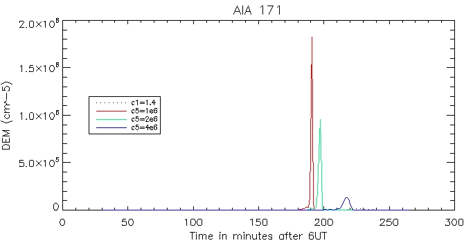
And for the other duller pixel:
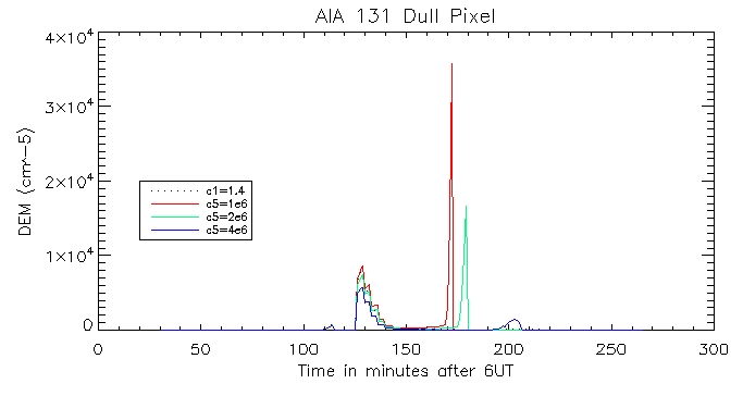
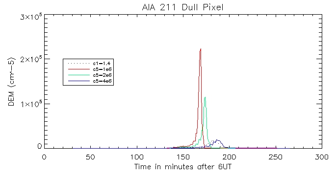
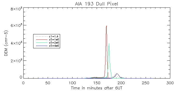
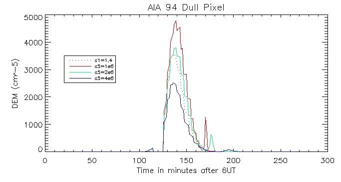
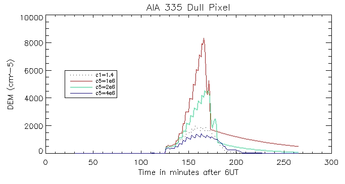
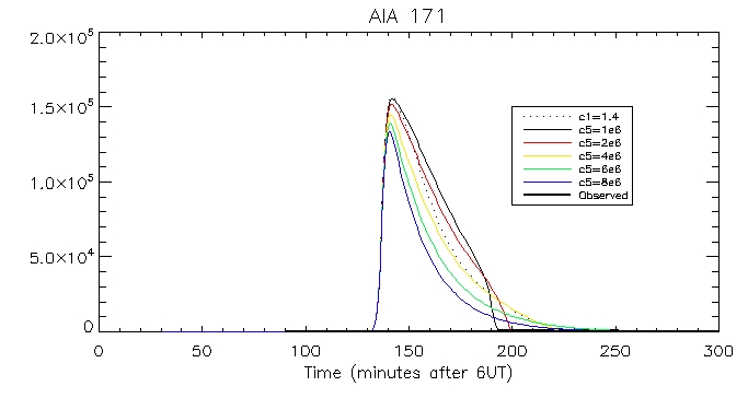
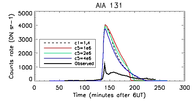
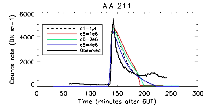
We can then look at the computed vs calculated footpoint radiation at the brightest pixel, for all 6 wavelengths.
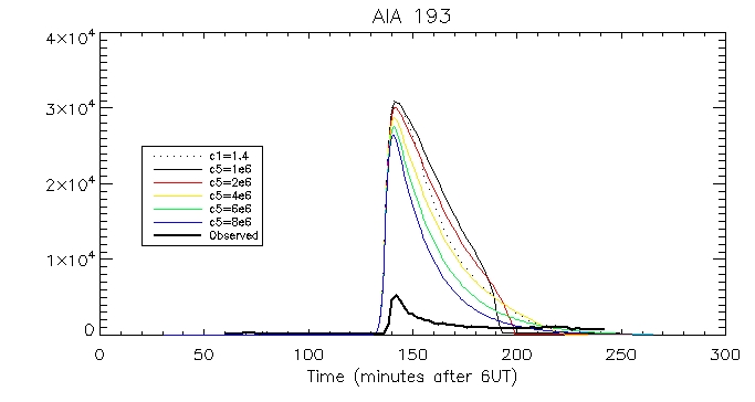
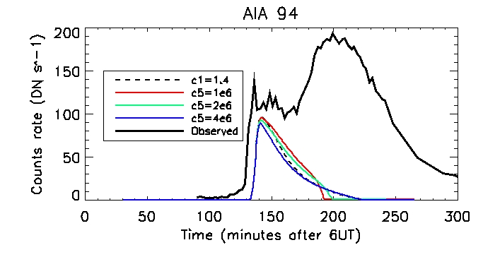
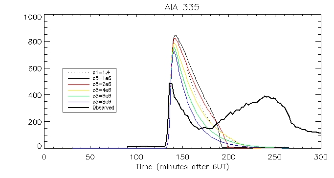
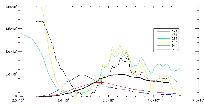
This is the observed total coronal radiation over the flare region in all different wavelengths:
Date:1st August
Today I computed carbon
4 line emission using the pressure gauge scaler method for the range of
c5 values. I calculated the DEM then passed it through the CIV
contribution function which describes the quantum mechanics of how many
CIV photons are produced at a give temperature of temperature range per
unit DEM. The units of the contribution function are
photons/cm^2/s/SR/cm^-5 (number of photons per second per unit area per
solid angle per DEM at a given temperature). We then multiply it by the
response function
8.46158e-12*0.003889/2.1. 8.46158e-12 is the solid angle of our pixel,
0.003889 converts photons to DN and is in the units cm^2DN/photon and
2.1 is a calibration factor. Through multiplying by all these constants
we get the count rate in DN/s.
And for the single brightest pixel:
Here's a plot of the different response functions:
|
|

