Week 5
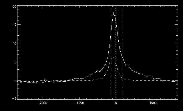
This week I continued working on the code to plot the spectra of the explosive events. I amended the plots so that the quartiles were more accurate and also overplotted the average of the whole region's spectra. Here is an example plot:
 |
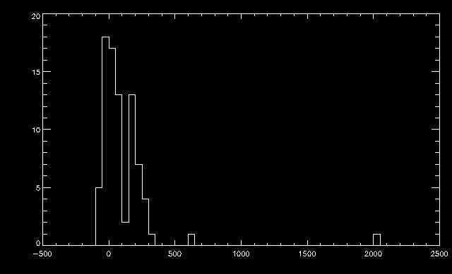
I added to my program a feature to generate histograms of the data. I used the classifications I produced earlier on (red, blue, both, compact, alternating, etc.). I made a histogram depicting the velocities of each of these categories so that we could determine whether certain characteristics are correlated with particular velocities.
 |
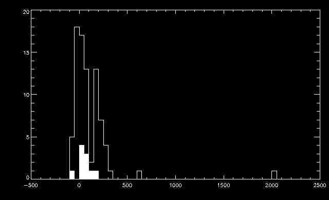
I also overplotted some of the data on top of the entire histogram to see how EEs of different classifications may relate to one another. Here is an example, where the the histogram of the spectra that were alternating is overplotted on the whole data set:
 |
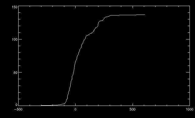
Finally, I made cumulative histograms of the different EE types. These can be used in the future to compare the distributions and determine whether they are distinct or not. This is the cumulative histogram of all of the data from both 2014-04-15 and 2014-04-16:
 |
