07.27.09
I also plotted the different UV light
curves on top of the X-Ray intensity for each pole. The first UV light
curve is where total >.5 of the max, the second is total >10% of
the med, third is mean >.5 of the max, and the fourth is
total >10% of the med. The positive pole 1 is used as an example
below:
07.23.09
I finished up the REU webpage today.
Check it out: http://solar.physics.montana.edu/home/www/reu/2009/index.html.
Masha has helped quite in bit in the automation of making
plots to analzye data. I will now give data for the poles that make up
the major contenders in magnetic reconnection.
12-25 keV:
25-50 keV:
Positive poles
12-25 keV:
25-50 keV:
Negative poles
12-25 keV:
07.20.09
I am working towards creating plots
of HXR versus UV for each of the four stages and each of the four ways
I have found to calculate the UV lightcurve. Today, I managed to create
a plot combining all four stages, but looking at the four ways to
define the UV lightcurve. I'm not yet sure if this is the way these
graphs are actually supposed to look. I have my doubts, but I shall see
tomorrow.
07.17.09
Today I was able to create a plot of
x-ray intensity for the primary pole regions involved in mangetic
reconnection (all for the 25-50 keV energy range). The positive poles
are as follows:
07.16.09
With the help of Masha and her
programming skills, I was able to create data cubes for each
energy level from the fits files taken during the evolution of the
solar flare. With these, I then produced the following graphs (12-25
keV on left, 25-50 keV on right):
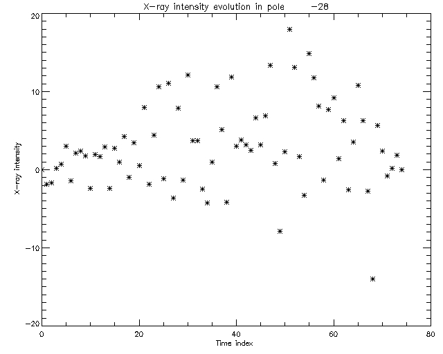
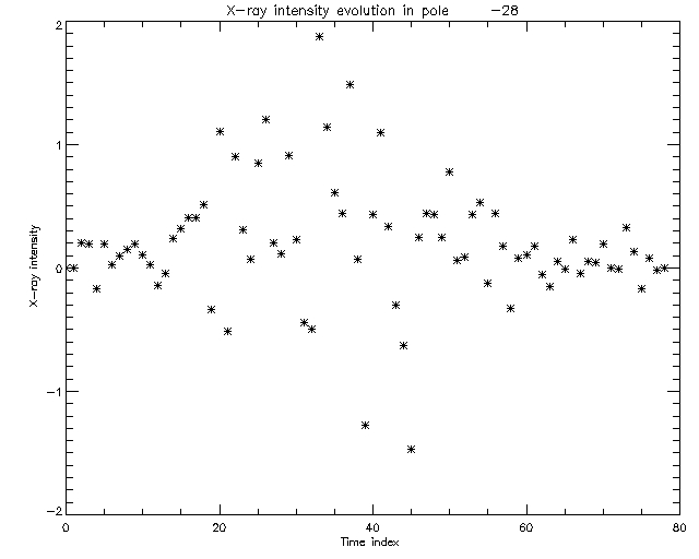
This is for cell N28. I'm working on
trying to figure out how to get this to work so I can define the cells
that actually matter (the ones directly involved in magnetic
reconnection). From there, I will be able to directly compare
X-ray versus UV.
07.13.09
I made 6 pixon images to act as
representatives for the 4 stages of the solar flare in the 25-50 keV
range. The first image represents the first stage . The second and
third image represent the second stage (rise). The fourth image
represents the third stage (peak). The fifth and sixth image represent
the fourth stage (decay).
07.09.09
Again, today I worked on making a more complete visual evolution of the
solar flare. This time, I sampled roughly 12-20 seconds each minute for
the 12-25keV energy range to continue in following the evolution. I
also sampled a few images from the 50-100 keV energy range. The 12-25
keV range:
I also completed the table for the stages of the 25-50 keV energy
range. It seems that the rise of the solar flare (stage 2) and the
decay phase (stage 4) encompass a majority of the time and data. Stage
3 is the peak of the solar flare.
|
Images |
Time |
| Stage 1
|
1-6
|
16:38:00 -- 16:39:30 |
| Stage 2
|
7-33
|
16:39:30 -- 16:42:45 |
Stage 3
|
34-41
|
16:42:45 -- 16:43:24 |
Stage 4
|
42-79
|
16:43:24 -- 16:53:12 |
07.08.09
I worked on making more images today for the 25-50 keV energy range as
a continuation of the image range on June 30.
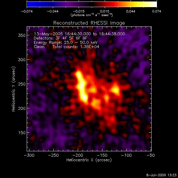 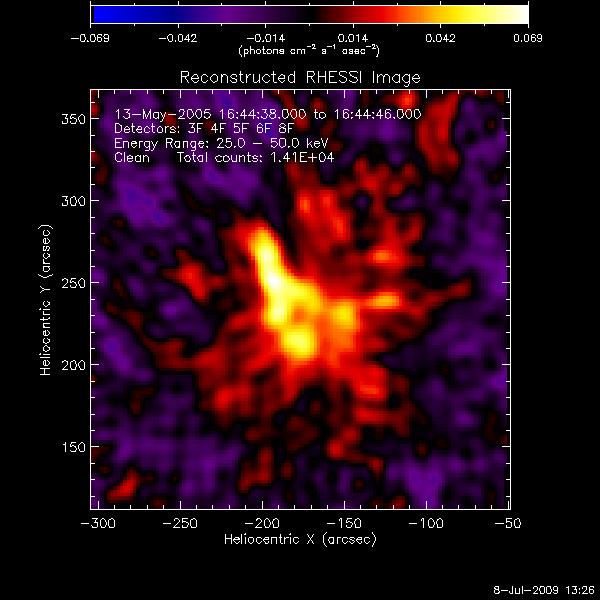 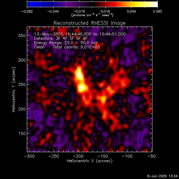 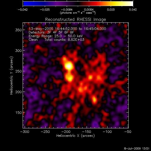 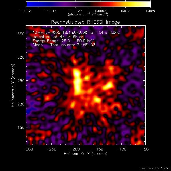 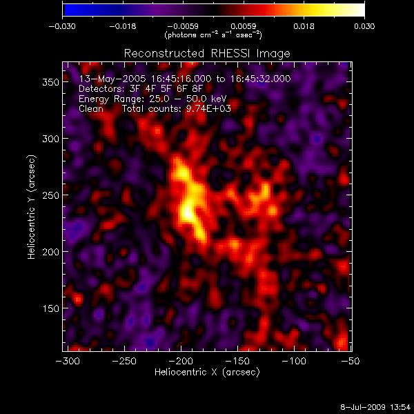 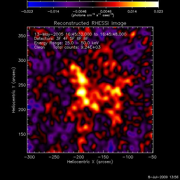 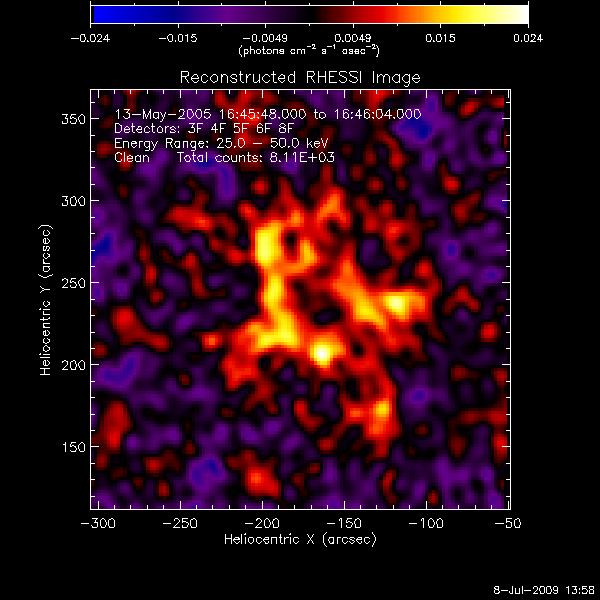 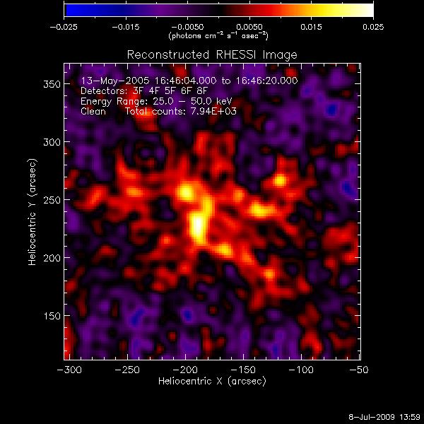 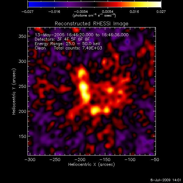 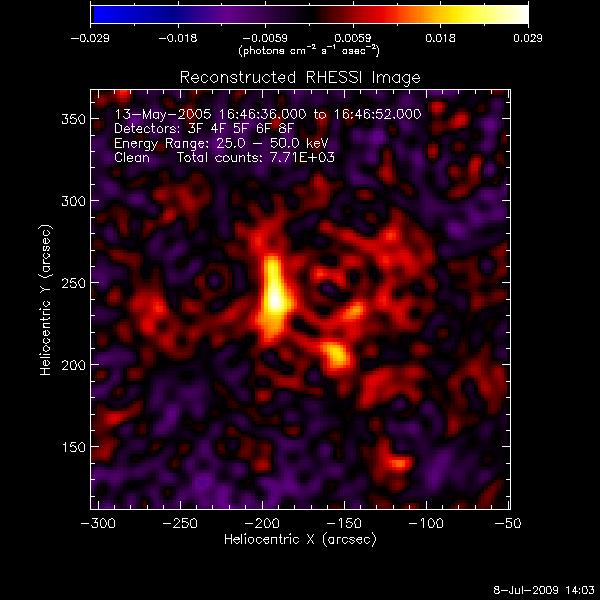
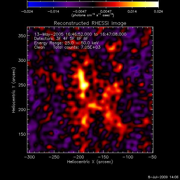 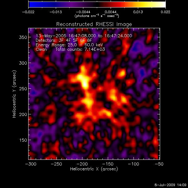 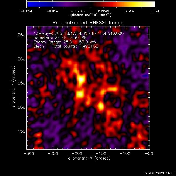 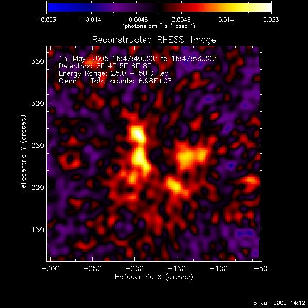 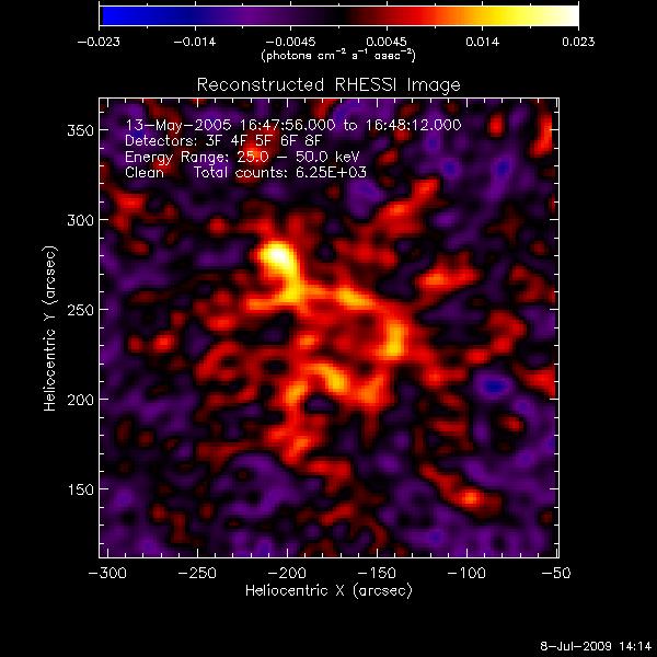 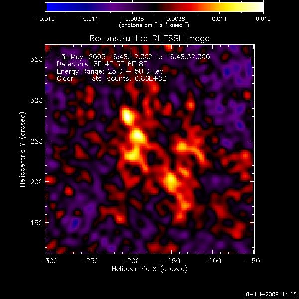 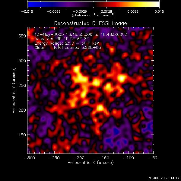 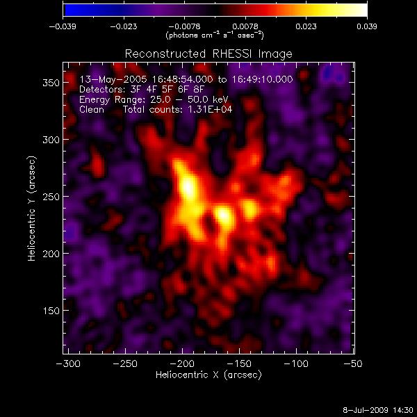 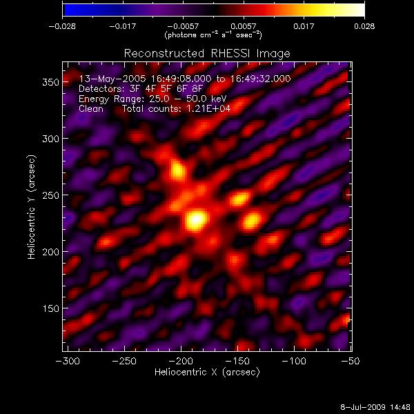 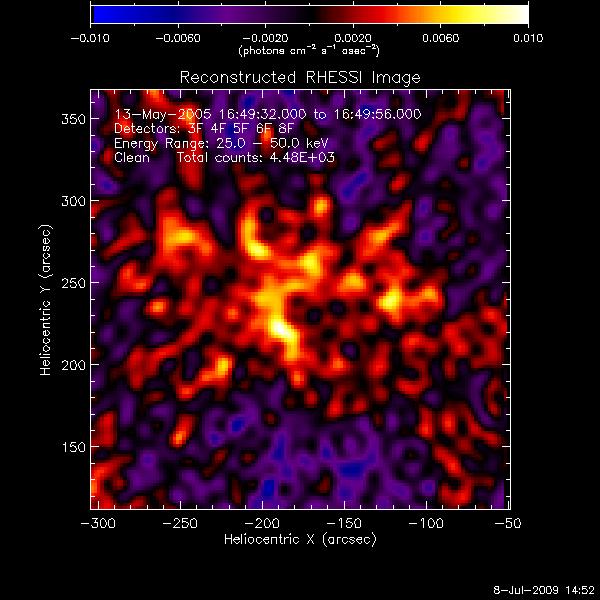 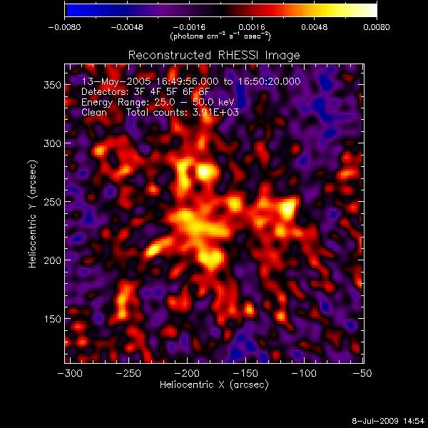
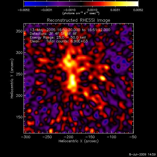 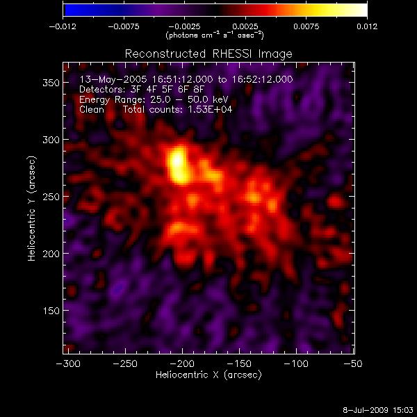 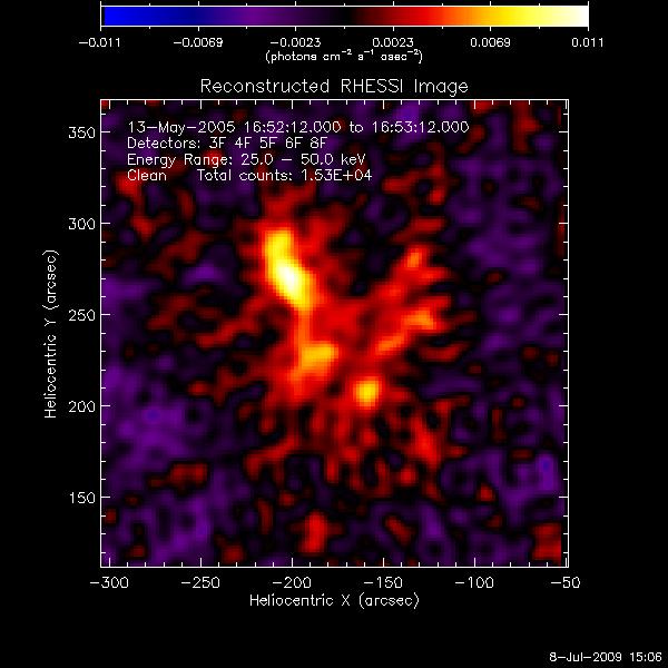
I also looked at the 25-50 KeV energy
range to sort the solar flare into stages. I did this by viewing the
contours of the images over a magnetogram and observing the flare's
progression. The stages are as follows:
|
Images |
Time |
| Stage 1
|
1-6
|
16:38:00 -- 16:39:30 |
| Stage 2
|
7-33
|
16:39:30 -- 16:42:45 |
Stage 3
|
34-41
|
16:42:45 -- 16:43:24 |
Stage 4
|
42-54
|
16:43:24 -- 16:44:30 |
06.30.09
Images, images, so many images. This time I followed the rise and peak
of the solar flare evolution through tiny time increments (aka between
5000 and 10000 counts). I'll begin with the 12-25 keV range:
06.29.09
Today I worked to include the UV light curve for each flux cell
exhibiting significant activity. There are nine active negative flux
regions (left) and four active positive flux regions (right). The 25-50
keV HXR light curve is included for comparison.
06.26.09
This morning I worked to create plots of reconnection rate for the flux
regions with significant activity. There were nine active negative flux
regions (left) and four active positive flux regions (right). The 25-50
keV HXR light curve is included for comparison.
06.25.09
I added a legend to the plot so you can actually understand what is
going on this time, instead of the plot just being a pretty image.
I also plotted the HXR contours (both
12-25 keV and 25-50 keV) onto the UV image of a solar flare to show the
evolution of the footpoints for the energy ranges involved.
Top
06.24.09
I spent the morning working on writing a program to put the 25-50 keV
HXR contour
lines on top of the magnetogram with mask. It took a good long while to
get everything to line up properly, but is not the result just charming?
06.23.09
I used the time segment from each section of the solar flare evolution
and plotted it on the light curve graph to make it easy to see which
light curve segment corresponds to the images created the previous day.
The right picture is simply a zoomed in picture of the light curve
graph.
06.22.09
I spent the morning making images for the evolution of the solar flare
for the 12-25 keV and 25-50 keV energy ranges.
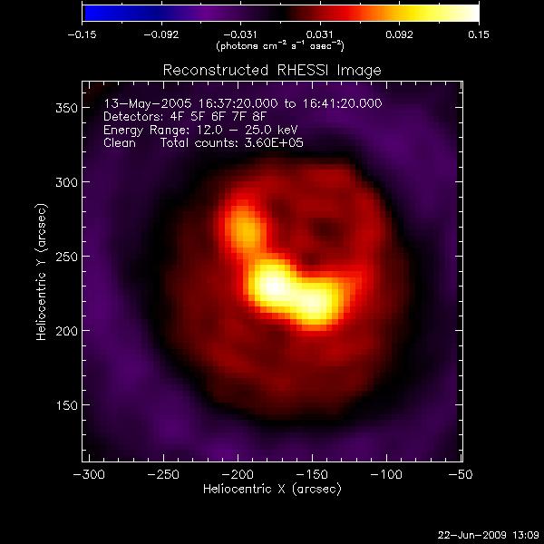 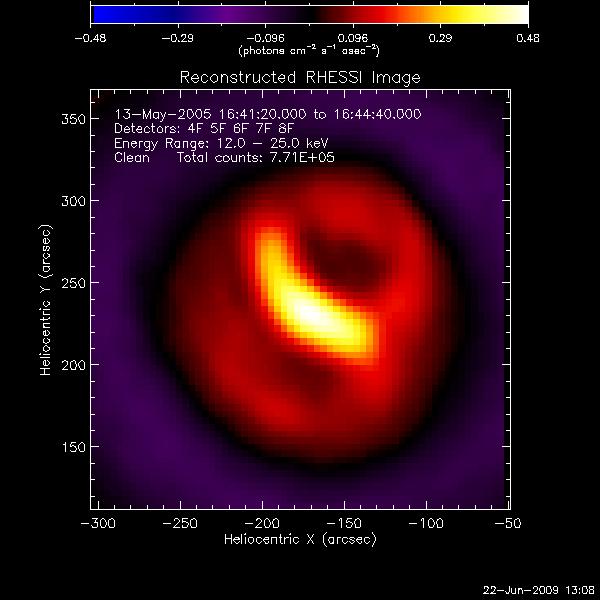 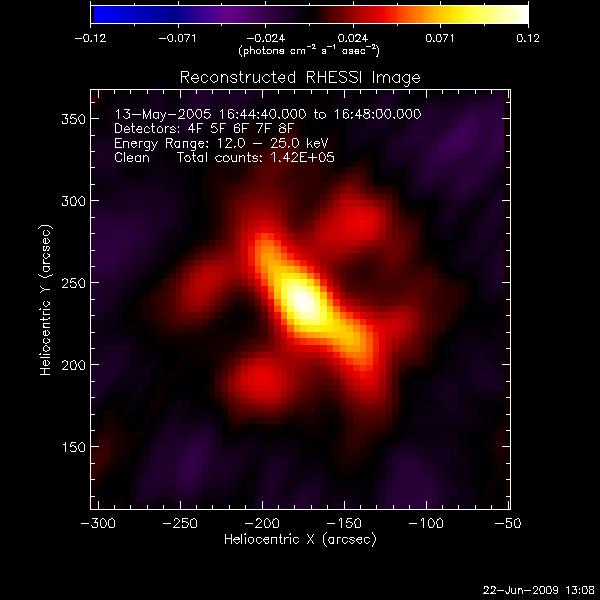
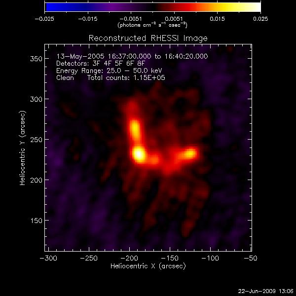 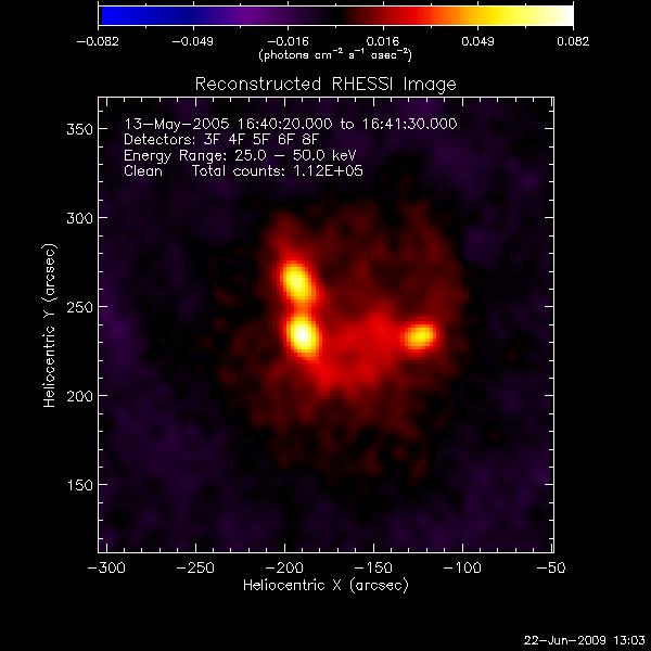 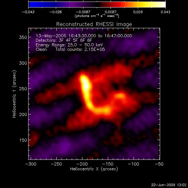
The afternoon was spent making a more
detailed image progression of the evolution of the solar flare. The
energy ranges are 12-25 keV and 25-50 keV, respectively.
06.19.09
This morning Dana Longcope gave the solar physics lecture. It was all
about understanding the interior of the sun. I found the formation of
sunspots to be the most interesting part. Afterward, I met with Jiong
to go over some of the problems I had been having this week. The
lightcurve problem now makes sense (I hadn't been scaling correctly and
needed to reverse the obs_times and obs_data) and we talked a bit about
why spectra are so important for understanding the energy involved in
solar activity.
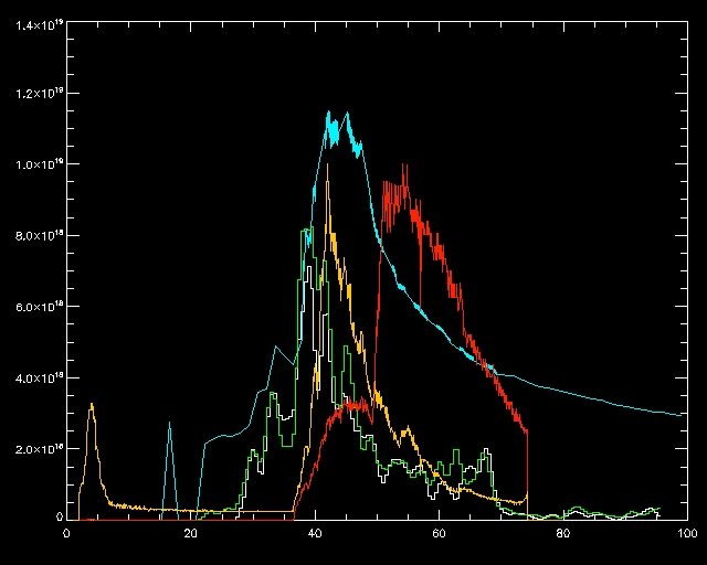
The positive and negative
reconnection rates are green and white, respectively, the UV light
curve is blue, and the red (12-25 keV) and yellow (25-50 keV) lines
represent the HXR energy ranges.
I also now understand how to get around the problems of low counts for
the imaging the evolution of the solar flare and will spend the rest of
the day working on making (hopefullly) clear images.
06.18.09
Today is the day of confusion, questions, and frustration. I have run
into roadblocks in every task I have tried to do. After a rather
unproductive morning, I talked with Angela this afternoon and I now
have a better grasp on what I need to do to accomplish for my tasks
this week. I finally managed to save a counts corrected HXR light curve
as a .sav file and was able to plot it to make proper curves. However,
when trying to combine it with the reconnection rates and UV light
curve from before, again, I ran into problems. Although I shifted the
coordinate system to make up with the reconnection rates, for some
reason the HXR is still too small to be seen properly:
The red and yellow line off to the left side represent the 12-25 keV
and 25-50 keV. For some reason, they are not scaling properly and the
time scale does not appear to match up either. I'm not sure how to fix
this, so I will put it off until I have a chance to talk it over with
Jiong tomorrow.
There are also problems in trying to capture the evolution of the solar
flare over varied energy regions. The light curve and the image are
having a bit of trouble agreeing with one another on how many counts
there are. The light curve believes there are roughly 500 at the time
of the peak, whereas the image reckons there are about 10,000, if not
more. Either I managed to break the RHESSI data or something very
curious is going on here. The PROOF that I am not crazy:
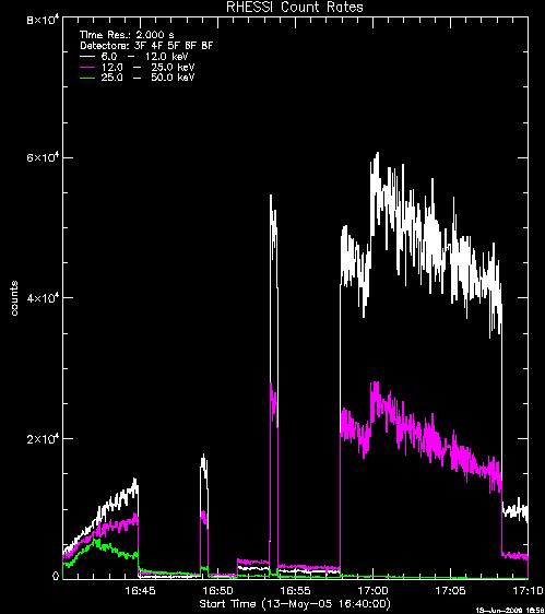
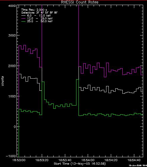
The counts for the 25-50 keV range are not enough to make an image for
the timespan directly before and for the entire time period after the
flare. The 12-25 keV range is only enough to make images after 16:58
UT. But look! The images below clearly say otherwise. The image
overestimates 8,000 counts for the 12-25 keV data range and 1,500 for
the 25-50 keV data range. The real question here is whether the image
or the light curve is telling the truth.
I feel like a detective. However, knowing this information doesn't help
my problem with imaging in the slightest. It's just a peculiar,
troublesome feature. Oh, joy.
06.17.09
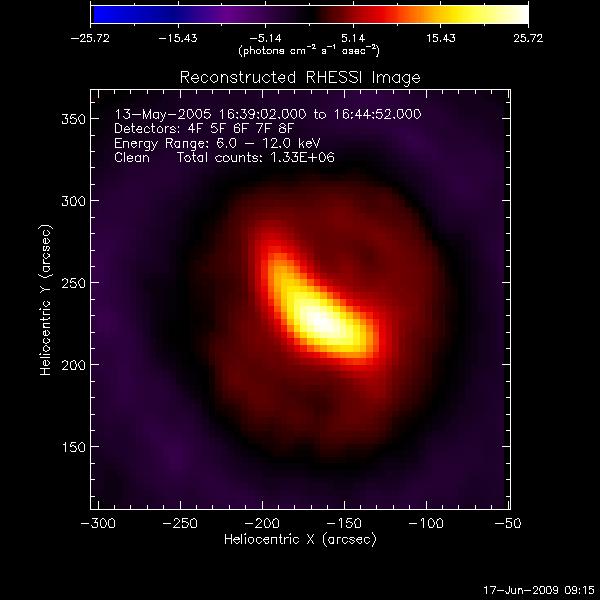
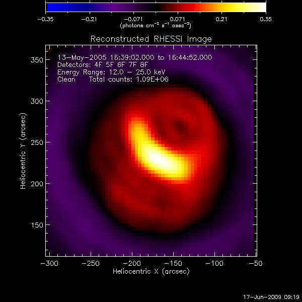
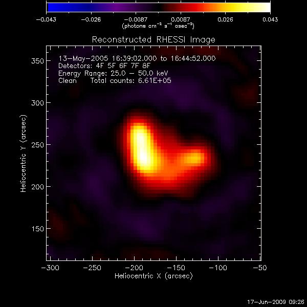
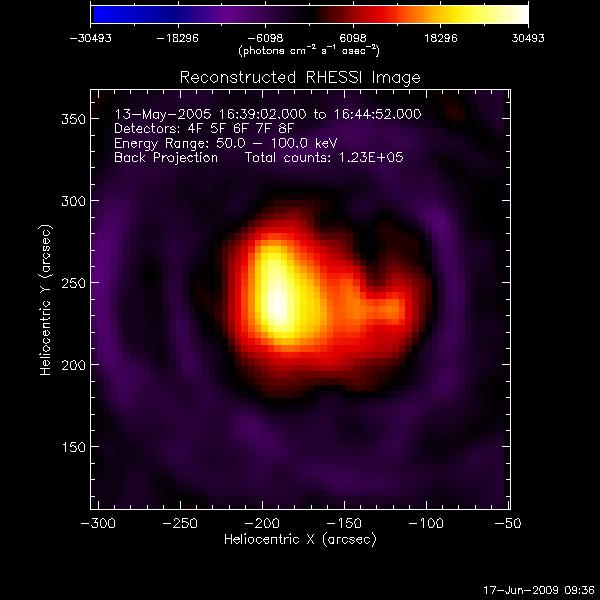
I re-made images of the solar flare for multiple energy ranges because
you can barely tell where the peak was in the first batch. The ranges are as follows, from left to
right: 6-12, 12-25, 25-50, 50-100
keV.
I also tried again to find the counts corrected light curve.
Apparently, the counts corrected button just needs to be selected. I
guess I thought it would be more complicated than simply clicking a
button.
06.16.09
I found images of the solar flare for multiple energy ranges. The
ranges are as follows, from left to right: 6-12, 12-25, 25-50, 50-100
keV. It is best to have a few thousand counts per image (these produce
the clearest and most accurate images). However, there are only a
thousand counts for the 25-50 keV image and much less for the 50-100
keV image, making both of these images fairly inaccurate and
meaningless because the details of the image are not present. The 12-25
keV image provides the clearest image of the footprints of the solar
flare.
06.15.09
I finally got the RHESSI data to work on my computer. Apparently I
needed to delete some programs from my .cshrc file, because it was
confusing commands between the programs. At least it works! I messed
around with the GUI interface and did a couple tutorials. Here are the
results of my messing around:
This is a clean image of the May 13,
2005 solar flare. The yellow arc across the image represents the
position of the sun's limb. The image itself seems to be fairly
meaningless (there are no significant flare footprints or sources of
information), but at least it looks pretty.
Secondly, I created a light curve for the energy ranges between 6 keV
and 300 keV. The curve itself does not have abrupt peaks and dips as it
would appear. The attenuators affect how large the curve appears
depending on whether a filter is turned on or off. The curve is fairly
smooth, in reality.
Once I understood the basics in creating plots and saving files, I
began to work on the first goal assigned to me by Jiong. This involves
deriving counts-corrected light curves in a few energies - at least two
energies, one below 25 keV, and the other above 25 keV and figuring out
from GUI how to save the data for the light curve, as well as restore
and display it in a general IDL window:
Then, as an end result, I am supposed to plot the RHESSI HXR light
curves together with the reconnection rates and UV light curve I found
earlier. This part is proving the most difficult.
06.12.09
By isolating the region of the solar flare, I am best able to analyze
the ribbon speed in multiple directions. The negative ribbon speed is
on the left and the positive ribbon speed is on the right:
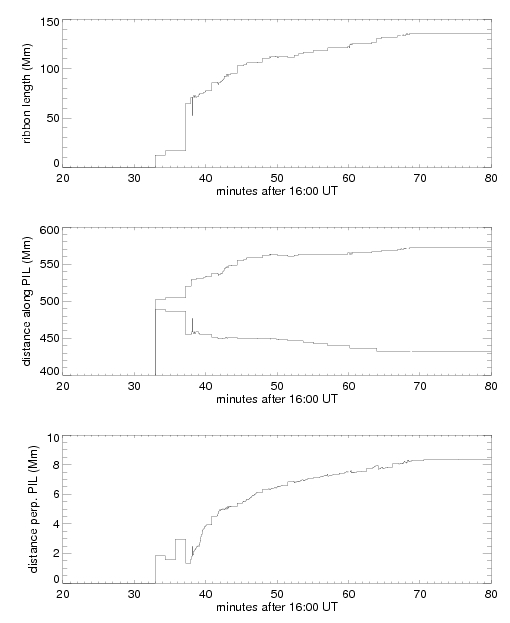
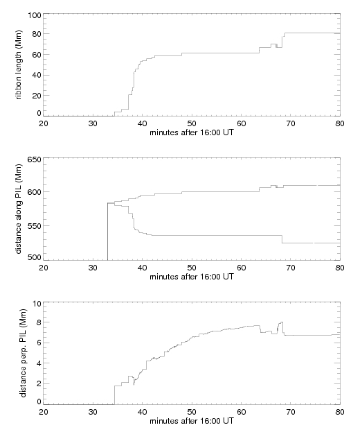
The most curious result from this is that the ribbon speed grows much
faster in one direction than the other. In fact, the difference is
approximately 70 km/s faster. Jiong explained that this is just another
unknown in the field of solar physics. From today onwards, I will be
working with hard x-rays instead of UV light. The goal for the rest of
today is to familiarize myself with RHESSI and the GUI interface.
06.11.09
This morning we had a lecture on the instrumentation involved in
looking at the sun and examining the sun in various wavelengths
(Visible, FUV, EUV, Soft X-ray, Hard X-ray, Gamma Ray, etc). I had no
idea how difficult it is to view the sun in any wavelength besides
visible. As the filters are increased, the efficiency of the detector
goes down--much more than I expected it to. I also finally learned how
CCD cameras operate, which was really interesting in and of itself.
Afterward, I met with Jiong to work with the program to find out the
magnetic reconnection ribbon speed. I had to re-find the PIL line (I
didn't extend the line far enough the first time). I think it turned
out fairly smooth, but, when trying to fit a line to it, the
polynomials seem to disagree with me and don't provide the nicest fit:
06.10.09
There is a linear
correlation between the observed and modeled reconnection flux:
The observed data is off by approximately 30%. This is because the data
is observed at the top of the chromosphere, whereas the data is modeled
from the photosphere. Thus, because the observed data is taken higher
in the sun than the modeled, it has a lower reconnection flux. I also
determined the PIL (polarity inversion
line) of the magnetogram. This is essentially the line dividing the
positive and negative flux regions. From here, I am working on
debugging the program to find the ribbon speed of the magnetic
reconnection.
06.09.09
This morning we
started the first of many solar physics
lectures. Today's lecture gave a background of the sun, including
topics like hydrostatic equilibrium and quantum tunneling. Afterwards,
I spent some time with Jiong discussing where my project was going and
what the next steps to take would be. The next task is to find the
reconnection sequence of the solar flare. To do this, I first plotted
the reconnection flux of each positive and negative flux region in
relation to time (top graph):
I
then identified the 6 distinct stages of the solar flare to find which
flux regions were going through magnetic reconnection at a particular
point in time. This table
can be seen below:
Episodes
(min after 16 UT)
|
25-31
|
31-34
|
34-42
|
42-55
|
55-64
|
64-72
|
Correlation
Pairs
|
P3
|
P4
|
P4
|
P4
|
P3
|
P4
|
|
P1
|
P3
|
P3
|
P3
|
P1
|
P1
|
|
N10
|
P1
|
P2
|
P2
|
N3
|
N4
|
|
N5
|
N18
|
P1
|
P1
|
N2
|
N3
|
|
N2
|
N5
|
N10
|
N18
|
|
|
|
|
N2
|
N8
|
N10
|
|
|
|
|
N1
|
N5
|
N8
|
|
|
|
|
|
N4
|
N5
|
|
|
|
|
|
N3
|
N4
|
|
|
|
|
|
N2
|
N3
|
|
|
|
|
|
N1
|
N2
|
|
|
|
|
|
|
N1
|
|
|
I also spent a long while trying to
make a scatter plot of the observed and modeled reconnection flux to
see if they have a linear correlation. I keep stumbling into
roadblocks, so I'll try to finish this up tomorrow morning and
hopefully I'll have better luck.
06.08.09
I
spent some time reading up on the Encyclopedia of the Sun for our
lectures tomorrow. I had no idea the corona extended past the solar
system. There is still so much to learn. I also plotted the UV light
curve
from my IDL project together with the reconnection rate to see the
correlation, if any:
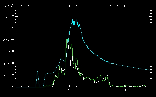
There
is a correlation between the light curve and the reconnection rates.
The two peaks of the light curve (blue line) match up with two peaks on
the reconnection rate (green line). From here, I was going to look back
at the positive and negative flux regions to see if I could find the
order in which the regions experienced magnetic reconnection. This can
be done by looking at the overall flux and each individual regions
flux. When a particular feature of the individual flux region matches
up with the overall flux, it can be inferred that the particular flux
region was experiencing magnetic reconnection at that moment in time.
From there, the rest of the flux regions can be examined for magnetic
reconnection at the same instant. Thus, the flux regions can be matched
up in the order they experience magnetic reconnection.
The program files I
was trying to use to do this were experiencing
problems, so I couldn't plot anything meaningful today. Tomorrow, I
should have better luck.
06.05.09
This
morning I gave
my IDL presentation and met with Jiong to go over how to find
reconnection flux and reconnection rates. The reconnection flux is the
flux during magnetic reconnection. The magnitude is about 10^21 Mx. The
reconnection flux can only increase because it is the flux of the solar
flare over time--it doesn't make sense for it to decrease:
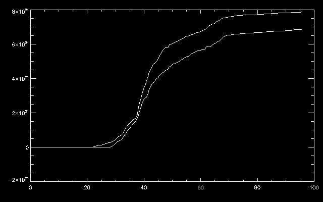
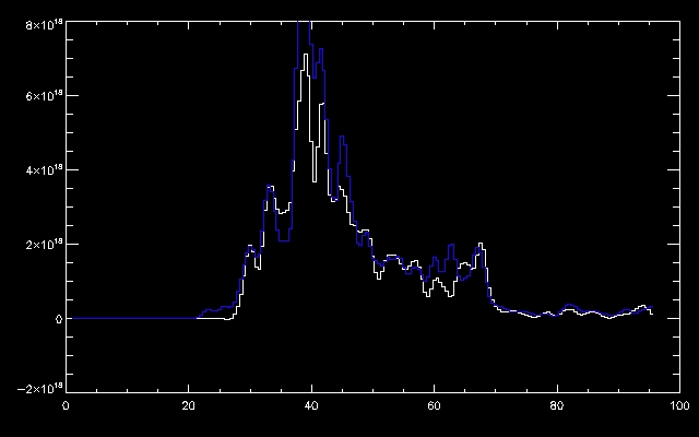
The
reconnection rate is the derivative of the reconnection flux with
respect to
time. It is on a magnitude of about 10^18 Mx/s:
After
lunch, the Solar Flare Group (Meghan, William, Theresa, and our
respective advisors) met for the first time to go over our progress
this
week and to answer any questions we may have. I had magnetic
reconnection explained to me in a different way and it made more sense
the second time around. Here it goes:
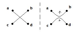
The
lowest energy
for the magnetic field lines is to be directly connected to the one
across from it (left side) and the highest energy is when the lines are
when the lines are bent (right side)--you can also think of this like a
rubber band. The magnetic field lines bend accordingly to follow the
rest of the lines. I realize this probably makes sense to absolutely no
one but myself. I'm working on it. I also plotted the brightness of the
magnetic flux regions (P1, P2, N1, N2, etc) of the magnetogram as the
solar flare progresses over time. The challenge was to figure out what
ntim to set to get the most balanced brightness progress (aka, not all
black color); the most balanced graph was when ntim=300. It's a little
bit hard to read, but the top plot shows the flux regions on the
magnetogram, and the bottom plot shows the brightness of the solar
flare over time:
06.04.09
I
worked on finishing up my IDL project by creating a light curve and
mapping the bright pixels of
the May 13, 2005 solar flare (10759) to the magnetogram.
The light curve can be seen below:
The
small commands
in IDL keep tripping me up, like how to open
multiple plot windows at once, or scaling graphs to be legible. These
tasks seem like they should be easy and intuitive, but they're not.
Well, not yet, anyway. Jiong also gave me a paper to read up on,
explaining
two-ribbon flares. Interesting things to note:
-
Solar flares are
composed of two magnetic regions, one positive and the other negative.
Both the positive and negative regions are composed of "flux cells" of
varied flux and size. Each positive flux cell corresponds to a negative
flux cell. However, the flux cells do not necessarily connect to the
nearest corresponding flux cell. The negative flux cell can connect to
any positive cell regardless of location, making the magnetic field
lines between these cells twisted and entangled. These connections can
change at any time. Hence, magnetic reconnection in all its messy glory.
-The
most accepted model for a solar flare is CSHKP model:
06.03.09
I
spent a good
portion of the day writing up some code for our IDL projects due for
Friday. I'm creating a "light curve" of the image of a solar flare. To
do this, I need to find the median values of the 406 images of the
flare, and the number of pixels with counts 10 times larger than the
median for each of the 406 images. From here, the sum of the brightness
of the pixels can be plotted against time to make the Light Curve of
Awesome. Then, I've got to transfer this to a magnetogram and find the
reconnection flux, but that's for another day. Like tomorrow.
|


