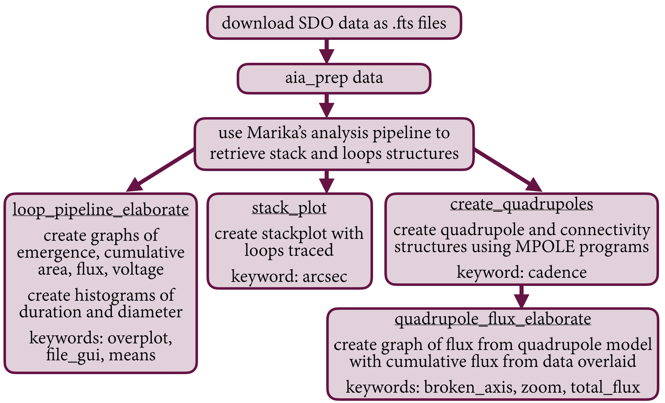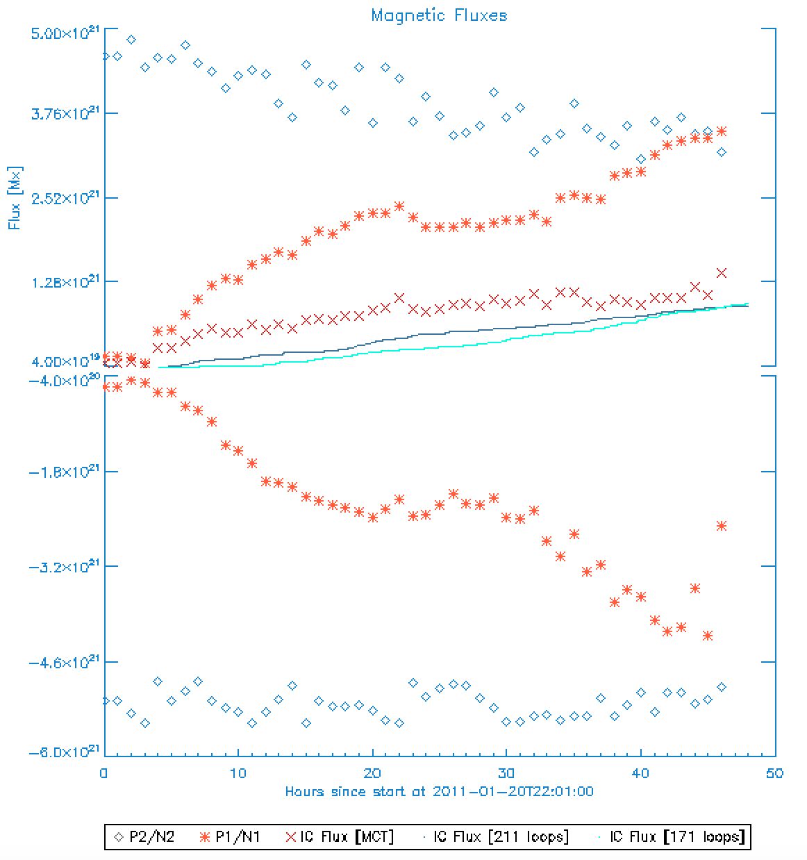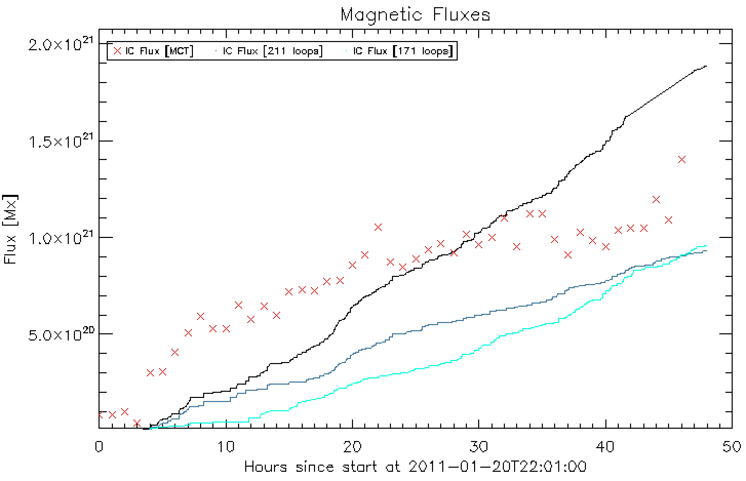
The final presentation for the REU was on Wednesday. Prior to the presentation, I worked on refining my codes for the magnetic flux plots, adding the keywords BROKEN_AXIS and TOTAL_FLUX to create plots that displayed the data better (BROKEN_AXIS) and allowed two different wavelengths of flux to be summed together (TOTAL_FLUX). Summing the fluxes was not entirely trivial as the different wavelengths of data had different cadences across the same time span. My code takes anything within 35 seconds to be the same time, and adds those values. I also worked on the ZOOM keyword from week 9 to better compare interconnecting flux in different wavelengths with the quadrupole model.
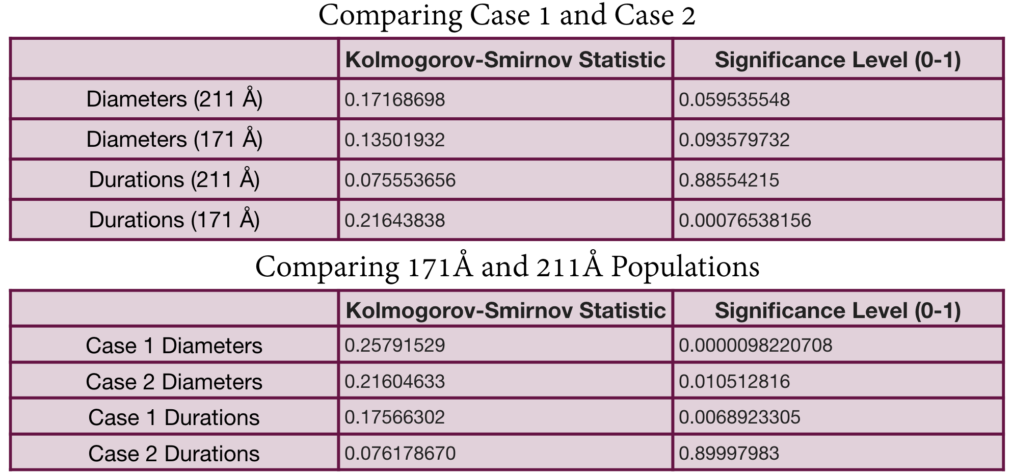
I performed the Kolmogorov-Smirnov two sample test to see whether case 1 and case 2 diameters/durations were from different underlying populations. After the final presentation, I worked on creating a technical report to describe my programs and the work I did this summer. This document is now included on my homepage. I had an unforgettable experience at MSU this summer. I hope this website has been an informative look at my work this summer; please feel free to contact me with any questions you may have.
