Friday,
June 25
|
|
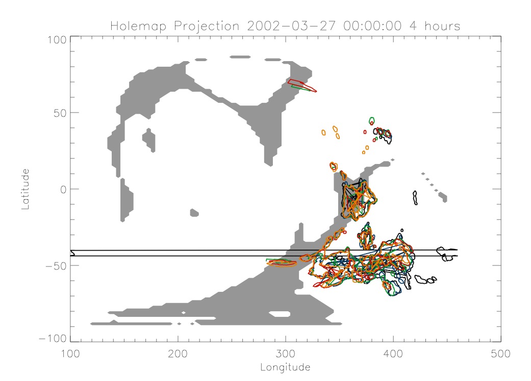
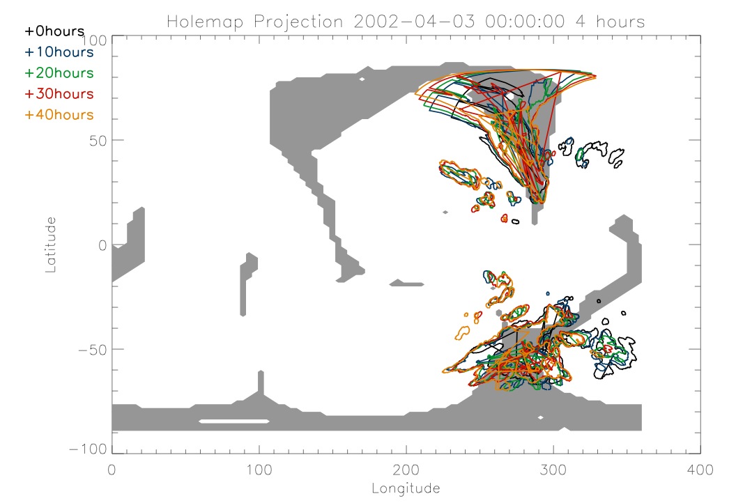
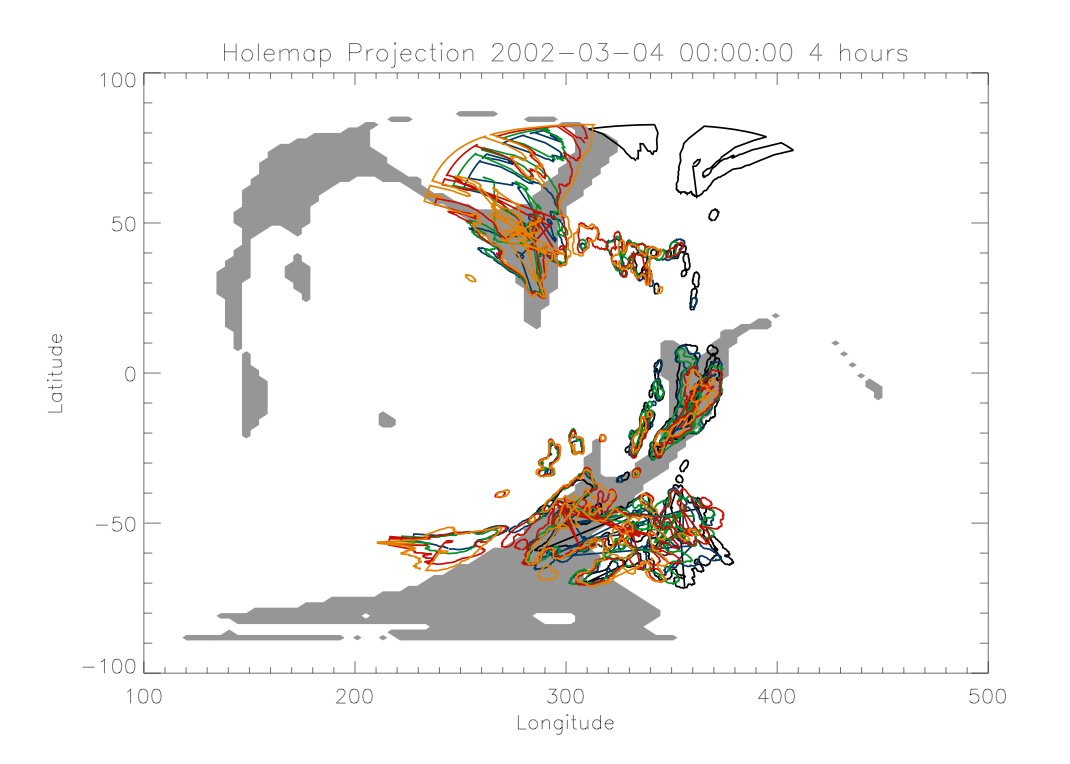
When looking at March 27, 2002 I
saw that there once again was an area of interest around 360. I did the
same thing that I did for March 4. It is interesting to compare these
two maps since they are almost a full rotation of the sun apart.
|
|
|
|
|
|
Thursday,
June 24
|
|
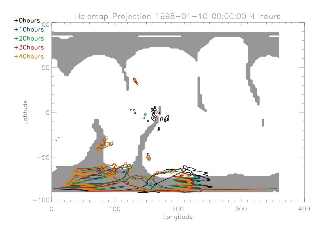
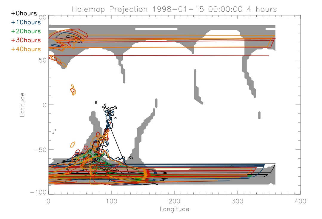
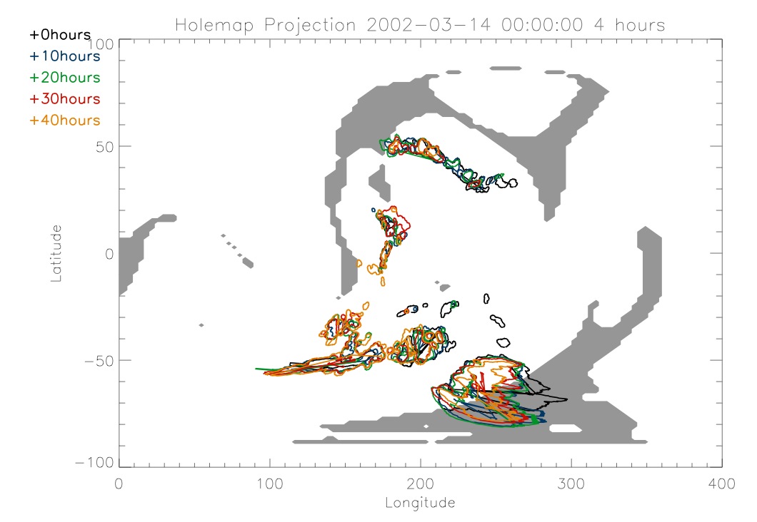
I continued doing the same type
of thing today that I was doing yesterday. I looked at times around
January 2, 1998 and I also looked at March 2002. I also changed the
program and started creating save files of the magnetic field data. It
takes a long time to run the magnetic field program so by running it
once and creating a save file I was able to save time when looking at
different coronal holes wihtin a sun's rotation.
|
|
|
|
|
|
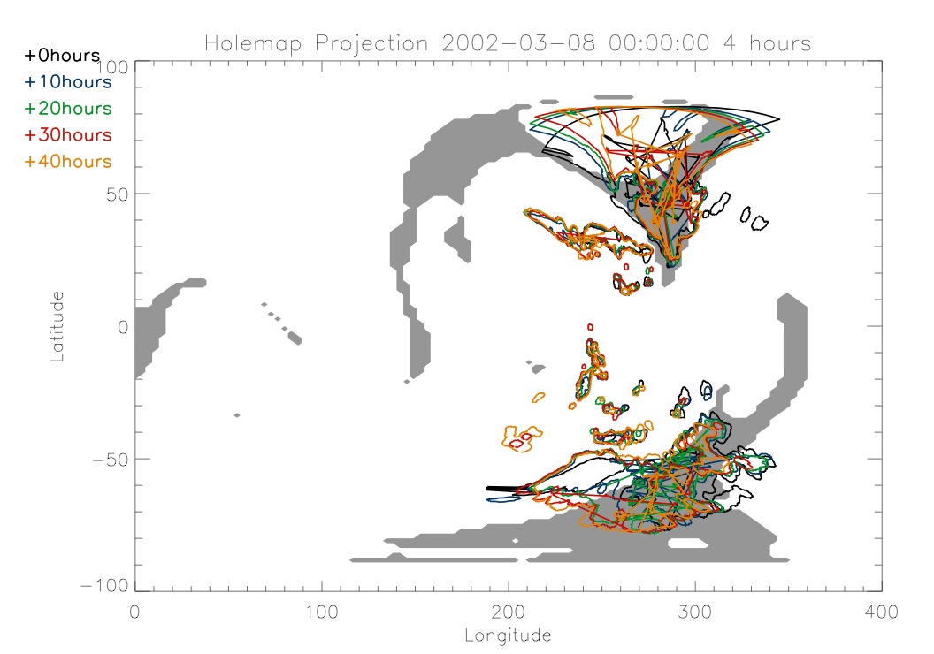
The image below is shifted over
because the interesting part is right at 360. I had to rework the
program and rerun the magnetic field program in order to produce it,
which takes a little while.
|
|
|
|
|
|
|
|
Wednesday,
June 23
|
|
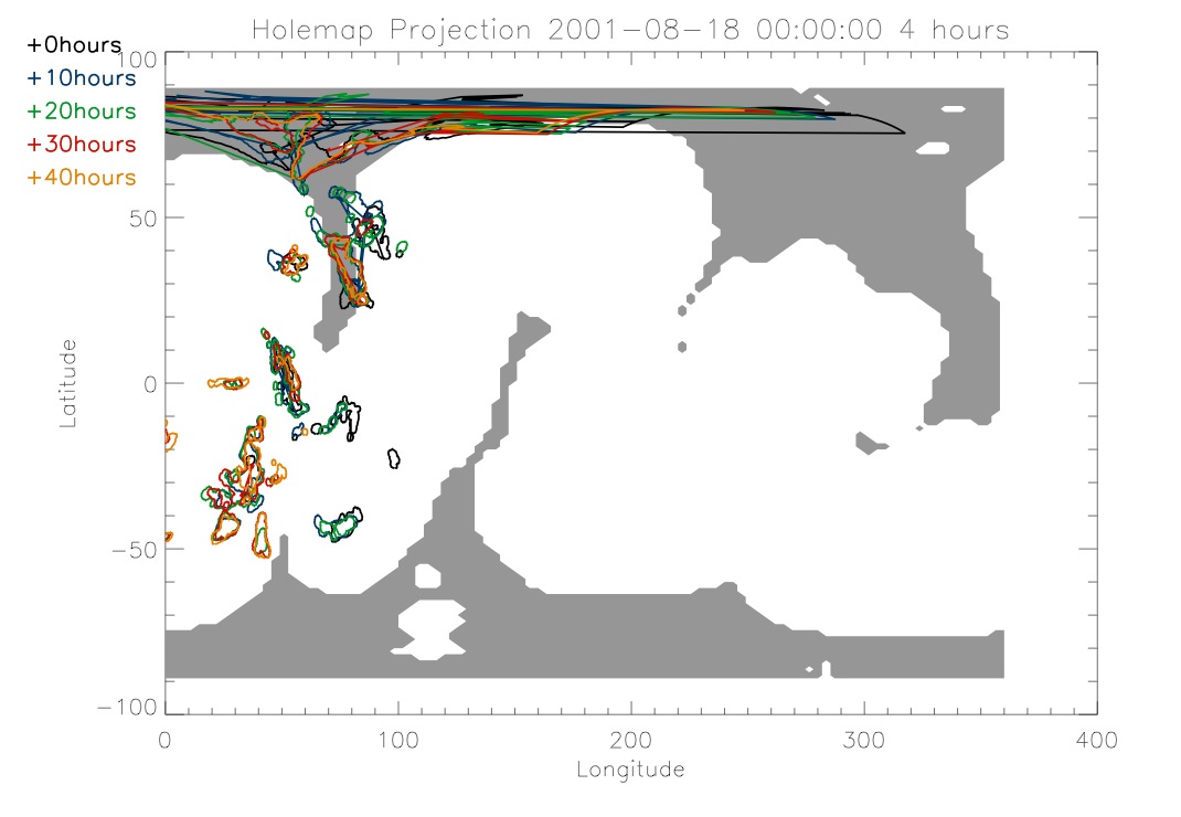
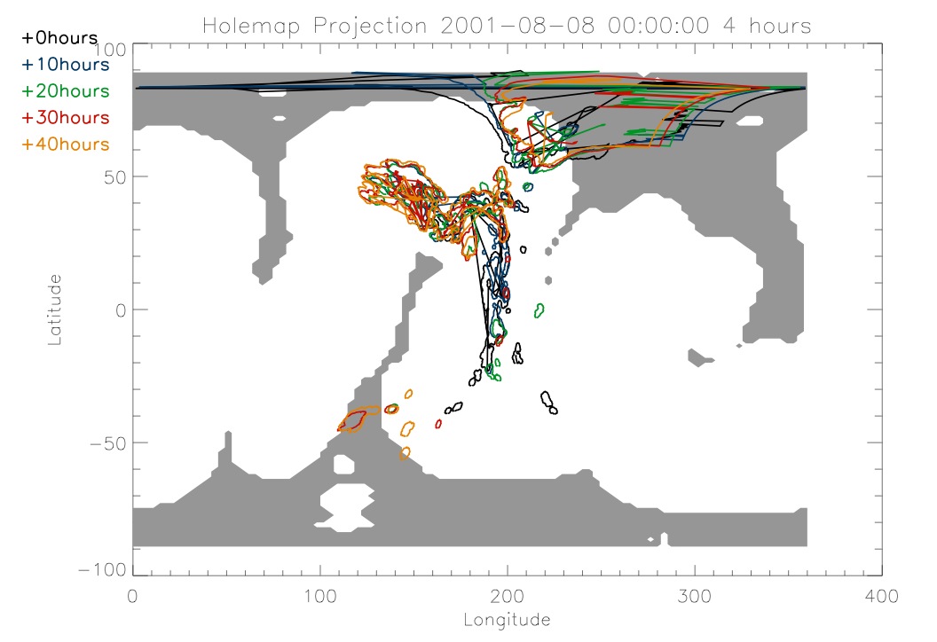
I started today by looking at
the different times around the August 15, 2001 date that I had been
looking at. The magnetic data is the same during a rotation of the sun
so my idea was to compare the different coronal hole data for the same
magnetic data. I have provided on here a couple of different examples
of some of the plots I made. I went in increments of two days in order
to look at them.
|
|
|
|
|
|
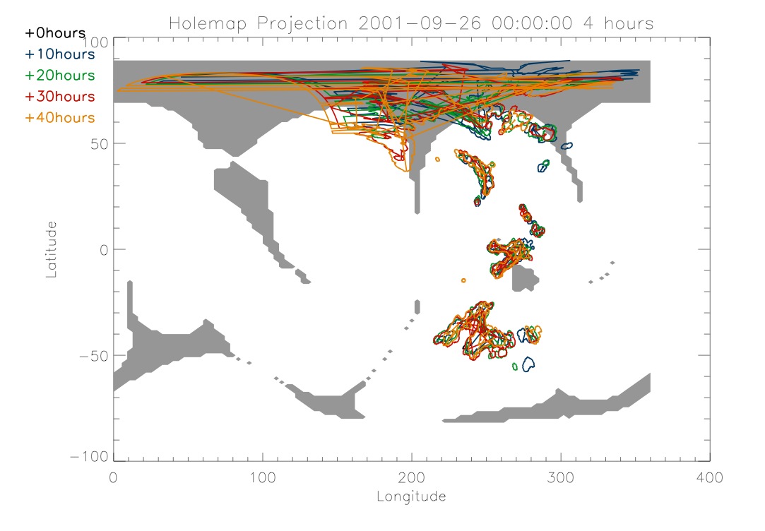
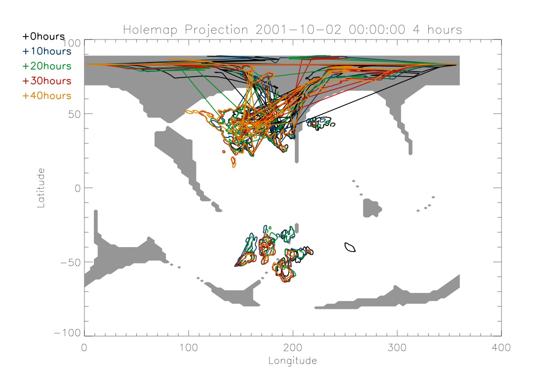
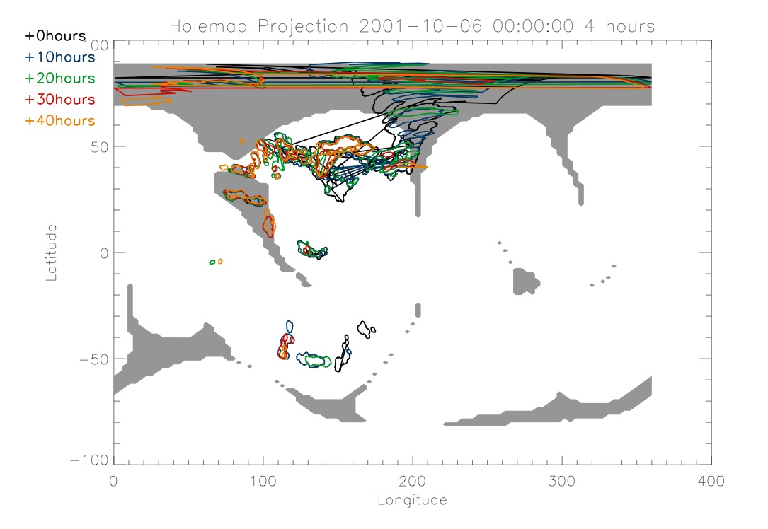
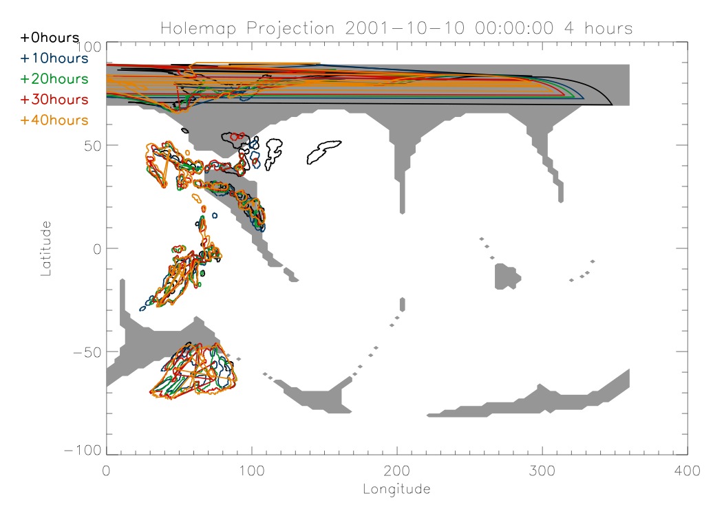
Next I looked at a full rotation
of the sun during early October 2001. Below are some plots comparing
times during the rotation.
|
|
|
|
|
|
|
|
|
|
Tuesday,
June 22
|
|
I continued working to integrate
the magnetic field programs into the coronal hole program. I was able
to successfully integrate them. I then had to adjsut some things in
order to create plots that are easier to look at, as in it is easy to
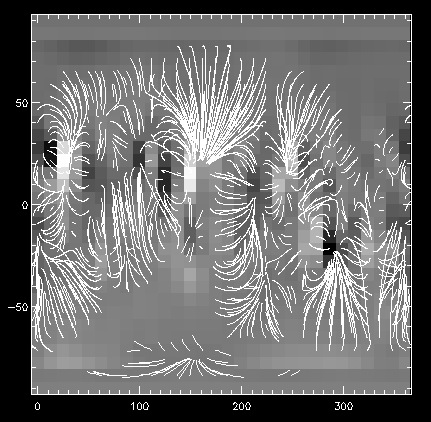
see what is going on in them. Below I have an example of a low
resolution carrington map of the magnetic field lines.
|
|
|
|
This is the low resolution image
that was used to create the plot from yesterday. The white lines are
the magnetic field lines. The areas where there are no field lines are
where there are open magnetic field lines, ones that go out from the
sun and don't loop back. The pixelation of the background is a good
indicator of the low resolution of this image. When I run the program
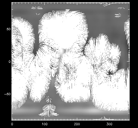
it makes contour lines of the open field regions. Below I have a higher
resolution map that is taken from data around August 15.
|
|
|
|
There are more field lines in
this image and looking at the background it can be seen that it is less
pixelated. The area where there is an open field is also more obvious
in this image. I used this resolution to produce maps of the open field
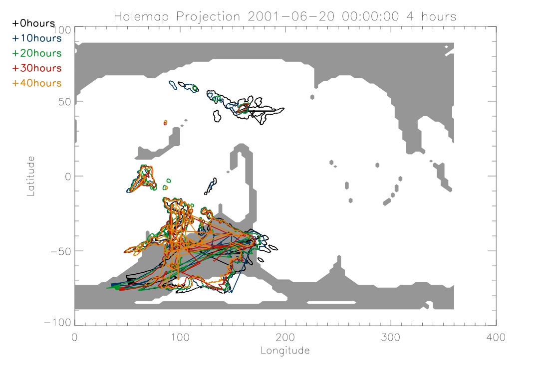
regions with coronal holes plotted on top. Today I did that for three
dates that I have been looking at. Below I have the same map that I
tried to create yesterday but now it is much better.
|
|
|
|
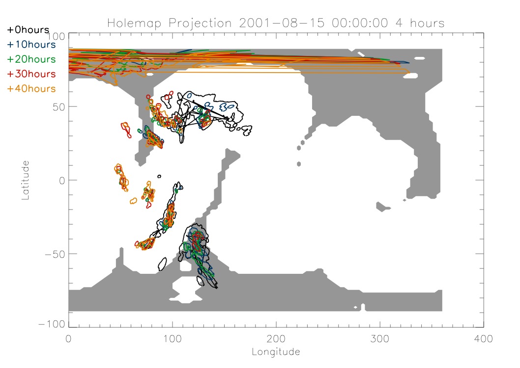
The gray areas in the background
are the areas of open magnetic field as determined by Dana's program.
The coronal holes at the south pole overlap with the open field regions
but the rest of the holes don't. Below I have the same type of map for
August 15, 2001.
|
|
|
|
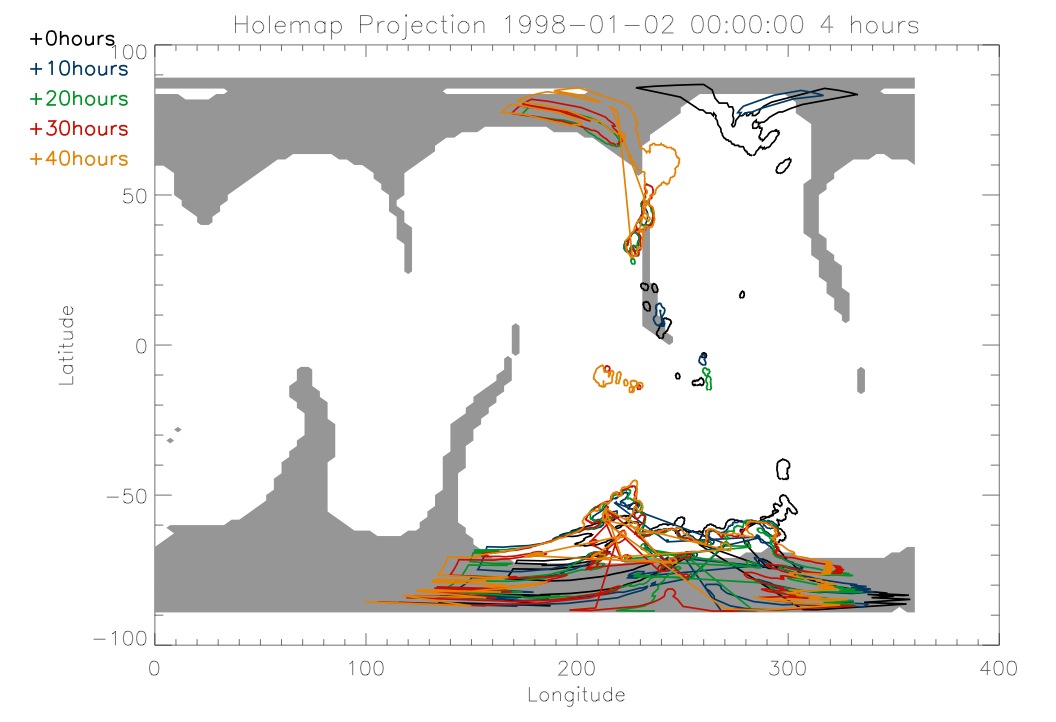
Again there is some overlap
between the open fields and the coronal holes but they don't always
coincide. The same is also true for the map below which is from January
2, 1998.
|
|
|
|
Monday, June 21
|
|
Today I started working with
magnetic data. Dana Longcope showed me how to use his programs that
model magnetic field lines. I spent most of today working with the
programs and playing around with them in order to figure out how to use
them with my programs. As I started to figure them out I then started
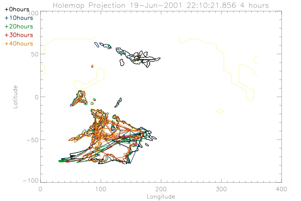
to rework my coronal hole program in order to combine it with the
magnetic field data. Below is an early version of what I am trying to
create.
|
|
|
|
The light yellow lines that are
separate from the rest of the colors are supposed to be the contour
lines of open magnetic field lines on the sun. This graph is just an
early step on my way to producing graphs that will be useful. There are
open field areas that are missing and the colors aren't what I would
like. I also have the ability to determine the resolution of the
magnetic field lines. The higher the resolution, the longer the program
takes to run. This plot was produced using low resolution in order to
save time as I figure things out.
|