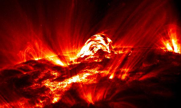
| 14th June 2010 I never really explained what the run_flux program I was using actually did so, I have a fair bit of time in between running this program (it takes ages!) to do that now (in a hand wavy way): 1) Basically, the tessellation map is a mask of cells which separates the magnetic flux elements into regions. 2) The reduced tessellation map was co aligned with the TRACE UV data, meaning that the regions of magnetic flux could be associated with brightened pixels in the TRACE images. 3) The program used an integration time to ensure that the pixel was brightened for a set number of frames, which helped to remove most of the cosmic rays from the data set. 4) The cut levels allowed the background levels to be set, so that the amount of data considered brightened by the flare could be varied (i.e. cut(i) * background = cut(i) * 20) 5) Once the noise levels had been set by cut, and the area of the cells were found, the field on the magnetogram corresponding to the flux cells was summed. From this the flux was calculated (flux = B.A). 6) The tessellation map differentiated between positive and negative regions, and so the run_flux program saved the positive and negative flux. Once I had the 25 flux variations (5 shift x 5 cuts) I could go on to find the reconnection rate. Unfortunately, a couple of typos in the program meant I had to run it again, but this time I also included the 'mflux' part of the program. This new part simply keeps all the flux values together, so a data cube consisting of the [time frame x number of cells x number of variations], and another cube where flux is replaced by area of the cell. This is just a practical measure so I don't have to restore 25 files each time. I then played about with making some plots of the data: The positive and negative should line up, as theoretically the field lines go from a positive cell to a negative cell. However, as you can see, they don't. This is due to experimental errors in the the data taking and is unfortunately unavoidable. This just means that the largest errors will result from finding the mean flux from the pos + neg fluxes. |
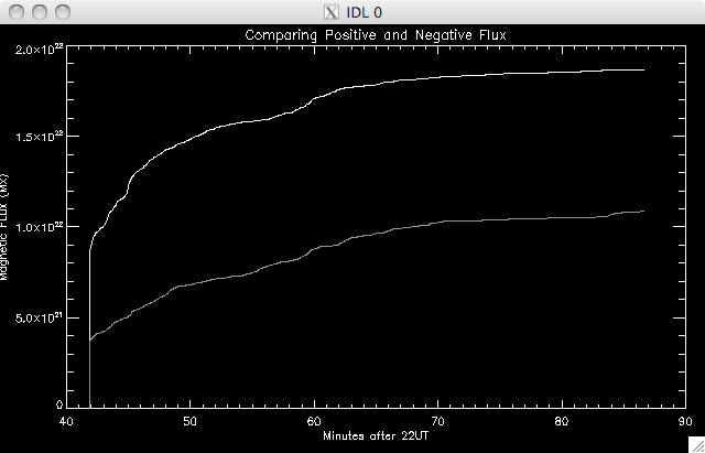 |
The top is positive and the bottom negative. Already this is looking like a good plot, as the flux should increase during the flare as field lines are reconnecting, and then flatten once the flare is over. I'll look into the errors tomorrow and Wednesday. |
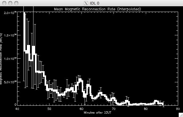
15th June 2010 Today I have to run the mflux again (!!) which will take a while, as I missed out a keyword I wanted to include. ....eventually I got the mflux data and it all seems present and correct. While I was waiting for this I have been writing/adapting a program to find the reconnection rate and the associated errors. The flux is separated into positive and negative arrays, and from there the reconnection rate for each variation is found by taking the time derivative of the integrated flux. This was then smoothed by a small factor as we are interested in the peaks and trends, and where they correlate with the UV and HXR light curves (not necessarily the value of reconnection itself- although I do want this to be as accurate as possible). The standard deviation and mean of the positive and negative reconnection rate arrays were calculated and I plotted the mean reconn rates: |
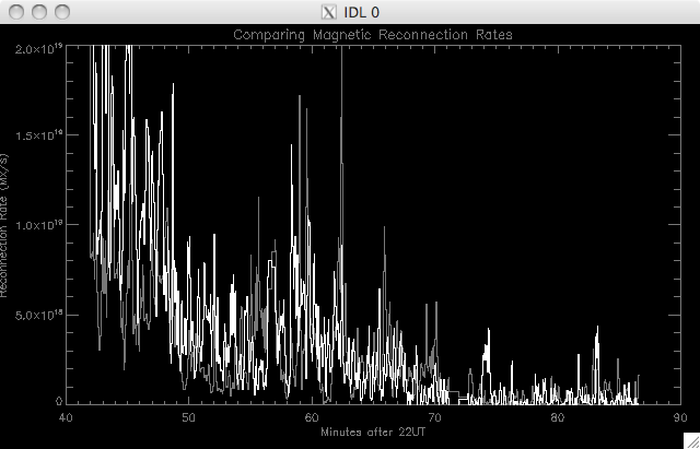 |
The error bars are not plotted here for clarity, as it is very noisy. While a peak can maybe be seen, it is not definite. I was also surprised that the reconnection rates match up so well here while the fluxes did not. Also - the rate seems to peak before the data was being collected, though I will have to plot this with the UV data to be sure. Due to the noisiness here, Jiong has suggested I interpolate the data. I started to write a code to perform a 30s spline interpolation. This will affect the error, but the standard deviations so far have been very large and so are likely to dominate. |
16th June 2010 I calculated the error as being the standard deviation between the positive and negative readings (which is only between two numbers, but this is necessary), and they were unusually high- most more than 100%. This is because of the very large difference in the mean positive and negative flux. While I wrote the code for the interpolation, Jiong looked through the data to try and see if we had made a mistake somewhere as even though we were expecting a very large error we didn't expect it to be > 100% ...the interpolation looks much cleaner, and it is easier to see the trend in the pattern. Jiong also found the problem. It was do to with the co alignment of the images I performed last week- I knew it wasn't so simple. It turns out I had mistook pixel values as arc seconds when extracting the positioning data from the TRACE data cube and SOHO map. (it's really annoying that I did this....but I can still use everything I've done earlier in the week- I just have to re-run the now correctly coalligned data through the programs I've been using and then see how the results compare (plus I've already tested and de-bugged the programs so they should work fine). Tomorrow and Friday are the XRT conference talks and so I want to attend as many as I can. The plan is to co align the images tonight so that tomorrow I can just set the programs running and leave them to go. |
17th June 2010 This morning I fixed the maps, and set the flux programs running- with the interpolation running. I've also noticed that one of the keywords set assumes a constant median value, which affects the background. I reset this to calculate the medians (see Week 2) and so when I go to the next set of XRT talks I'll get this set too....this means I'll have two sets of flux, and mflux data (and eventually two sets of reconn rate data) but I'll probably only use the median background version, as this will take into account the non-flat median I found last week. The new co alignment algorithms are: i
= ([Cx' - (Ls/2)*0.5''] - [Cx
- (Ll/2)*0.5''] ) *2
j =
([Cy' -
(Ls/2)*0.5''] - [Cy
- (Ll/2)*0.5''] ) *2
These
new values actually run off
the end of the Trace & tessellation maps, and so the top and bottom
right x values were taken to be the edge of the large magnetogram, i.e.
we know have [235 x 256] images.
bl
= [329, 180]
tl = [329, 691] tr = [799, 691] bt = [799, 691] the new co aligned tessellation map looks like: |
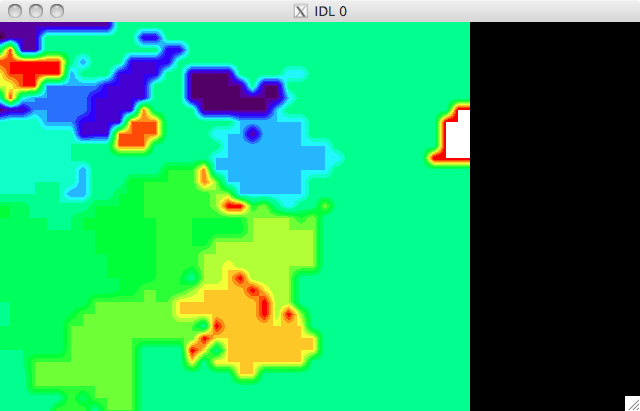 |
Just to be sure I spent a good wee while staring at a 'flick' of the region of the magnetogram and the TRACE UV image just to make sure that the magnetic features matched up well with UV features. You can see that a couple of plages do align well with magnetic areas. I don't know how to link the flick here, but I'll try to get it working. The positive and negative match up better now (though still quite a bit of separation) but the standard deviation is still quite high at an average of ~40% |
18th June 2010 The XRT conference is on again today and it's been really interesting so far and so I'm just going to have a quick look at the plots of the now corrected data I have. In summary: I have a number of small variations in the data which provided a mean positive and negative magnetic flux. These variations were used to calculate a set of magnetic reconnection rates for each variation, and from here a mean reconnection rate and the standard deviations were found. This was plotted against the UV light curve. As can be seen below, the UV light curve and the reconnection rate do not peak together, which is quite surprising, but we'll look into this more when we compare the HXR light curve. The magnitude is in the range expected ~ 1x10^(18-19) Mx/s Next steps: To investigate the spatial evolution of the flare. |
 |
|
(The blue is negative, white positive) 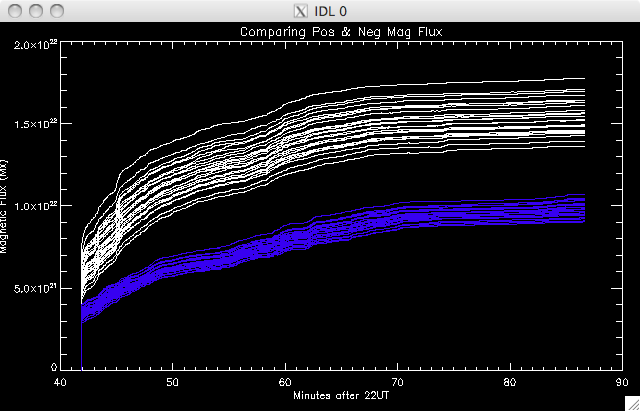 |
 |