Week
1 Week 2
Week 3 Week 4 Week 5
Week 6 Week 7 Week 8 Week 9 Week 10
Home
Research Home
Week 6 Week 7 Week 8 Week 9 Week 10
Home
Research Home
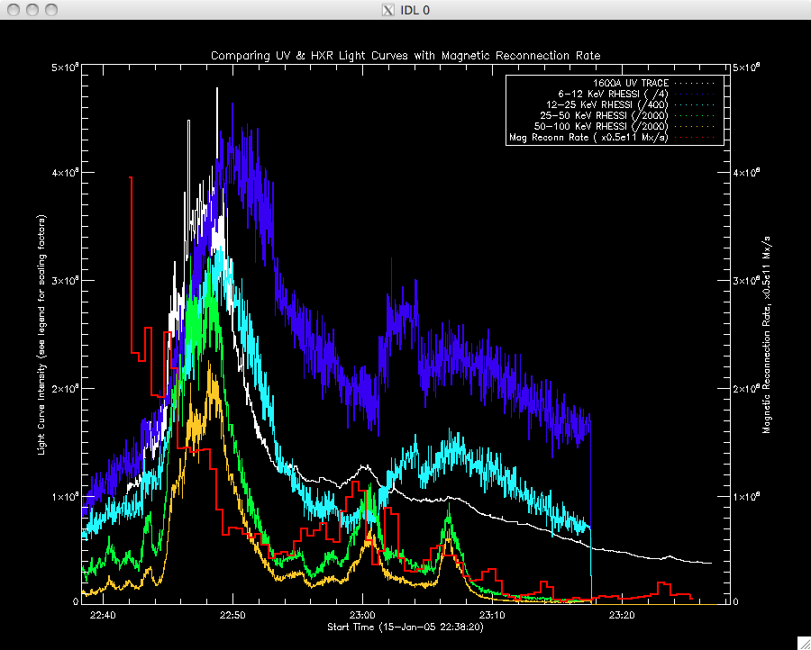
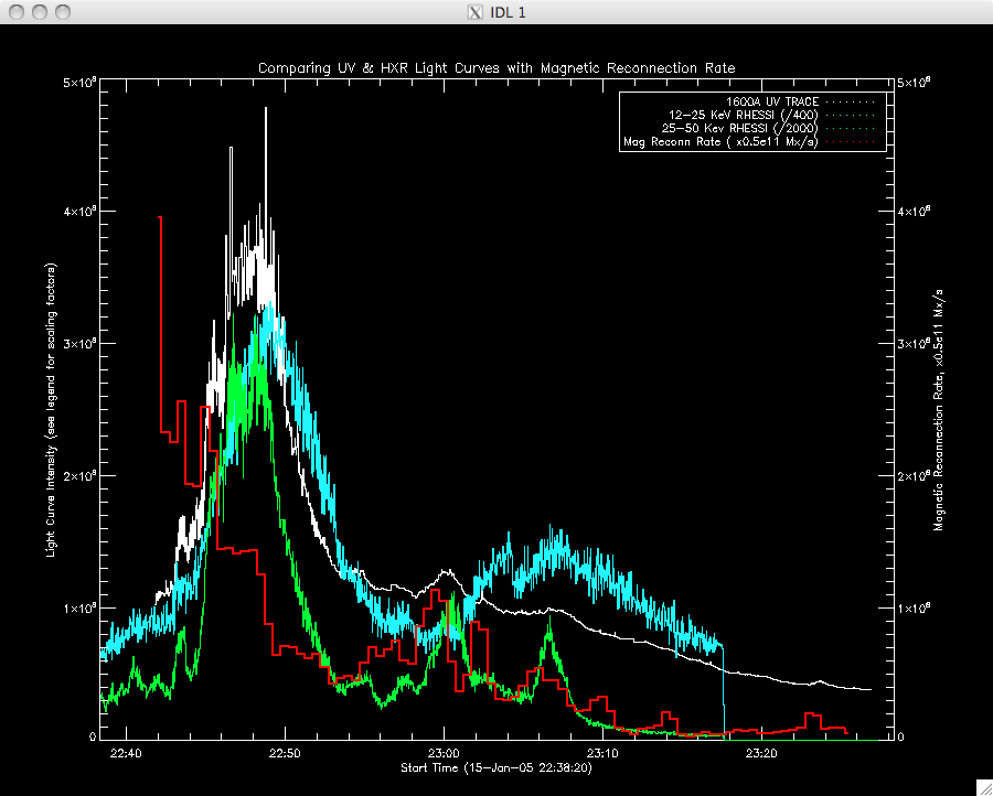
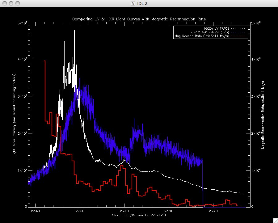
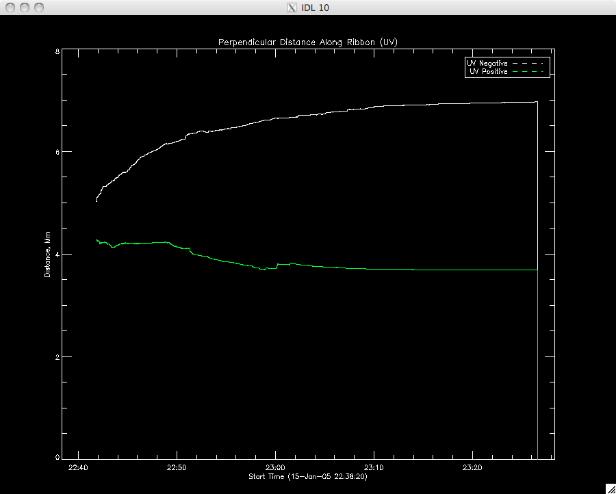
| 28th June 2010 So today has been a mixed bag....I got very frustrated this morning as I still cannot find the problem in my version of the program to analyse the position of the UV data, but this afternoon I got some good looking plots of the light curves from both RHESSI and TRACE and figured out how to use UT_PLOT. The negative ribbon's length along the PIL and the negative ribbon's perpendicular distance away from the PIL works fine as does the positive ribbon's length along the PIL. However, the positive ribbon's distance away from the PIL is decreasing which doesn't really make sense. I ended up with a bunch of printouts of the code (almost 1000 lines!) and a make shift highlighter and set about looking for the typo or other mistake, but to no avail. Hopefully Jiong will find out what's going on once she gets back from D.C. After that, I started to quickly plot the light curves of the RHESSI hard X-ray data, and figured out how to use UT_Plot, which is actually a really useful way to plot data with a different number of time frames. After playing about with scales and working out which data to plot first to get the cleanest looking graphs, I realised it would be far easier to write a program to automate this, and let me make small changes quickly without having to retype every line...so I did (plus this makes it much quicker to get the new plots when I get the correct positive ribbon perp. distance. I've only written the light curve parts of the program as I wanted to have some time to think about the second part of the project - I'll write the position graphs tomorrow. Below are the plots I have so far...they look quite busy and the scaling factors are a bit random and just designed to get everything on one plot (but I'll get this fixed up when I see what data Jiong wants to show). I plotted each energy band for the HXR on one plot but then plotted the mid-range together, and then the low-range. The error bars in the magnetic reconnection curve were omitted for clarity since the plots were quite busy, and they were reasonably large. |
 |
 |
|
The second part of the project involves looking at the brightening of individual pixels of the UV TRACE data to investigate their decay. Jiong sent some code for me to look over, so I'm going to have a play about with it. |
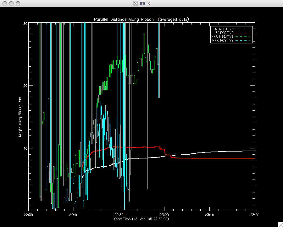
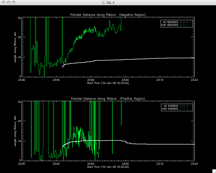
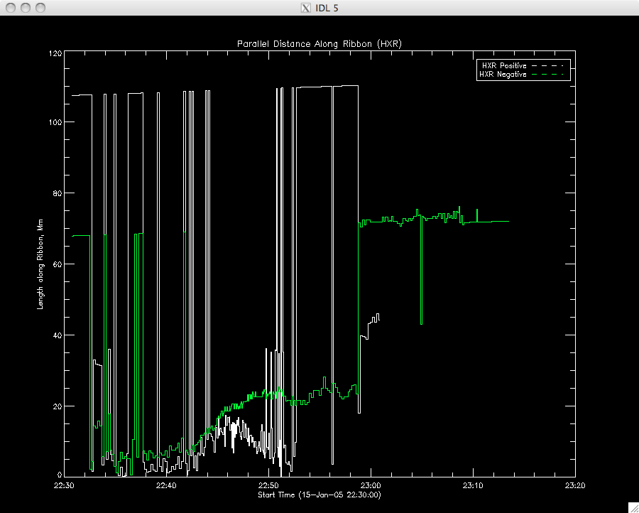
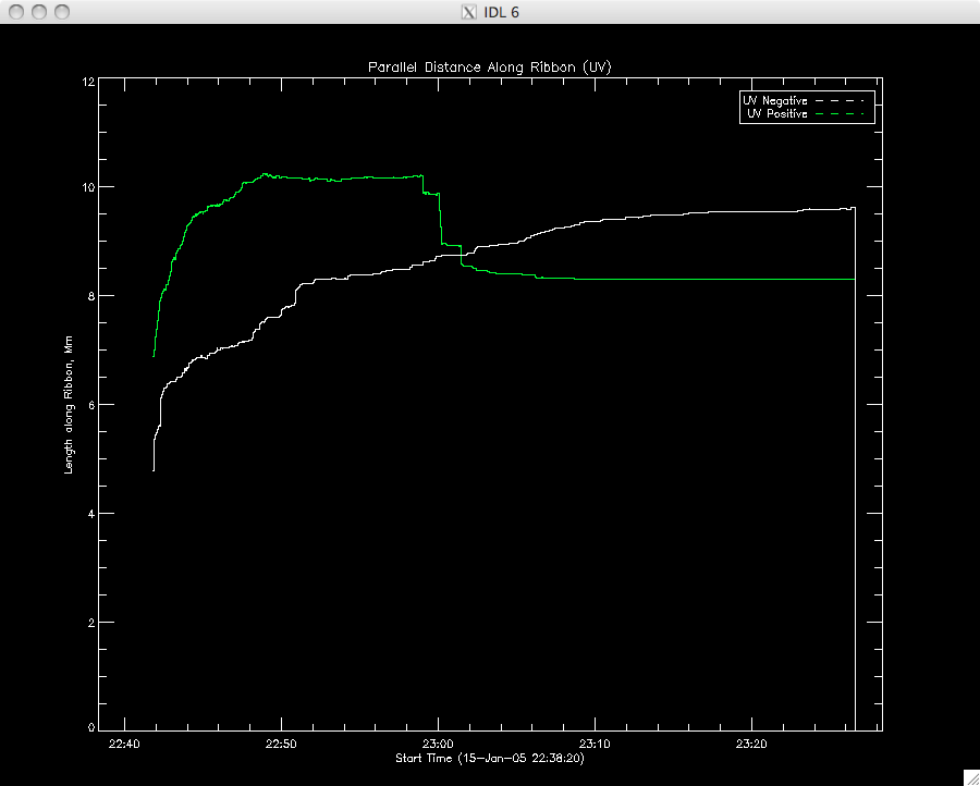
29th June 2010 I finished my plotting program this morning (and got distracted by an idea to write a generic plotting program, but by the time I got into it I realised that it was probably more effort to write this program than do the plots line by line so I got back to the matter at hand). It took longer than yesterday to identify the ranges and scaling for the position plots but eventually I obtained the plots below. I was a bit surprised by the difference in scaling between the HXR and UV data but they both follow the same trends (apart from the pesky positive perpendicular distance) which is encouraging. I averaged the 5 cuts into one curve for the moment. I haven't worked out the standard deviation between the cuts yet but I will if I think I need it later. I doubt it would be as large as the error on the mag reconn rate as the 5 cuts seemed very close together. I'm now going to continue to play about with the brightening pixels program.... |
 |
 |
 |
 |
 |
 |
 |
 |
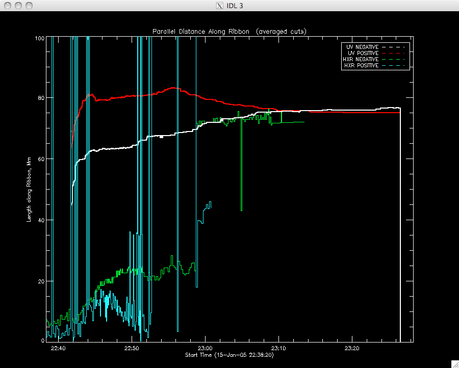
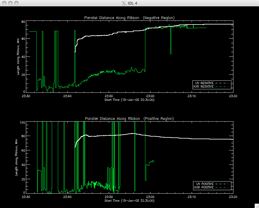
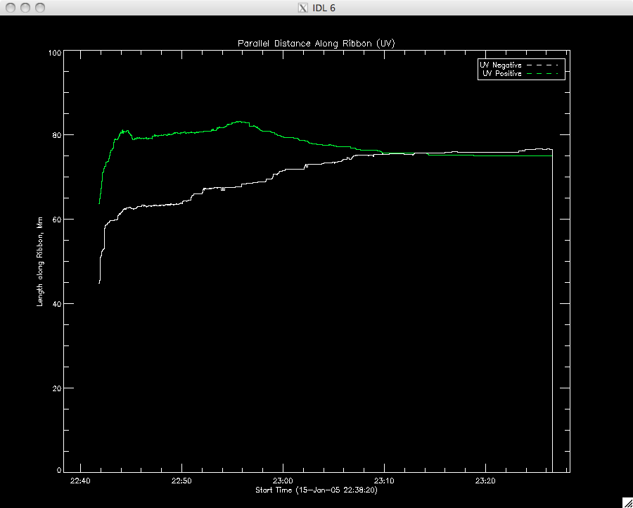
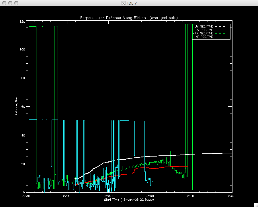
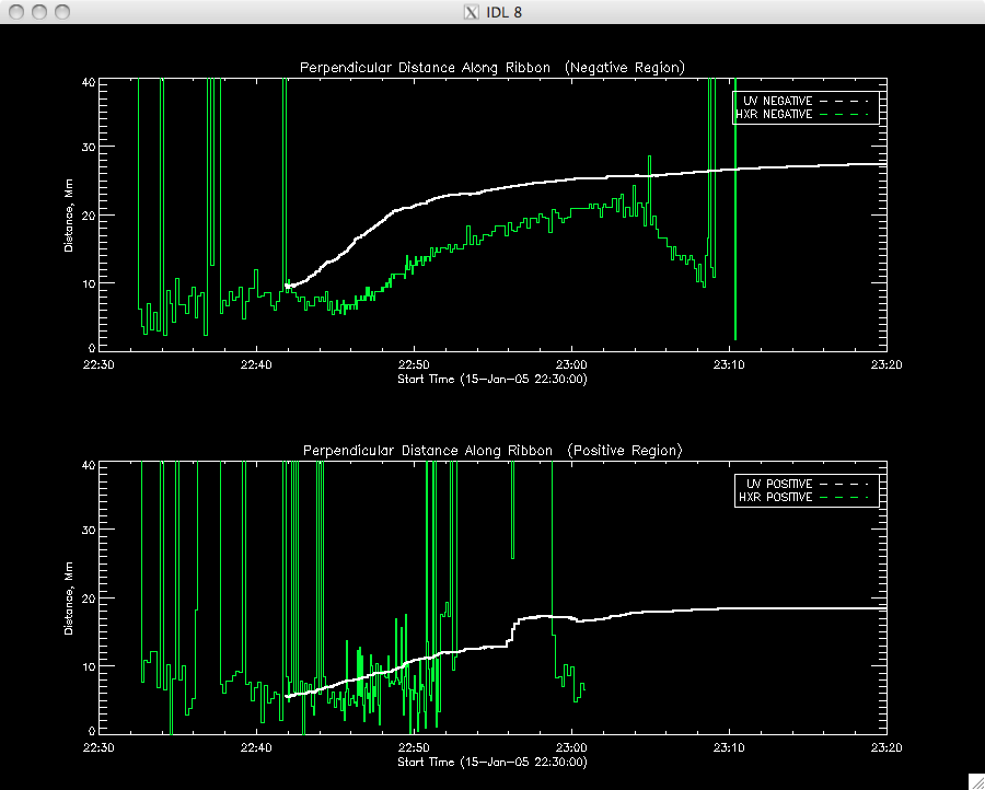
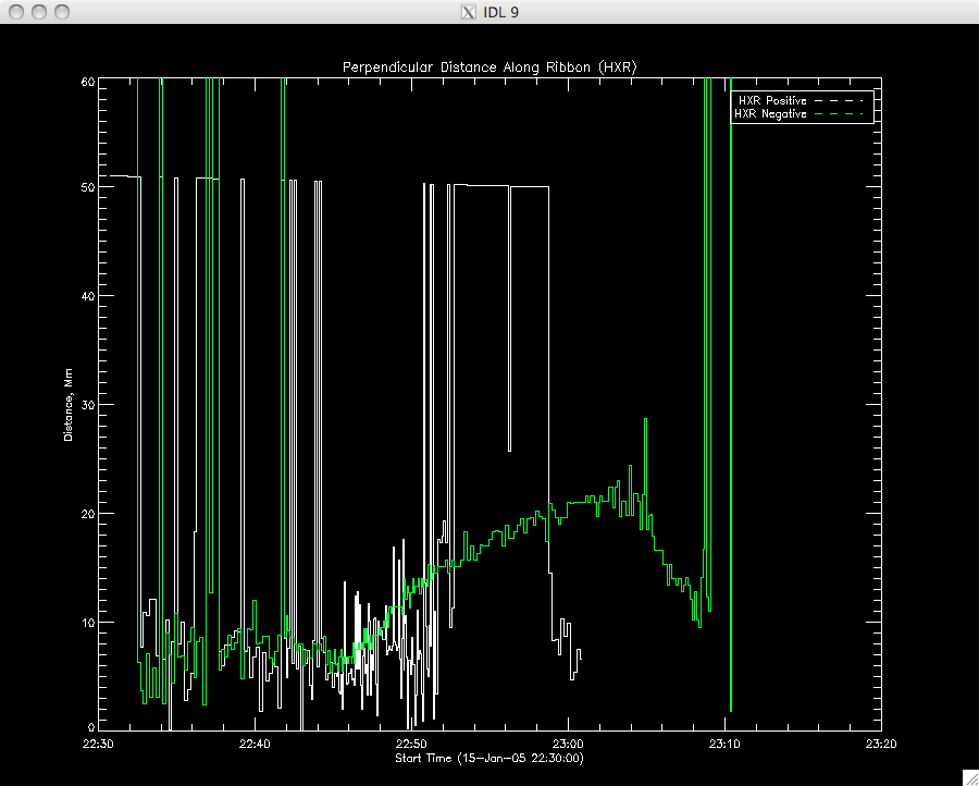
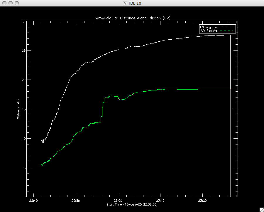
30th June 2010 Jiong managed to track down the mistake in my program (yay!)- I had written xx, instead of yy so I will now remember the dangers of copying and pasting! I now get an increasing perpendicular distance, which agrees not only with the HXR analysis but common sense (a flare gets bigger not smaller). Plus, I think the difference on scaling is due to me mistyping '1' as '10' in a few places....though now I suspect the UV might be quite a bit bigger than the HXR...but I'll wait and see.... ....I'll re-run my graphing program and plot the multitude of graphs I get. They're correct versions of those above so the same descriptions apply. ....OK, first off the new set of position plots: |
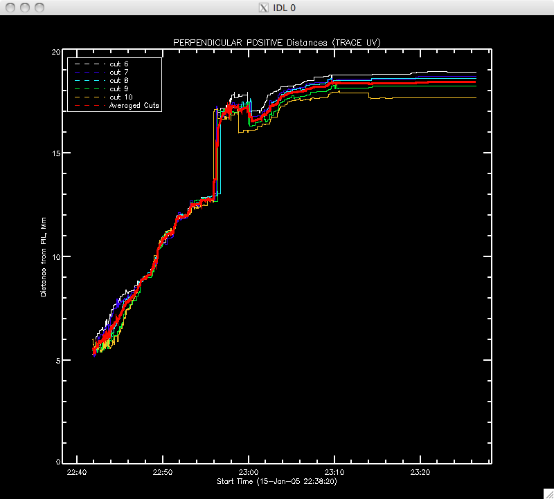 |
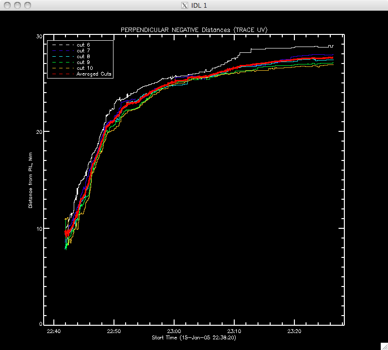 |
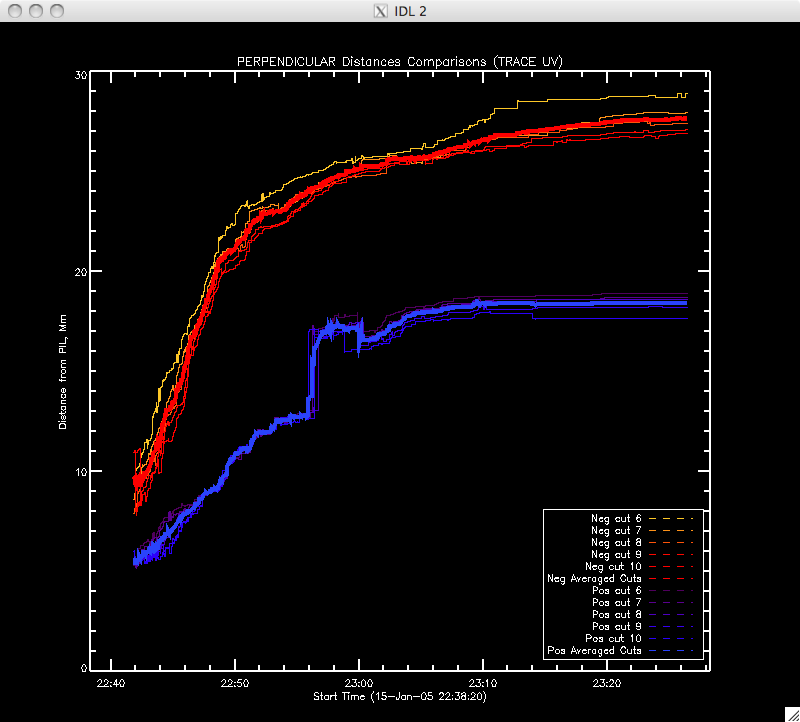 |
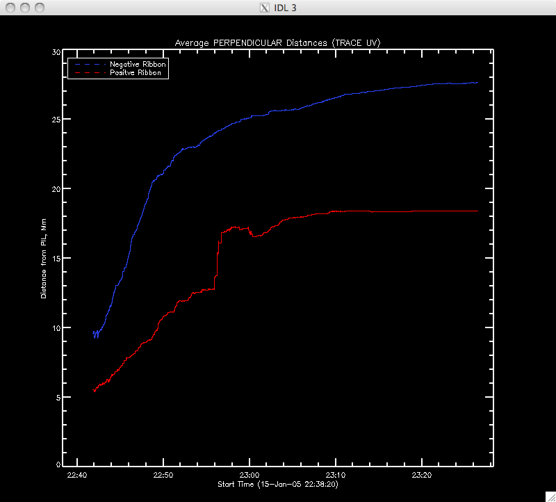 |
 |
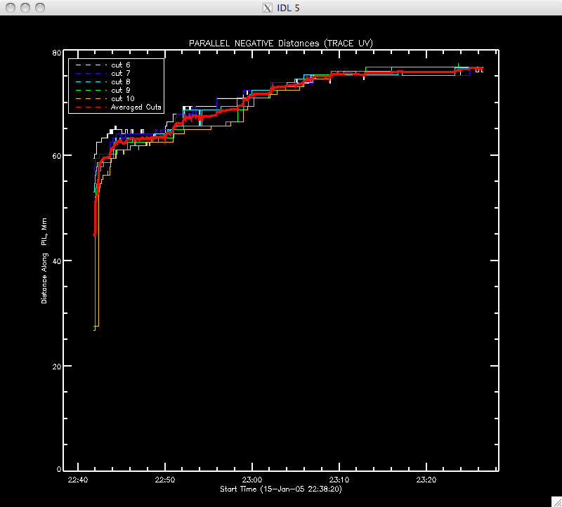 |
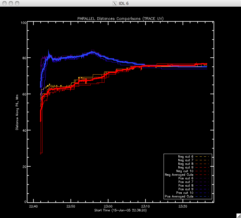 |
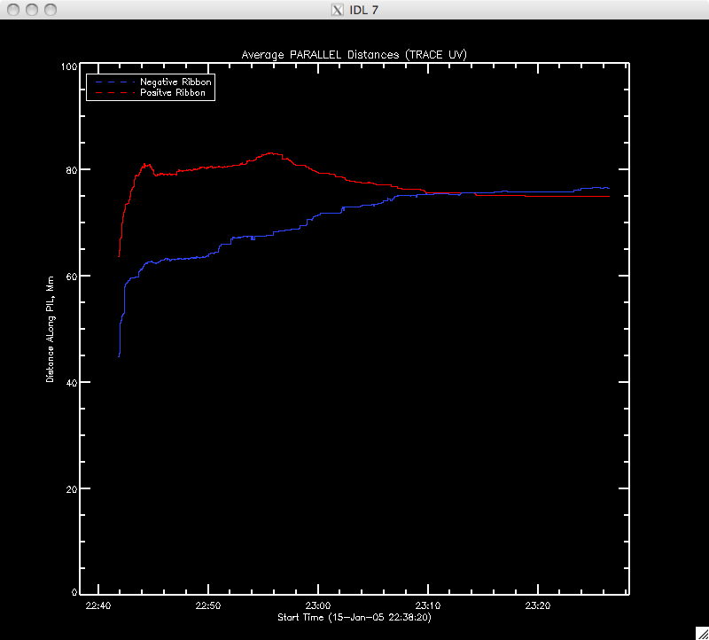 |
Now here are the new comparisons to the HXR data: |
Parallel
distance along the ribbon:
 |
Separated
into positive and negative ribbons:
 |
Positive
and negative HXR parallel distances (for reference):
 |
Positive
and negative UV parallel distances (for reference):
 |
Perpendicular
distance along ribbon:
 |
Separated
into positive and negative regions:
 |
| Positive
and negative HXR perp. distance (for reference)
 |
Positive
and negative UV perp. distance (for reference):
 |