Week
1 Week 2
Week 3 Week 4 Week 5
Week 6 Week 7 Week 8 Week 9 Week 10
Home
Research Home
Week 6 Week 7 Week 8 Week 9 Week 10
Home
Research Home
| 19th July 2010 Today I am working on the decay timescales for the UV pixels. Last week I got the draft program to work - this was just a rough version which forced a power law to fit the data. Due the fact that we think the data is described by two power laws, only about 1/7th (9000 some pixels from ~65000) of the brightened pixels are found to exhibit the one power law exponential decay model. The results I got were very similar to Jiong's results of the Bastille Day flare (which didn't have a very good cadence compared to the 15th Jan 2005 flare) which is encouraging. Below I've plotted the decay constants for each pixel, as well as a scatter plot as Jiong's results showed some form of correlation between the intensity at maximum and the decay constant: |
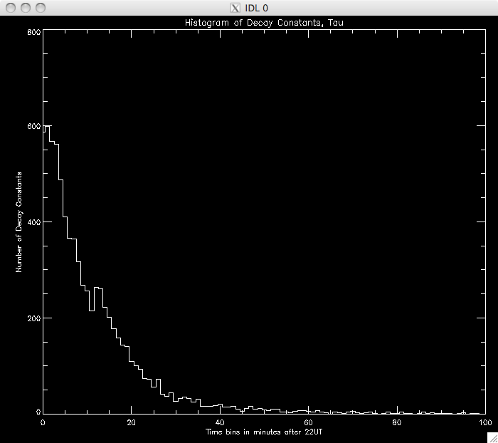 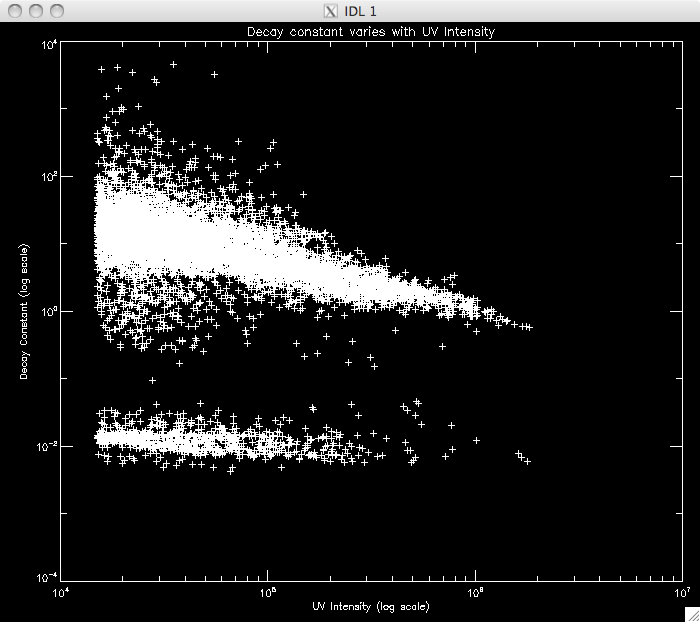 |
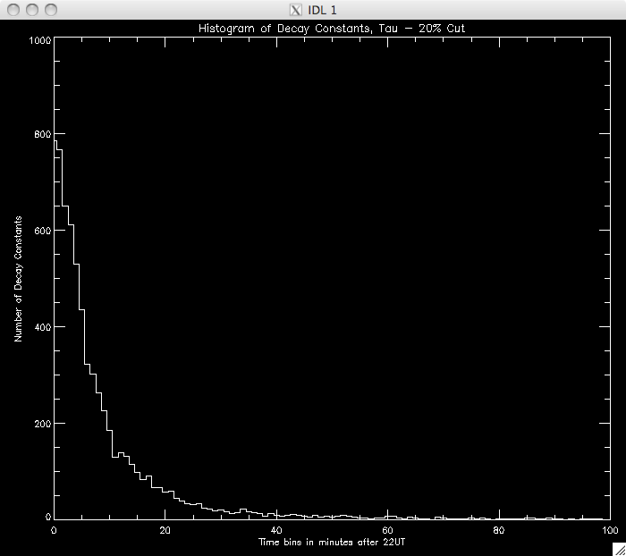
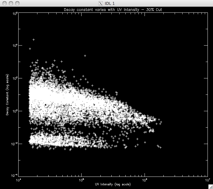
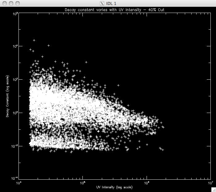
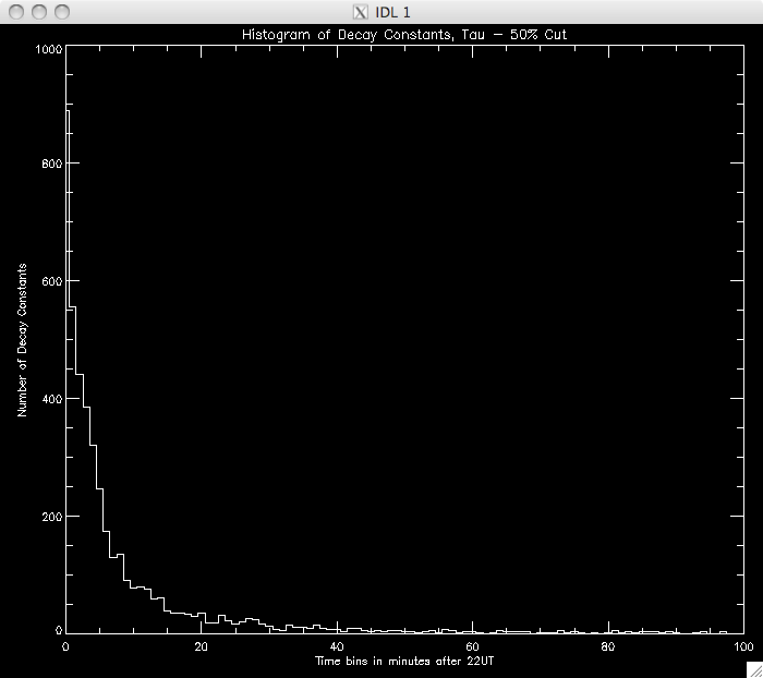
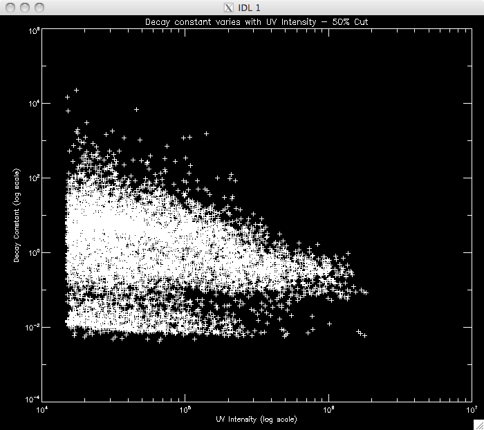
Jiong's Bastille Day flare data does not have as good a cadence as my flare and so the second object seen in the plot is likely due to spikes in the data, on the order of a few seconds. Jiong's data would need spikes on the order 30s to create this feature (which didn't appear). My next step is to try and identify where the power laws split and the second relation takes over. I think a good approach would be to set a very high cut to ensure that I am only measuring the 1st power law and to model this portion of the decay. Once I have this model, I could extrapolate it down, until I reach the point where the model no longer describes the observed data. I will then take this point and repeat my analysis to find the second model. First, I am going to plot similar graphs to those above, but with higher cuts to see if there is a noticeable difference in the amount of data modeled: CUT: 20% PIXELS: 8619 |
 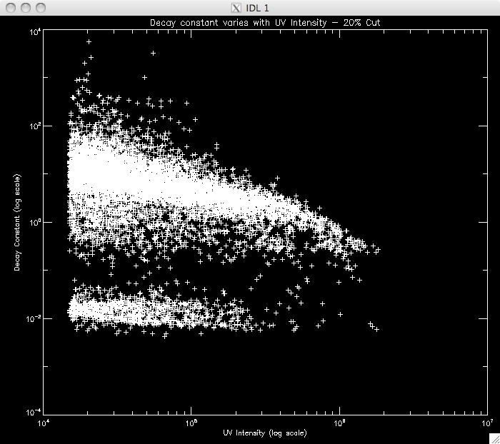 |
CUT: 30% PIXELS: 8515 |
  |
CUT: 40% PIXELS: 8531 |
  |
CUT: 50% PIXELS: 8571 |
  |
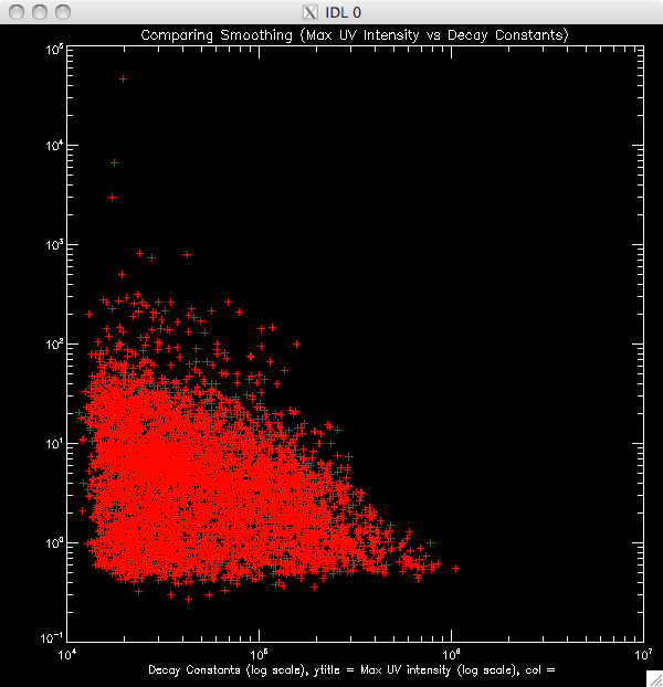
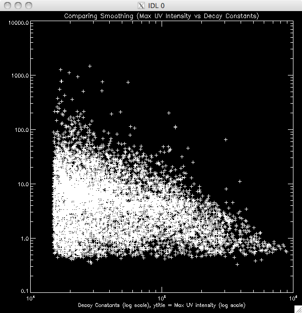
20th July 2010 Today, before I started working on an addition to my program to plot the second model to the second region of the decay, I had to investigate why the pixel numbers were so low (1/7 ish well fit by the lines), when they should be around 70-90% judging by Jiong's experiment with the Bastille Day flare. I started by trying to smooth the data just before the fitting process which didn't really seem to work. I figured the problem would be due to the program selecting the incorrect maximum- i.e. it was picking out points which were more like spikes in the otherwise continuous light curve. Also- depending on what cut I used, or how much I smoothed the data, the procedure would sometimes crash, citing a singular matrix problem. This was due the program choosing a spike at the end of the curve which did not leave enough points to fit the data and so I included a new line which required the data had at least 10 points after the maximum point before trying to fit a curve. I also played about with some WHILE conditions to specify some conditions on the maximum, to make sure it was well - behaved, like having points after which decreased fairly consistently for half a minute or so and if not, selecting the next maximum. To cut a long story short, it turned out the issue was a typo. I realised that I had missed out a '*blevel* along the way, which multiplied a factor by the background levels, which explained why 65000 pixels were being let through my filters as opposed to the 10000 we would expect - it was allowing greater than '30' rather than '30*blevel'. However, I did get a few good ideas out of my attempts to fix the problem (which, if not useful in refining the program, will come in useful in future programs) which is why I have included my waste of a day in my log. Once I fixed the typo, I had a choice to smooth the data before any analysis (my favoured option as it means that it is smoothed before trying to find the maximum values and passing through the filters) or after the bulk of the filters, just before I try to fit the line. Below is a plot showing the results of each, which a 50% cut, smoothed by '5'. The red is smoothing after filters, white is before. Before : ~9900 pixels, ~8300 brightened (~83%) After: ~8200 pixels, ~6200 brightened (~73%) |
Comparing the smoothing placement 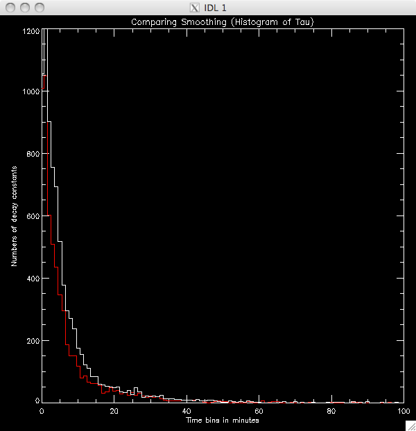 |
I couldn't get the overplot working for the scatter plot, so I've just plotted them separately. The same colour scheme applies |
  |
I also thought through the pseudo-code for fitting the second power law: The first region is modeled by I(t) = I1 exp {- (t-t1)/ T1}
Where
I(t) is UV intensity at
time t
I1 is Intensity at time, t1
t1 is time at region 1 maximum t is some time greater than t1, less than t2 T1 is the decay constant of region 1 Then at time t2, the
second region will begin to dominate and the second model will apply.
I(t) = I2 exp {- (t-t2)/T2}
Where
I2 is UV intensity at time
t2
t2 is the time at which the second model dominates (region 2 max) T2 is the decay constant of region 2 Then the point at which the
first model no longer describes the observed data will the start of
region 2. I can find this by first modeling only region 1 (by
selecting a large cut I will only select data which definitely falls
within that region) and then extrapolating down until there is a large
discrepancy.
So, for each time frame after the maximum point I will find di = Iobs - Imodel
using the parameters I1, and
T1 measured above. With the array of di's I will find where it exceeds
the standard deviation by a reasonable amount (say 1.5 sigma) AND where
it is increasing consistently, i.e.
di(k)<di(k+1)<di(k+2)<......since we think the second model is
not as steep, and so the first model will 'undercut' the second. I will
then take the index k where these conditions are met, add 10 indices to
this and repeat the procedures described last week to fit the curve.
|
21st July 2010 Now that I've fixed the typo I seem to get much more sensible (and expected) results. The second band in the scatter plots disappears and if you look within the first five minutes or so, most of the data appears to have a decay constant within this range, and there does not seem to be the anti-correlation Jiong saw with her low-cadence data (which Jiong is pleased about as it was a difficult thing to explain!). I'm going to stick with smoothing before the filtering. Below are a few plots showing 20%, 30% 40% and 50% cuts just to make sure there is nothing strange going on and to see how low I can make the cut: 20% total pixels: 9895 well fit pixels: 8503 (~86%) |
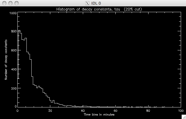 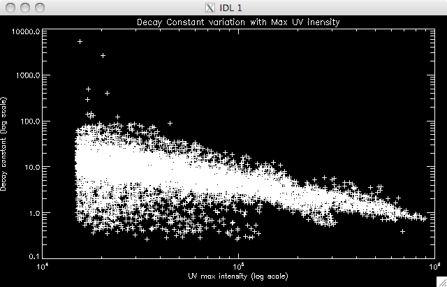 |
30% total pixels: 9895 well-fit pixels: 8796 (~89%) 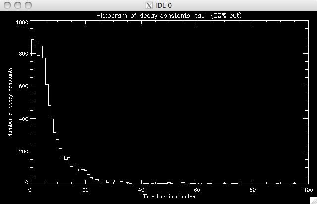 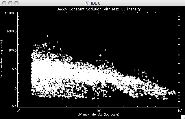 |
40% total pixels: 9895 well- fit pixels: 8785 (~ 88%) 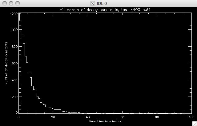 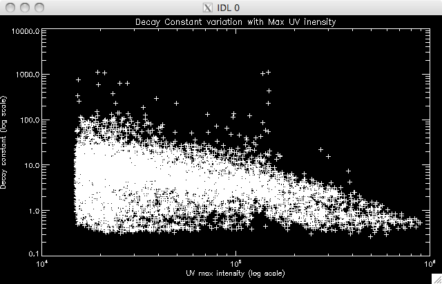 |
50% total pixels: 9895 well- fit pixels: 8311 (~84%) 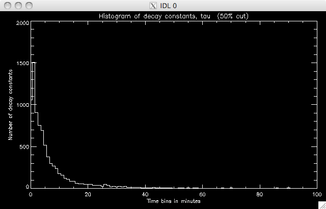 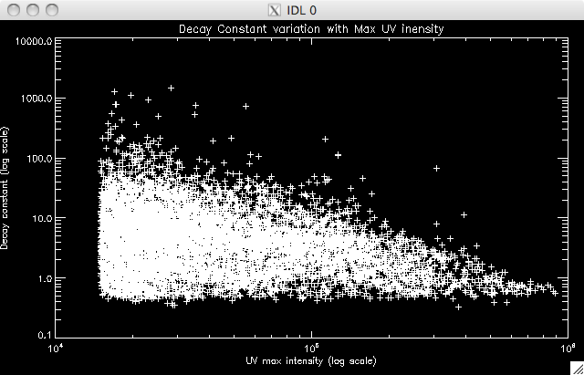 |
Jiong suggested using the 40% cut as, although there are (slightly) fewer points, it is a much better plot, with less spread in the decay constant values. Today I have also been spending a lot of time writing the program to identify where the second model takes over, and to then fit this second region. I reckon it's almost ready to run, but there are a couple of areas I need to have a think about - like which point to take as the end of the region, and IDL syntax, to make sure my various loops will do what I want them to do. So far I have set a condition that the difference between the model and data has to be at least 2 times the error in the fit at that point. If this is satisfied, I have a few IF and WHILE loops to impose the other condition I mentioned above. I decided to increase by 5 frames for this condition to allow for small scale, local, variations from point to point. I'll try running the program tomorrow morning. Also, Jiong has lengthened the PIL (the PIL was not stretching all the way to the end of the image and so this caused reference point problems) and also fixed an error in the program to look at the positions of the ribbons. Everything now seems to be working properly and giving sensible results. This afternoon I re-ran the program which included an additional bit of code which split the negative ribbon into two parts. If you watch the movie then you can see two areas of brightness in the negative (uppermost) ribbon, which has brightening occurring at the same time (suggesting an area in the middle in which reconnection is not occurring as intensely). Below are rough plots of the phases: Phase 0 is the case where the ribbons are treated as one long string. In the other two phases, the negative ribbon is split into two components. The most western segment is phase 1, and the most eastern is phase 2. The positive ribbon does not have a (yet??) obvious division and so is treated as one element in each scenario. Phase 0: 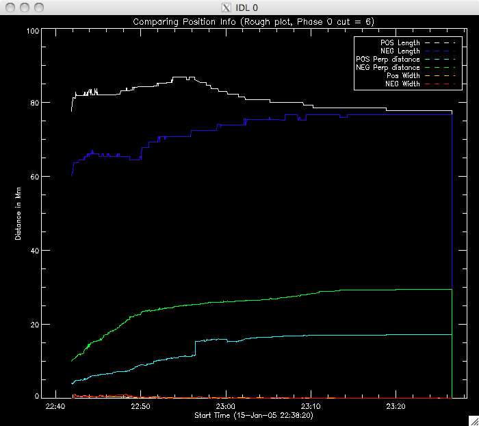 |
Phase 1: 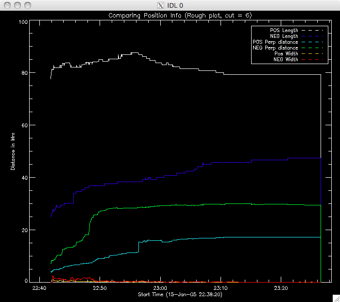 |
Phase 2: 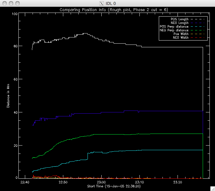 |
Below are plots of Lmax & Lmin for each ribbon in phase 0, phase 1, phase 2. 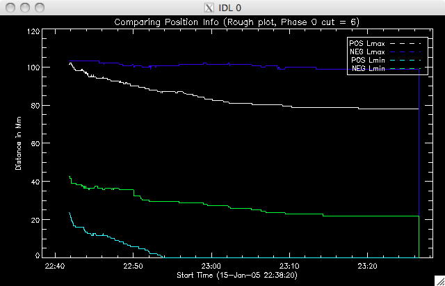 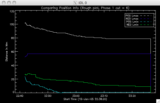 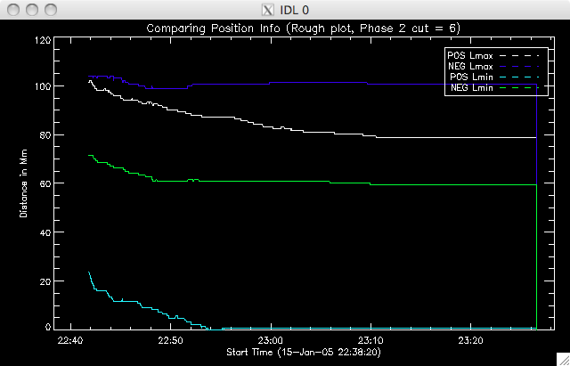 |
22nd July 2010 Jiong is going to finalise the position analysis, and work out which information is the most relevant to what we need to know while I work on fitting the second region. I am going to save the second region data in the same data structures as the first region, and if no second region fit is found then they will be assigned a value of '-1' so we know that the program processed the pixel but couldn't find a point matching the conditions I imposed. For the time being I am going to use a background level 0f 300 and a 40% cut. I am also stipulating that up to 35 frames after the initial value I find for the start of region 2 the data must continue to decrease- meaning that the point must be at least 35 frames from the end of the data. I may increase or decrease this depending on what the results show. So, the first run of the program will require that the difference between observation, dI, must be greater than 2*error on model at that point. Once this condition is met the point will be passed to a set of further conditions, requiring that that for the dI starting point, every 5 frames later must have a greater dI. |
23rd July 2010 My region 2 fitting program failed to fit any curves to the regions, and so I suspect that not enough pixels are getting through my filters. I put in a couple of lines to show the progress of the program, and a large number seemed to get through the first filter but only 1 or 2 through the second, so it is either too strong (maybe these regions mainly begin near the end of the data set???) or there is a dimension problem. I'll look into this after the group meeting. Jiong took my data to plot the most relevant data together (for today's meeting at least) and also fixed the HXR vs UV reference point problem which means I can show the following plots. We also spoke about what else I could do with the position info- we are going to try and get some additional data from Dr Cheng, but in the meantime I'm going to use roughly look into the GOESS temp and emission measure to see if we can locate a convincing theory about where the energy for parallel reconnection goes (or rather, why perp reconn energy is different from parallel reconn energy)- but I'll do this next week. 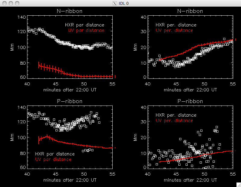 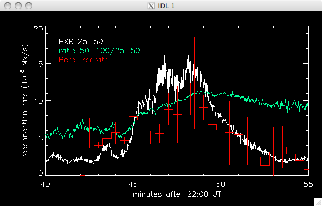 Also, although not really
connected to my summer research I plan to work with Jiong on the mirror
effect a bit during the next school year, and at the last meeting Dana
was interested in a plot of UV intensity with mag field, so here is a
(VERY) rough plot I just did showing this for my flare.
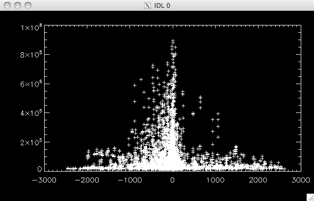 |